


Houzz Tour: Cozy Pied-à-Terre for a Father and His 2 Teens
A designer turns a one-bedroom apartment in France into a comfortable weekday home for a family
Valérie Carreno & Frédéric Sautai
May 6, 2019
If you haven’t been to the old town of La Rochelle, France, you’re missing out on the joy of strolling through its cobbled lanes and vaulted arches. Interior designer Coralie Bizot invited us to see her latest renovation — a small apartment, surrounded by greenery, that stands just in front of La Rochelle’s New World Museum. All that’s needed are horse-drawn carriages for the place to feel as though history has come to life.
The owner lives outside the city but works downtown, so he wanted a cozy pied-à-terre to share with his two teen-age children during the week. Having previously worked with Bizot on a professional project, he entrusted her with his own apartment, which he had bought in 2017.
The owner lives outside the city but works downtown, so he wanted a cozy pied-à-terre to share with his two teen-age children during the week. Having previously worked with Bizot on a professional project, he entrusted her with his own apartment, which he had bought in 2017.
Photos by Jours & Nuits
Apartment at a Glance
Who lives here: A father and his two high-school-age children
Location: Downtown La Rochelle, France
Size: 538 square feet (50 square meters)
Designer: Coralie Bizot of Décoralie Concept
“As soon as I visited the apartment, I immediately felt the serenity of this place in the old town,” Bizot says. “Bright and with large windows in two directions, the apartment was already very pleasant to live in, and we had to make sure it would stay that way.”
Find a local interior designer in the Houzz pro directory
Bizot worked on everything from the design of the space to the furniture and decor selection. The renovation started in February 2018 and was completed that May. It cost about $50,500, including labor, taxes, kitchen cabinetry and furniture.
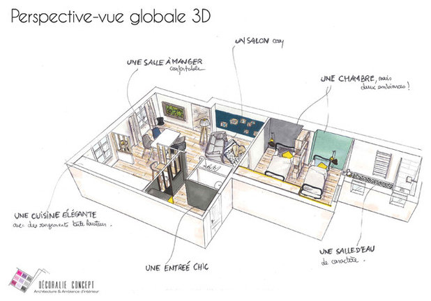
Bizot made sketches, including the apartment overview above, to help the owner visualize the final result.
Bizot made sketches, including the apartment overview above, to help the owner visualize the final result.
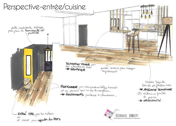
Here is her sketch for the entry and kitchen.
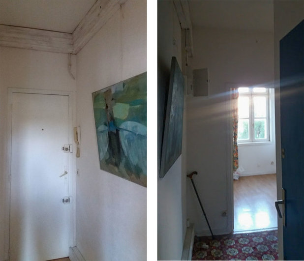
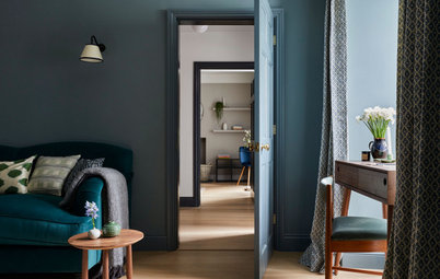
Before: “The apartment was really old and hadn’t been renovated for a good 20 years,” Bizot says. The entryway was separated from the kitchen by a plain door.
After: Just past the powder room (the door on the right), a sliding door with inset windows now leads to the kitchen. A separate entrance to the living-dining room is around the corner.
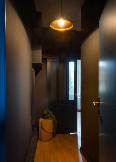
“The concept was to keep the idea of a dark entryway with a chic twist that would contrast the diaphanous light of the main room,” Bizot says. “The dark transition zone recedes to better introduce the main area. The dark gray that covers all the surfaces has a uniform shine under the orange, coppery glare of the matte black pendant light.
“To hide the boxing and make the entryway functional, I thought it would be more interesting to install a mirror or something the owners could use to get ready before going out,” she says. The mirror is against the wall to the left of the cork stool.
Find pendant lights with black shades in the Houzz Shop
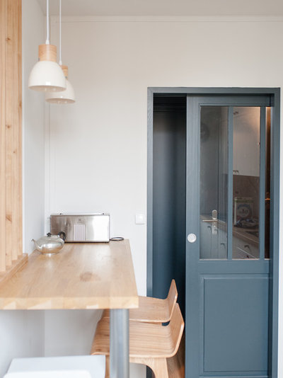
The sliding door is stylish and saves space. Its glass panel separates the entry without completely obscuring it.
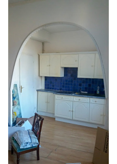
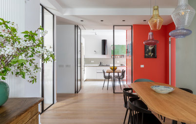
Before: The kitchen had a 10-foot-high ceiling and a beautiful floor typical of old La Rochelle apartments. But it was dated and separated from the living-dining room by a wall with an unattractive archway.
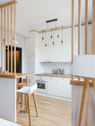
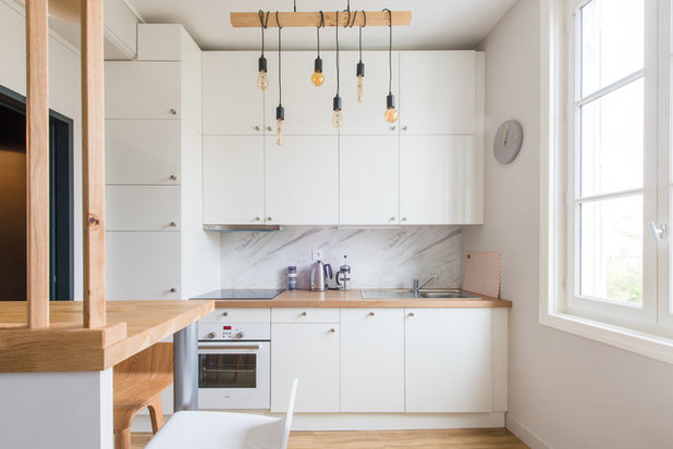
After: The owner wanted a Scandinavian-style kitchen, so Bizot used white cabinetry and light oak accents. The lower portion of the original wall supports the oak room dividers and the bar counter where the family has breakfast.
The natural charm of oak is a good match for the bright white surfaces. “The original kitchen was not functional at all. The whole interior structure was replaced with a custom-made solution made by a carpenter who specializes in kitchens. The main objective was to provide maximum storage by taking advantage of the entire height of the room.”
Townshend pendant light: Eglo
Find a cabinet pro on Houzz
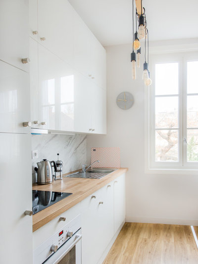
Bizot handled the technical and aesthetic choices in the kitchen, working with trusted craftspeople. “To start a project, I draw and propose the layout for cabinets and household appliances, and I discuss the choice of materials with the owner. Here, it was oak counters and white lacquered cabinetry doors with stainless steel handles.”
The backsplash is a marble-look laminate, which is economical and easy to clean.
Shop for stainless steel cabinet hardware
The backsplash is a marble-look laminate, which is economical and easy to clean.
Shop for stainless steel cabinet hardware
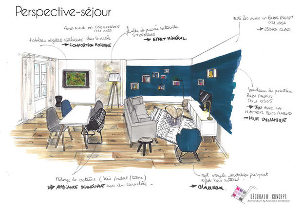
Here is Bizot’s sketch for the living-dining room.
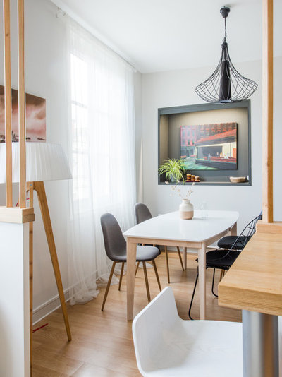
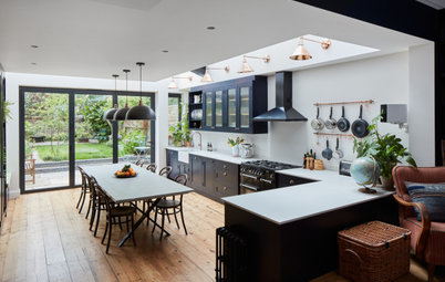
The dining area, which overlooks the building’s private yard, is a tranquil haven and a place for the family to come together after a long day. At the back of the room, an existing niche was repainted dark gray to display art and decor. The painting is a copy of Edward Hopper’s Nighthawks made by the owner.
The extendable table echoes the kitchen’s Scandinavian style. The black wire chair was a deliberate choice to make the space less matchy-matchy.
The extendable table echoes the kitchen’s Scandinavian style. The black wire chair was a deliberate choice to make the space less matchy-matchy.
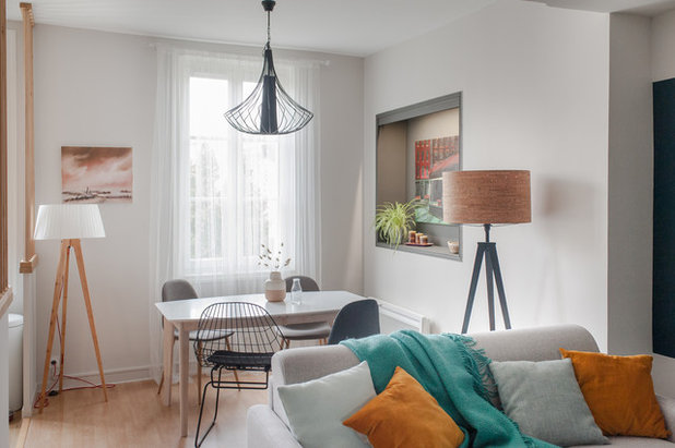
The smoky white on the walls reflects natural light and visually unifies the spaces. Bizot preserved the traditional moldings on the walls and ceiling.
She also chose a comfortable sofa bed for the owner to sleep on Monday to Friday.
Shop for a sleeper sofa
She also chose a comfortable sofa bed for the owner to sleep on Monday to Friday.
Shop for a sleeper sofa
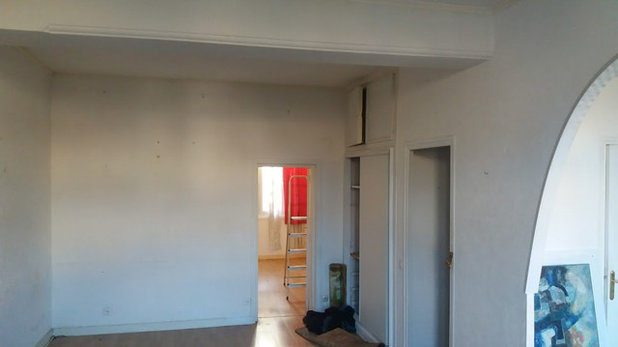
Before: The original living room was very impersonal. A small door led to the bedroom and bathroom.
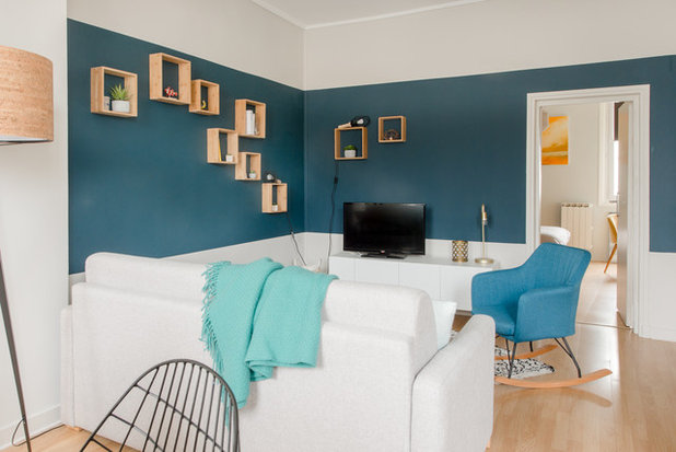
After: The living area is a bit larger than the dining area. The change in size helps define the two zones.
The height of the ceiling in this space allowed Bizot to go for a two-tone paint treatment and a gallery effect. Wooden boxes display objects that change with the seasons or when the family members find new things they like.
How to Get a Half-Painted Wall Right
The height of the ceiling in this space allowed Bizot to go for a two-tone paint treatment and a gallery effect. Wooden boxes display objects that change with the seasons or when the family members find new things they like.
How to Get a Half-Painted Wall Right
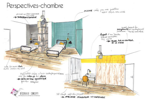
Bizot reconfigured the apartment’s only bedroom to fit a bed and private space for each of the two teenagers. She also included a desk and simple, space-saving storage.
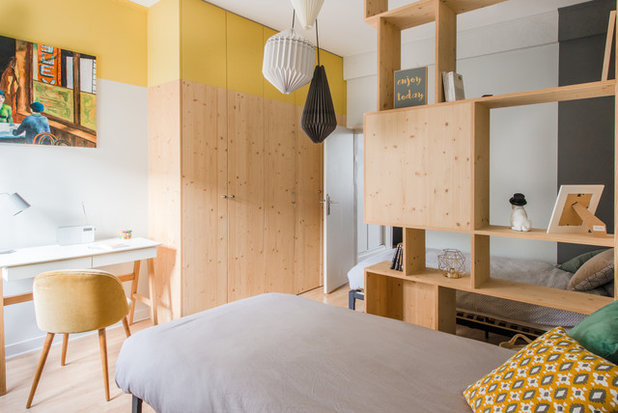
For the sake of space and to preserve a clear path from the bedroom to the bathroom, Bizot opted for beds with minimalist frames.
A custom floor-to-ceiling closet provides storage. Bizot proposed the design and, on the carpenter’s advice, decided on softwood for the cost savings.
A band of bright yellow paint near the ceiling catches the eye and keeps the space from feeling cramped by the large closet.
A custom floor-to-ceiling closet provides storage. Bizot proposed the design and, on the carpenter’s advice, decided on softwood for the cost savings.
A band of bright yellow paint near the ceiling catches the eye and keeps the space from feeling cramped by the large closet.
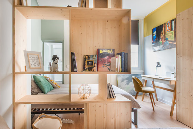
A wooden bookcase divides the sleeping areas. Different wall colors — green and gray — mark different zones.
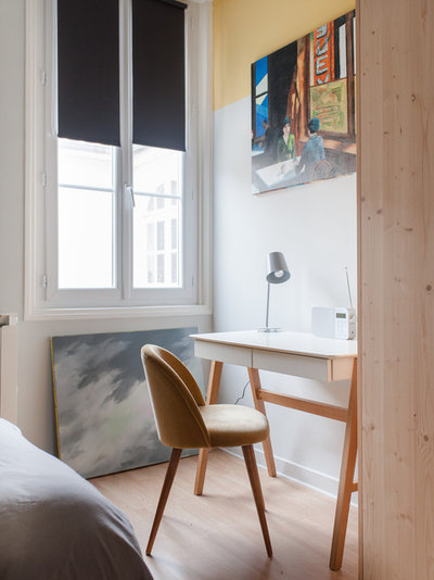
A desk stands in the corner. Roller shades make it easy to adjust the light.
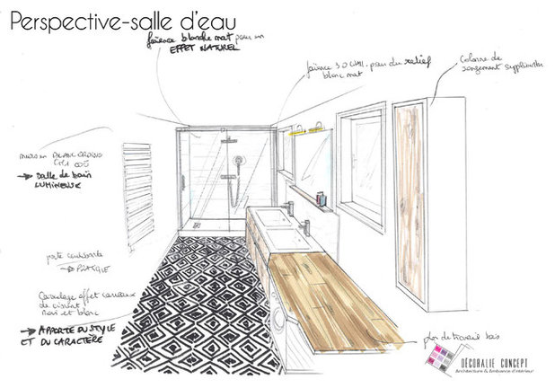
Here is Bizot’s sketch for the bathroom.
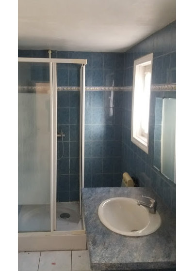
Before: In the back corner of the apartment, the original bathroom needed an update.
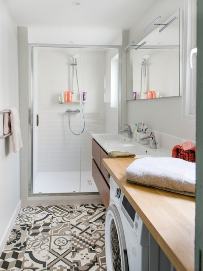
After: “The shower booth was replaced with a walk-in shower that extends the whole width of the bathroom. A large-format tile floor with a textured matte finish was chosen for the shower,” Bizot says.
A mirror occupies the wall between the two sources of natural light. A custom vanity floats over a cement-effect vinyl floor to give the bathroom character.
More on Houzz
Read other stories about homes around the world
Find a pro for your home project
Shop for home products
A mirror occupies the wall between the two sources of natural light. A custom vanity floats over a cement-effect vinyl floor to give the bathroom character.
More on Houzz
Read other stories about homes around the world
Find a pro for your home project
Shop for home products


We believe everyone deserves a space that will make them feel comfortable. Our goal is to help you create and... Read More
What are you working on?
Related Products


We help you design, build, and turn your home into the space you’ve always wanted. Contact us today about your... Read More
Related Stories
Houzz Tours
Houzz Tour: Period Home Gains Color and Character
By Kate Burt
Before-and-after photos show how a bold palette and restored features bring warmth and personality to this English house
Full Story

Barn Homes
Houzz Tour: Old Barns Become an Airy, Modern-Rustic Home
A barn home in Devon, England, sits lightly on the land and offers simple, relaxing spaces for an extended family
Full Story
Houzz Tours
Houzz Tour: Once-Bland Rental Now a Welcoming Home
By Kate Burt
A designer found on Houzz transforms a plain city apartment using color, texture and space planning
Full Story
Houzz TV
Tour a Contemporary London Home Full of Light and Garden Views
See and read how an architect on Houzz dramatically brightened once-dark spaces to create an airy contemporary home
Full Story
Houzz TV
Tour a Contemporary London Home Full of Light and Garden Views
See and read how an architect on Houzz dramatically brightened once-dark spaces to create an airy contemporary home
Full Story
Trending Now
The Most Popular Kitchens From Around the World in 2023
Visit Japan, Germany and 8 other countries to get inspiring design ideas in the most-saved kitchen photos of the year
Full Story

Houzz Tours
Houzz Tour: Lighter Look and Period Features in a Converted Barn
By Jo Simmons
In England’s Cotswolds district, an update introduces calm, contemporary elements while keeping a barn home’s character
Full Story
Houzz Tours
Houzz Tour: Updated Historical Home With a Modern Addition
By Jill Morgan
A light-filled addition and reworked layout transformed this period property in Wales into a stunning home
Full Story
Modern Homes
Houzz Tour: Family Says No to Relocating in Favor of Remodeling
An architect helps a family in Rome bring light, color and natural materials into their apartment
Full Story
Eclectic Homes
Houzz Tour: Rich Color and Classic Features Revive a Row House
A designer restores period details and improves the layout to reinvent a London home for a family of 5
Full Story
So many excellent ideas here. The use of paint to change the room’s proportions and reduce the visual height of the wardrobe. The divider between the teens’ beds. The separation of the loo - very sensible when there is only space for one bathroom and one loo. The washing machine in the bathroom, not the kitchen. Ideally I would not have partitioned off the kitchen or hallway so that the space felt even bigger, but perhaps the structural costs of opening it all up were prohibitive.
Excellent transformation. I especially like the defined different zones of the kitchen/diner/sitting room whilst keeping the areas open and linked. Good idea to give the girls their own separate space. Dad must be woken up very early in the Summer as there doesn’t seem to be blinds to the window but flat is in France, I am assuming there are outside shutters. I also would add a foldable screen so can Dad have a bit of privacy.
Phenomenal job working with the space. Love the colour scheme in each room too