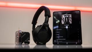
YouTube Music album interface gets a makeover on Android phones and tablets
Google teases baby steps to improve the look of Android apps on tablets.

Update (June 27, 11:47 am ET): The new album UI is also available on Android phones.
What you need to know
- YouTube Music appears to be getting a new interface on Android tablets.
- The fresh coat of paint will introduce a tablet-optimized design to the app's album UI.
- The new interface resembles the previously seen UI redesign for the app's playlist.
Google hasn't shown much love to Android apps on tablets in recent years until recently thanks to Android 12L, which has provided a lot of inspiration for major changes to tablet apps and interfaces in Android 13. YouTube Music now appears to be benefiting from this optimization.
As spotted by a Reddit user (u/MoistTart3258), YouTube Music's album interface is getting a facelift on Android tablets (via 9to5Google). The new UI places the album art in the top center of the screen, and it's larger than it is currently.
The artist's name and year of the album's release appear at the top of the album art, with the album's name and description appearing beneath it. As usual, there are buttons to play songs, download them all, add the album to your library, and open the overflow menu.
Another difference in the new interface is the location of the share button: it sits right next to the play button. In the current version, it shows up alongside the Chromecast button in the top right corner. Oddly, the shuffle button appears to be missing from the action button bar, presumably because the UI isn't finished yet.
The soundtrack list also appears on the left when in portrait orientation, though 9to5 notes that it moves to the right in landscape mode.


However, the revamp does not seem to be widely available at the moment. In addition, the modern UI doesn't seem to be applicable to songs uploaded from your device.
Be an expert in 5 minutes
Get the latest news from Android Central, your trusted companion in the world of Android
However, it is a positive step in Google's broader effort to care about its tablet apps after years of neglect.
It's notably similar to the redesign of YouTube Music's playlist interface, which surfaced earlier this month, courtesy of the same Reddit user. The redesign apparently showed up recently for a few Android phone users.
YouTube Music's Android tablet interface is currently just a blown-up version of its smartphone counterpart, so a fresh coat of paint will undoubtedly make it look better on many of the best Android tablets.
Update
The new album interface is also rolling out on Android phones and foldables, including the Samsung Galaxy Z Fold 3 and various Xiaomi models.
Apart from the new look, YouTube Music's redesign on tablets and smartphones includes a minor change: the shuffle button is now tucked away within the overflow menu.


It's still readily accessible on the playback screen, which would make the button redundant if it stayed in the album screen. It makes sense, therefore, to hide it somewhere.

Jay Bonggolto always keeps a nose for news. He has been writing about consumer tech and apps for as long as he can remember, and he has used a variety of Android phones since falling in love with Jelly Bean. Send him a direct message via Twitter or LinkedIn.