From our sponsor: Leverage AI for dynamic, custom website builds with ease.
Today I have yet another image transition for you. This time, we’ll do something super simple: animate a large image to its place in a grid. This is certainly the first step of something more creative… think of two images, or three! Or maybe changing the size more dramatically! I hope this little experiment gives you some creative ideas 🙂
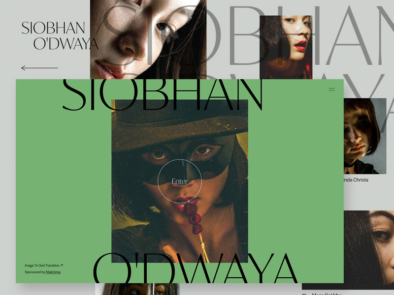
This is the initial view:
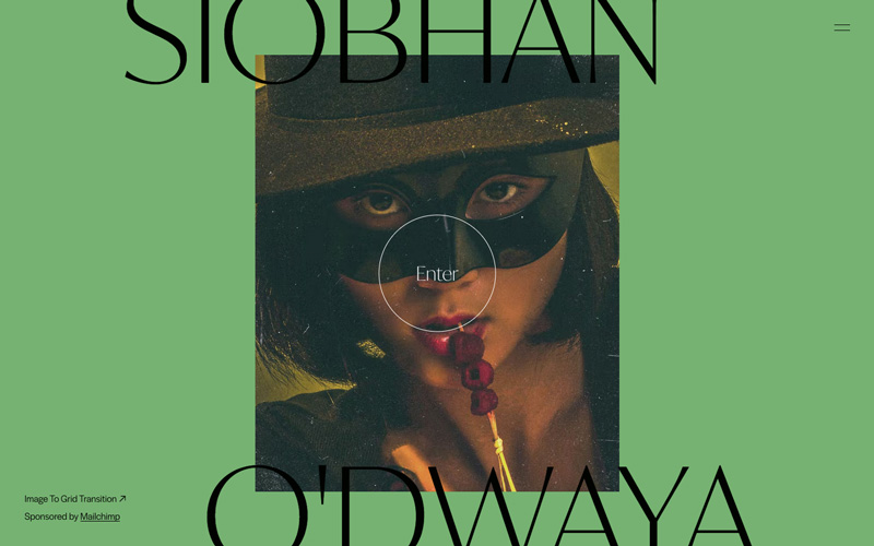
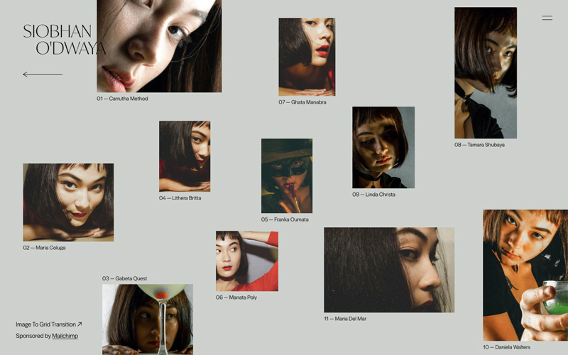
When clicking on the enter button, we animate the image to its tiny place in the grid:
If you are curious about how this grid is made, have a look at the HTML and the inline styles of each grid item: The grid is a responsive 100 ✕ 100 cell grid. We use some variables to set the column, row and the “size” by setting a proper span value over the column or row, like this:
<div class="grid__item" style="--c: 18;--r: 1;--cs: 22;--rs: 26;">
	<div class="grid__item-img" style="background-image:url(img/5.jpg)"></div>
	<h3 class="grid__item-title oh"><span class="oh__inner">Carrutha Method</span></h3>
</div>
The variables are then used in the CSS like this:
.grid__item {
	position: relative;
	display: grid;
	grid-template-areas: 'grid-img' 'grid-title';
	grid-template-rows: 100% auto;
	grid-column: var(--c) / span var(--cs);
	grid-row: var(--r) / span  var(--rs);
	will-change: opacity, transform;
}
This makes it easy to inspect the grid in the web inspector and then set the variables visually.
Let’s see how everything looks in a flow:
Thanks for checking by and hope you enjoy this little animation!