
A stepwise guide on how to create interactive financial charts in the form of an OHLC chart. Visualizing the stock prices of Amazon over the course of Jeff Bezos's tenure as the CEO.
Financial charts are especially useful to represent large amounts of data and identify trends. Would like to learn one such cool financial chart called the OHLC chart that visualizes stock price movement?
What is an OHLC chart and what does it represent?
An OHLC chart shows the open, high, low, and closing prices of a stock. It is a type of bar chart that is used to illustrate movements in the price of a financial instrument over time. A vertical line indicates the high and low prices while small horizontal lines on that vertical line show the open (left line) and close (right line) figures. The colour of the line indicates whether the closing price of the instrument was more or less than the opening price.
Here, I have decided to plot the highs and lows of Amazon Inc. on the Nasdaq under the leadership of Jeff Bezos. Amazon has grown tremendously, and the stock price has seen a lot of ups and downs through the years.
Take a look at my final OHLC chart here and hope that makes you excited to learn how to create this chart:

Creating the OHLC chart with JavaScript
Using any JavaScript library makes it faster and easier to create visualizations with their ready to use chart options. There are a lot of good JavaScript charting libraries that can be used to make beautiful charts though not all of them may have stock charts. For this tutorial, I am using the AnyChart JS library which has some cool financial charts under the AnyStock umbrella.
A working knowledge of HTML and JavaScript makes it easier to grasp the concepts but don’t worry in case you are a total newbie too. I will show you how you can create an interactive, useful JS OHLC chart in 4 basic steps. It’s time to start the session!
1. Create an HTML page
To start with, I create an HTML page to hold the chart and add a block element with a unique id that I will reference later.
I set the <div> to have 100% width and height which will display the OHLC chart over the whole screen. You can change these parameters to suit your requirements.
<html>
  <head>
    <title>JavaScript Word Tree Chart</title>
    <style type="text/css">
        html, body, #container {
            width: 100%; height: 100%; margin: 0; padding: 0;
        }
    </style>
  </head>
  <body>
    <div id="container"></div>
  </body>
</html>
2. Include the necessary scripts
When using a charting library, I need to include the appropriate JS scripts of that library in the HTML page.
To create an OHLC chart, I will link the AnyChart’s ‘core’ and ‘stock’ modules.
<html>
  <head>
    <title>JavaScript OHLC Chart</title>
    <script src="https://cdn.anychart.com/releases/8.10.0/js/anychart-core.min.js"></script>
    <script src="https://cdn.anychart.com/releases/8.10.0/js/anychart-stock.min.js"></script>
    <style type="text/css">
      html, body, #container {
        width: 100%; height: 100%; margin: 0; padding: 0;
      }
    </style>
  </head>
  <body>
    <div id="container"></div>
    <script>
      // All the code for the JS OHLC chart will come here
    </script>
  </body>
</html>
3. Add the data
To load the data file, I need to add the Data Adapter module of AnyChart and do so in the <head> section of the HTML page.
For the stock chart, I take the data from Yahoo finance. I am using weekly stock price data for Amazon from the time it was listed on the Nasdaq to the last week of June. You can download the data file here.
<script>
  anychart.onDocumentReady(function () {
    anychart.data.loadCsvFile( 'https://gist.githubusercontent.com/shacheeswadia/e2fd68f19e5331f87d38473a45a11dbe/raw/396b3e14f2d7e05aa188e0a420a7b622ed4111bd/amzohlcweekly.csv',
      function (data) {
        // All code here
      }
    )
  });
</script>
4. Write the JavaScript code for the chart
Now that everything else is done, let’s jump into writing the code to create and show the OHLC chart.
The first thing I do is enclose the code inside a function called anychart.onDocumentReady(). This is to make sure that the code will be executed only after the page is fully loaded. Then, I load the data with the anychart.data.loadJsonFile() function.
To use the data, I create a dataset table and then map the values to indicate that my data is in the sequence of open, high, low, and close data points.
// create data table on loaded data
var dataTable = anychart.data.table();
dataTable.addData(data);

// map loaded data for the ohlc series
var mapping = dataTable.mapAs({
  open: 1,
  high: 2,
  low: 3,
  close: 4
});
Next, I create the stock chart and plot it. Then, I map the data to the plot and define the grid settings. In a stock chart, it is always a good idea to keep the grid to facilitate easier reading of the chart figures.
// create stock chart
var chart = anychart.stock();

// create first plot on the chart
var plot = chart.plot(0);

// create ohlc series
plot
  .ohlc()
  .data(mapping)
  .name('AMZ');

// set grid settings
plot
  .yGrid(true)
  .xGrid(true)
  .yMinorGrid(true)
  .xMinorGrid(true);
I add a scroller series under the main chart to allow a closer look at any specified range of data.
Lastly, I add the title of the chart, reference the chart container and draw the chart.
// create scroller series with mapped data
chart.scroller().area(dataTable.mapAs({ value: 4 }));

// sets the title of the chart
chart.title('Amazon Inc. Stock Prices');

// set container id for the chart
chart.container('container');

// initiate chart drawing
chart.draw();
That’s all there is to do! A functional, interactive OHLC chart is conjured up!
It can be quite clearly seen that the stock prices have risen steadily with major gains after 2012 and a sharp rise in 2020.
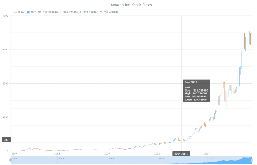
You can see that the legend is automatically added and on hovering, useful crosshair lines with the tooltip are displayed.
This is the power of the JavaScript library where a seemingly complex stock chart is created with such few steps. You can check out the entire code of the initial version here or on CodePen.
<html>
  <head>
    <title>JavaScript OHLC Chart</title>
    <script src="https://cdn.anychart.com/releases/8.10.0/js/anychart-core.min.js"></script>
    <script src="https://cdn.anychart.com/releases/8.10.0/js/anychart-stock.min.js"></script>
    <style type="text/css">
      html, body, #container {
        width: 100%; height: 100%; margin: 0; padding: 0;
      }
    </style>
  </head>
  <body>
    <div id="container"></div>
    <script>
      anychart.onDocumentReady(function () {
  anychart.data.loadCsvFile( 'https://gist.githubusercontent.com/shacheeswadia/e2fd68f19e5331f87d38473a45a11dbe/raw/396b3e14f2d7e05aa188e0a420a7b622ed4111bd/amzohlcweekly.csv',
        function (data) {
          // create data table on loaded data
          var dataTable = anychart.data.table();
          dataTable.addData(data);

          // map loaded data for the ohlc series
          var mapping = dataTable.mapAs({
            open: 1,
            high: 2,
            low: 3,
            close: 4
          });

          // create stock chart
          var chart = anychart.stock();

          // create first plot on the chart
          var plot = chart.plot(0);

          // create ohlc series
          plot
            .ohlc()
            .data(mapping)
            .name('AMZ');

          // set grid settings
          plot
            .yGrid(true)
            .xGrid(true)
            .yMinorGrid(true)
            .xMinorGrid(true);

          // create scroller series with mapped data
          chart.scroller().area(dataTable.mapAs({ value: 4 }));

          // sets the title of the chart
          chart.title('Amazon Inc. Stock Prices');

          // set container id for the chart
          chart.container('container');

          // initiate chart drawing
          chart.draw();

        });
      });
    </script>
  </body>
</html>
Customizing the JavaScript OHLC chart
I feel that the basic version of the interactive OHLC chart is pretty awesome as it is. But, to guide you on how JS charting libraries make it convenient to modify the chart according to one’s preference and display some more information, I will showcase a few customizations for this chart.
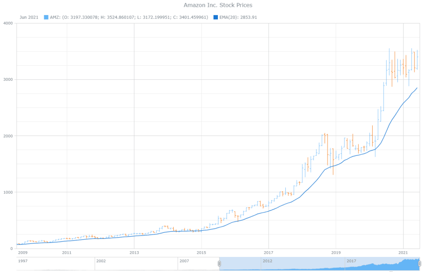
1. Add an EMA line
In a stock chart, technical indicators like moving averages, Bollinger bands, relative strength index, standard deviation and such are often used by analysts to predict price fluctuations.
An important and popular technical indicator is Exponential Moving Average(EMA) which helps to identify the trend direction by giving more weightage to recent observations. This functionality is inbuilt in the charting library so all I have to do is map the data and a line representing the EMA values is drawn over the chart. See how this indicator automatically shows up in the legend and you can toggle showing or hiding the line by clicking on the legend.
// create EMA indicators with period 50
plot
  .ema(dataTable.mapAs({ value: 4 }));
2. Fix a default chart display range
Since the chart data ranges from 1997 to 2021, it is quite a long period. If you want to focus on some specific area or show a particular range of dates, you can define the start and end dates. This will render the chart over that date period.
// set chart selected date/time range
chart.selectRange('2009-07-01', '2021-06-31');
You can have a look at this version of the OHLC chart on CodePen.
3. Change the colour theme
A simple yet effective way to make your chart look aesthetically personalized is to change the colours of the chart. There are multiple colour themes available in the AnyChart library.
I use a dark theme by including the script for that theme and setting it in the code. I like the lighter colour showing the positive close and the darker red showing the negative close for each data point.
<script src="https://cdn.anychart.com/releases/v8/themes/dark_glamour.min.js"></script>

...

// set chart theme
anychart.theme('darkGlamour');
4. Modify some aesthetics
A small change I make in the legend is modifying the icon to indicate the rising or falling of the stock price. And I also change the colour of the EMA line by using the Amazon logo colour.
// create EMA indicators with period 50
plot
  .ema(dataTable.mapAs({ value: 4 }))
  .series()
  .stroke('1 #f79400');
Here is the whole code with these modifications.
5. Include specific pre-defined range selection options
In financial charts, there are certain shorter time periods that are often used by users to check the price movement.
The great part about stock charts in the JS charting library is that all such functionalities are available by default. So again, all I have to do is add the range selector into my code. Just one thing before using this functionality is to include the required script and stylesheets that I add in the <head> section. You can click on the buttons to render the chart for that zoom level.
// create range selector
var rangeSelector = anychart.ui.rangeSelector();

// init range selector
rangeSelector.render(chart);
6. Add some events on the chart
Stock prices can fluctuate based on events or news. So, I decided to showcase some events that include product launches by Amazon and the start of the global pandemic which has made the Amazon stock price rise steeply.
I add the events data and the settings to display the events. This is a great way to make your chart more informative.
// set markers data
eventMarkers.data([
  { "symbol": 1, date: '1998-04-11', description: '2-for-1 Amazon stock split' },
  { "symbol": 2, date: '2000-11-01', description: 'Amazon launches Marketplace' },
  { "symbol": 3, date: '2002-07-20', description: 'Amazon launches AWS - Amazon Web Services' },
  { "symbol": 4, date: '2005-02-01', description: 'Amazon launches Prime membership' },
  { "symbol": 5, date: '2007-11-19', description: 'Amazon released the Kindle, its first e-reader for $399' },
  { "symbol": 6, date: '2014-11-15', description: 'Amazon launches Echo, a speaker powered by its digital assistant Alexa' },
  { "symbol": 7, date: '2020-03-11', description: 'Covid-19 declared as a global pandemic by WHO' }
]);
That’s the closing bell and a lovely, interactive JS OHLC chart is all done! Go ahead and check out the final version of the chart on CodePen.

Conclusion
This tutorial was just about one financial chart - an OHLC chart - with some features applied. There is a plethora of other series and customization options available so I would suggest that you have a look at what else is possible starting from here.
Actually, there are many JavaScript charting libraries out there that provide many necessary chart types and features out of the box, making interactive data visualization more convenient. Some of them do support financial charts. You can have a closer look and make your own choice based on your specific needs.
It may be difficult to predict markets and stock movements but quite easy to plot them! Do let me know if you have any doubts or need any guidance.


Top comments (0)