

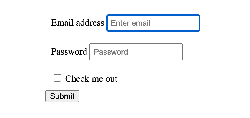
In this quick tip I’m going to show you how to create better focus styles on form elements with a CSS pseudo-class called :focus-visible. Or, in plain English, I’m going to show you how to get rid of this blue outline the right way:


CSS Pseudo-Class :focus-visible
Check out the video below, subscribe to the Tuts+ Youtube channel, and see below for the written version of this quick tip!

Removing Input Focus Styles (the Wrong Way)
When you create a simple form, the user agent (browser) will apply its own styles to the focus state of the form elements (like the text inputs, text areas and so on).
This is actually an important accessibility feature, and it allows users whose experience of the page is somehow impaired to navigate and use the form properly. When an element is in focus, keyboard events will be applied to that element.
The very clear shade of blue #2360c5 that browsers tend to use by default is an effective and functional color to use in terms of accessibility, but there’s a good chance it won’t work well with the rest of your design.
To remove this blue outline entirely we could use the following CSS to target all focus states:
1 |
:focus { |
2 |
outline: none; |
3 |
}
|
That solves your problem from a stylistic angle, but in doing this you’ll remove the accessibility cue that visually tells users which element has focus. In other words, it’s not a good idea.
Changing Input Focus Styles (the Right Way)
Let’s look at the :focus-visible pseudo-class. This applies when an element matches the :focus pseudo-class (in other words: an element is in focus).
It even goes further, allowing us to differentiate the input modality (whether the user is focusing on an element using the keyboard or the mouse, for example). I’m going to demonstrate how you can remove focus styles for mouse users, but keep focus styles for those users navigating the form elements with the keyboard.
Note: this isn’t necessarily a perfect accessibility example, but it serves our purpose for demonstrating :focus-visible capabilities.
Apply an Outline Default Style
Let’s begin by determining how our focus outlines will appear by default. We’ll give focused elements a solid red outline:
1 |
:focus { |
2 |
outline: 3px solid red; |
3 |
}
|
Here’s what that gives us. Importantly, you’ll notice that the inputs and the button all get a red outline when focused, with the keyboard and with the mouse:
By default a browser won’t give buttons a visible focus style when you click them with the mouse. It’s implied that the user is executing an event by deliberately clicking and doesn’t need to see the focus. It will, however, add a focus style when the button is navigated to via keyboard.
Remove Focus Styles for Button and Mouse Combination
Let’s emulate this behavior by removing focus styles for the button when clicked on with the mouse.
We can do this by selecting any element which is in focus, but is not() considered :focus-visible by the browser. Like this:
1 |
:focus:not(:focus-visible) { |
2 |
outline: none; |
3 |
}
|
Add Enhanced Styles for Supporting Browsers
As a last bit of enhancement we can add a purple outline for any elements which have focus and are considered to be ::focus-visible by the browser:
1 |
:focus-visible { |
2 |
outline: 3px solid #9999FF; |
3 |
}
|
Here’s the resultant demo:
Conclusion
That wraps up how to use the :focus-visible pseudo-class! You now know how to make stylish and accessible forms. For more details on how browsers determine which elements should and shouldn’t qualify for :focus-visible check out the video at the top of the page.
Useful Resources


