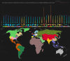
![If there were only 1000 GDP in the world, where would they be, 2021.
Each hexagon roughly equals to 1‰ of World total nominal GDP
by u/BerryBlue_BlueBerry
[[MORE]]This is an updated version from my previous 2018 GDP cartogram. Because just doing the...](https://openseadragon.github.io/openseadragonizer/?img=https://i.redd.it/8fky2aqhm5t61.png)
If there were only 1000 GDP in the world, where would they be, 2021.
Each hexagon roughly equals to 1‰ of World total nominal GDP
This is an updated version from my previous 2018 GDP cartogram. Because just doing the same map using the same method is boring, this time I tried to make the numbers more comparable and easy to read by standardizing the basic unit to 1‰ of World GDP, and with hexagons!
Note:
- Big GDP Countries >10‰ of World GDP are showed with subdivisions. (Congrats to Netherlands entering the 10‰ group this year.)
- Metropolitan Areas ≥3‰ of World GDP are featured. They are labeled in red and colored in white shades.
- Small GDP Countries <1‰ of World GDP are merged with other small GDP Countries in grey hexagons.
Source:
- GDP data of countries: IMF estimates (“World Economic Outlook Database, April 2021”)
- GDP data of subdivisions: from each government’s stats & estimates (for example: US Census Bureau & Euro Stats)*
- *Most subdivision data are outdated (2017-2020), 2021 stats are estimated by this formula: “national GDP from IMF (2021) x % of subdivision participation (2017-2020)”
- *Metropolitan area GDP are gathered from different country’s estimates and economic studies. These numbers can vary a lot, depending on definitions of metropolitan areas.
- *Thus, this cartograph is best seen as an overview of World GDP distribution. It’s more accurate at a country scale, but can be a bit vague at subdivision & metropolitan area scales.
Related Posts
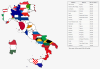
![2018 Nominal GDP Cartogram, subdivisions of the top 16 countries included.
[[MORE]]by BerryBlue_BlueBerry
I was wondering how a world GDP cartogram would look like if there are subdivisions of major countries involved. So I made this thing. Most of...](https://64.media.tumblr.com/94f7ce684db53fe10ac53b4769376da0/5ad567e0b3eb815c-8b/s100x200/921b705fc2f2723013f151da90b77f6f861031b4.png)