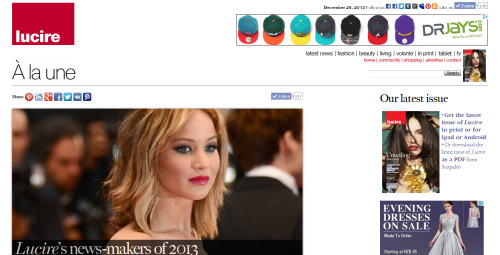
Above: The very first site (alphabetically) linked from our Newsstand pages, Annabelle of Switzerland, complete with large lead image and smaller subsidiary ones.
I took a look at Lucire’s Newsstand reviews tonight. This section is a relic of the early dot-com days that Lucire came from (in the 1990s), when people exchanged links with each other to help with their search engine positioning, and, to make the sections look legitimate, you put your favourite websites in there as well. When it came to Lucire, naturally, we included our competitors as a resource for readers. I have to say that we were pretty choosy.
Each time I re-examine the list, which is probably every couple of years, I’m removing sites. Many have fallen by the wayside over the last 23 years, and some that we link have content frozen in the mid-2010s. They are still good resources, so they’re staying. They might even be a good read for those countries who are still dealing with COVID-19 cases in a very real, confronting way.
What I did remove throughout the three pages of reviews, however, were the ratings. We used to rate quite a few of the sites on content and design, because when we first started, there was a huge variety. It was a relatively new medium, so people were still experimenting. They were a guide, nothing too serious—though I still remember one New Yorker getting so upset that, if I recall correctly, he felt he had to retaliate by linking Lucire with a negative review. (His low score came in part from home page art that was only tested on certain monitors, and on higher-res ones, its elements didn’t line up, with ghastly results. Cutting up images and have them reassemble on screen was something we all did back then, to cope with slow download speeds.) I suspect all that did was send his readers intrigued about our supposed terribleness our way, who then would have found his review somewhat childish and unreliable, since we were winning awards for the online edition of Lucire. Other than that humorous blip of small-mindedness—which I suppose underlines how elements of New Yorkish Trumpism was there long before the real estate magnate ran for president—the ratings were an accepted feature of the pages for many years.
The reason for their removal is, sadly, the lack of creativity in web design these days. I’m not saying we’re breaking new ground ourselves, though what you see here was still designed by someone on our team and not part of a template that comes with a web-page service. And don’t get me wrong on that, either: some of those templates are really, really good.
But we’ve settled into a certain look being acceptable on the web, including mobile devices (which have limited creativity in publishing). As browsers and computers have become more powerful, publishing packages have made use of more of their capabilities. Also a good thing, because this enables more people to make websites. However, this means there is less need for someone to tinker and create something from scratch, because there are great programs that have more than half the legwork done. Then there are those developing templates for these software packages, bound somewhat by the features that form their foundation. That has led to standardization, because, like it or not, there are certain things you must do to make a site work for the range of devices that will be pointed at it nowadays.
The ratings, then, become meaningless, if so many of the sites reviewed have a similar design concept: big lead image, smaller ones on the home page pointing to the significant articles, similarly sized text (and, in many cases, pretty big text), etc. With fonts now transmitting with web pages, it’s no longer special for a website to have bespoke typography. And with so many fonts available, many have opted to get creative on their typographic choices—which could give us some basis for separating the great from good, but outside of the design world, this seems to be an unfair criterion on which to judge.
We could still rate for content, but to get in to the directory, the content had to be reasonably decent to begin with.
While there’s big type on the web, the trend in print appears to be very small body type, so small that it’s uncomfortable to read. I don’t know what’s driven this, since the physiology of the human eye and what point sizes we find legible and readable haven’t changed, but needless to say it’s not one that Lucire in print has, or will, follow. Trend-wise, I hope that we might get to a more sensible balance again.

Above: A spread from Rolling Stone, November 2020, showing the small type now seen in print.
Right now the mobile space is getting all the love, hence this standardization, even though I’ve tired of those devices for some years now. We anticipated that the tide would turn with Facebook and removed all the gadgets sourced from that site before The Observer broke the Cambridge Analytica story. I’ve tired of the privacy intrusions by some of the Big Tech websites, even though I have a Google-free Android phone; and I’ve tired of the tiny keyboards and the utterly inefficient ways of entering words on phones, and that includes voice recognition. Technology is here to serve us, not the other way round.
Therefore, I’m not sure that pandering to the limitations of the smaller screen is the right thing to do, which I know, given the time people spend on their devices in 2021 could be an unwise decision. But maybe some of us have to take those first steps and say: there are better things to do with your day, and better ways of reading that won’t strain your eyes. Look up from your devices. Enjoy life. Find the medium where your posture’s not compromised. Even if the trend is to fixate you to your phones and strain your eyes there, and then to make life difficult for you in print with tiny type that strains your eyes even more. We want to be humane, take part in making your lives better, and not hooking you for every moment possible.
Another reason this site doesn’t get as much mobile support as others—a reason to knock our own design score down—is that each time we create a version for handheld devices (at the turn of the century, you could download Lucire news on to PDAs like Newtons), the technology is quickly rendered obsolete: either programs are invented that distil the large images and web page layouts into something that the devices can tackle, or resolutions improve, or browsers come with a text-only mode. Worryingly, the means of having smaller devices being able to deal with traditional web pages haven’t appeared as quickly this time, which may point to a dearth of innovation in the occidental online space in the 21st century.
That is what you get when the technology space is dominated by giants, as it leads to the suppression of innovation, something that isn’t serving humankind one bit. Standardization hasn’t just happened because we all settle: the clever inventions aren’t getting out there because the barriers to entry are high. Big Tech isn’t just about suppressing speech and getting political: it’s affecting our everyday enjoyment and appreciation of online media. YouTube and others have “exit pages” that hinder us from leaving their sites, in an attempt to keep us from departing and score themselves an extra page view that they can record (if we the people do this, the search engines penalize us). They want to keep us where they can watch us, not the other way round.
I’d love to see that “old-fashioned” innovation return, with great websites that knock our socks off, getting 10 for content and 10 for design again. I’m sure there are clever people out there bucking the trend, and we’d love to hear from them. With all the sites out there, discovering them is as hard as ever, with search engines like Google potentially getting less reliable as their algorithms feed us content that might hook us more than help us, such as giving us political news that appeals to our own biases rather than help make us better rounded people.
It’s really down to us to get the word out about great sites, businesses and organizations. I realize that most of us can only do this through the services Big Tech provides. You’re probably on this page because you followed a search engine result or a social media referral. But if we want to break free of them, if we want to see great sites and innovation return, then we each need to do our bit, by freeing ourselves from the dominant players that are holding things back. Ask yourself whether it’s that vital to share that Tweet, Facebook post, Instagram photo, or social media comment. And, I say this without irony, let us know in the comments of some of those great online destinations that you think deserve to be linked.—Jack Yan, Founder and Publisher


