
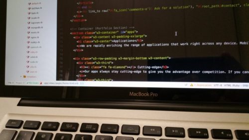
Image credit
Having a functional, usable, and super fast website doesn’t have to cost an arm and a leg.
As a web designer, you can use a few pieces of code or some minor tweaks to ensure a much faster and better appealing web design.
Without having to fork out thousands of dollars to a designer, and without having to change the underlying infrastructure of your website, here are four simple web design hacks that can enhance your website today:
- Use HTML5 DOM Storage (Instead of Cookies) to Ensure a Faster Website
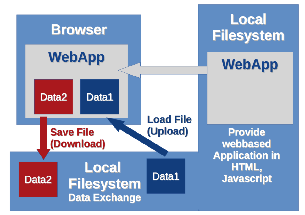
Image Credit
Depending on how big a website/web page is, it “costs” quite a bit of data and bandwidth to load that website when you rely only on cookies. When this website is loaded repeatedly for a lot of users, depending on the server it is hosted on, the result can be a slower website (due to increased strain on available server resources) and increased hosting costs.
Often, this is because of how cookies are used: cookies are generally only necessary when there is a need for client-server communication between a user’s browser and your server.
If there’s no need for a user’s browser to interact with your server before the user experience is fulfilled, you should consider using DOM storage instead of cookies.
DOM Storage can take the following forms:
- sessionStorage in which data is stored in a user’s browser for the current session
- localStorage in which data is stored in a user’s browser without an expiration date
You generally want to focus on localStorage. With this, data is stored in the user’s browser and won’t be deleted even if they close their current browsing session. This will reduce server connection requests and make your website a lot faster for the user.
So how does this work? Assuming you want to store the “name” value in a user’s browser, for example, you will have:
// Store
localStorage.name = “Firstname Lastname”;
To retrieve the value:
// Retrieve
document.getElementById(“result”).innerHTML = localStorage.name;
To remove the value:
localStorage.removeItem(“lastname”);
What if you want to check if localStorage is available? You can use:
function supports_html5_storage() {
try {
return ‘localStorage’ in window && window[‘localStorage’] !== null;
} catch (e) {
return false;
}
}
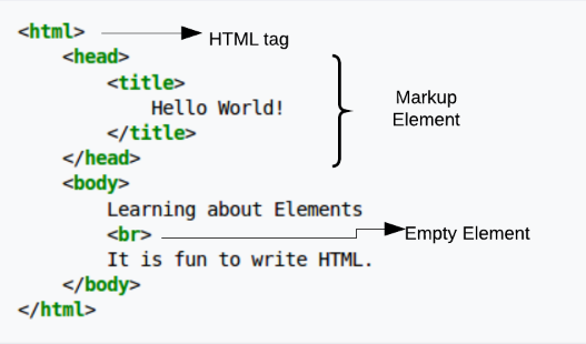
- Achieve Better Image Styling by Using the <Picture> Element
In a world that is heavily reliant on images — research shows that our brains process images a lot faster than text — being able to effectively manipulate images is one of the key advantages you can have as a web designer; and this goes beyond looking for the best photo editing app out there today.
Being able to properly style images is a web design super power for a few key reasons:
- It makes your web design a lot faster since you’re able to control when and how images should load.
- It gives you a lot of flexibility when it comes to which image/version of your design users should see depending on their device.
- It allows you to serve different images/image formats for different browser types.
- It allows you to save money you’d have otherwise spent creating different design versions with different image elements.
So how do you go about achieving this? By effectively leveraging the HTML <picture> tag.
Here’s an example code:
<picture>
<source media=”(min-width: 600px)” srcset=”img001.jpg”>
<source media=”(min-width: 250px)” srcset=”img123.jpg”>
<img src=”img234.jpg” alt=”Header” style=”width:auto;”>
</picture>
In essence, the above code involves three images; the original “img234.jpg” which is displayed. Under certain conditions, however, other images could be served. For example, the code says “img001.jpg” should be served for devices with a minimum width of 600px, “img123.jpg” should be served for devices with a minimum width of 250px. You could add more lines of code to specify more possibilities.
Some sub-elements and attributes that can be used for this tag include:
- The <source> subelement to specify media resources.
- The <img> subelement to define an image.
- The srcset attribute that is used to specify different images that could be loaded depending on the size of the viewport; you use this when dealing with a set of images as opposed to just one image (in which case you use the src attribute).
- The media attribute that the user agent evaluates for every source element.
- Enable GZIP Compression via .htaccess to Boost Site Speed

Image credit
No matter how well-designed a website is, it won’t make much of a difference if the website is slow.
This is why it is important to make sure you enable proper compression to minimize the number of files that have to be loaded and as a result get a website speed boost. The best way to do this is via GZIP compression.
You can enable GZIP compression by adding the following code to a web server’s .htaccess file:
<ifModule mod_gzip.c>
mod_gzip_on Yes
mod_gzip_dechunk Yes
mod_gzip_item_include file .(html?|txt|css|js|php|pl)$
mod_gzip_item_include handler ^cgi-script$
mod_gzip_item_include mime ^text/.*
mod_gzip_item_include mime ^application/x-javascript.*
mod_gzip_item_exclude mime ^image/.*
mod_gzip_item_exclude rspheader ^Content-Encoding:.*gzip.*
</ifModule>
If your web server doesn’t have .htaccess, there are also instrunctions for NGINX, Apache, and Litespeed.
- Combine Fonts to Spice Up Your Design
Typography is generally believed to be the most important part of a design, so the fonts you use will go a long way to influence how your design is perceived.
So much has been written about selecting fonts, so I won’t be covering that again in this article. One hack I’d like to recommend you give a shot, however, is combining multiple fonts.
You can combine two, three, or more fonts to make your web design look a lot more appealing. Fonts can be combined in a logo, layout, or the actual web design itself, combining fonts can go a long way to make your website look different.
That said, there are a few rules you might want to stick to if you want to get results from combining fonts. These include:
- Choosing fonts from the same superfamily. This is especially important if you’re a beginner designer or not familiar with how to pair fonts.
- If you’re not sure where to start, you might want to start by pairing a serif font with sans serif and see how that looks.
- Consider the flow of content on your web design when combining fonts — since fonts influence content readability, you want to make sure that the fonts you use match the attribute of the message that will be displayed and as a result flows.
- You also want to make sure that the fonts you pair contrast with each other — this is one of the reasons why pairing serif and sans serif might be a good place to start. Contrast can be achieved through size, style, spacing, and weight.


Leave a Reply