
When fonts fall


One of the typographical questions we get often is, “How does font fallback work exactly?” It’s not even that Figma does something unique here (although we have our own specific take), but font fallback is just complex, filled with quirks and unexpected side effects. Our resident font enthusiast Marcin Wichary decided to dig into the issue and prepare an exhaustive guide to font fallback, its beauty, and all the pitfalls.
Raise your hand if you’ve ever encountered any of the following—and don’t put it down.
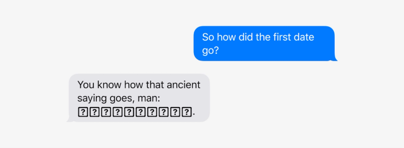
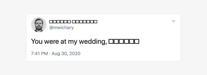
You’ve received a text with weird boxes or question marks like this:

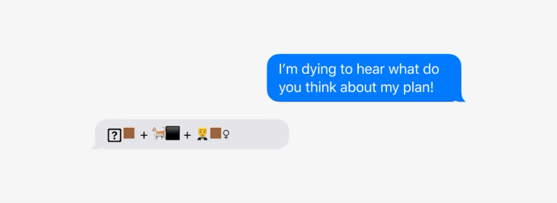
Or, the emoji looked fine to you when you sent it, but arrived weirdly disassembled to the recipient?

You saw someone using cool fonts on Twitter, a place you didn’t think allowed people to choose fonts?

Or, you actually figured out how to use those fonts on Twitter, only to have someone shout at you to think of screen readers—or to complain about seeing empty boxes.

You added an emoji to a line—and at that moment, that line awkwardly shifted down:
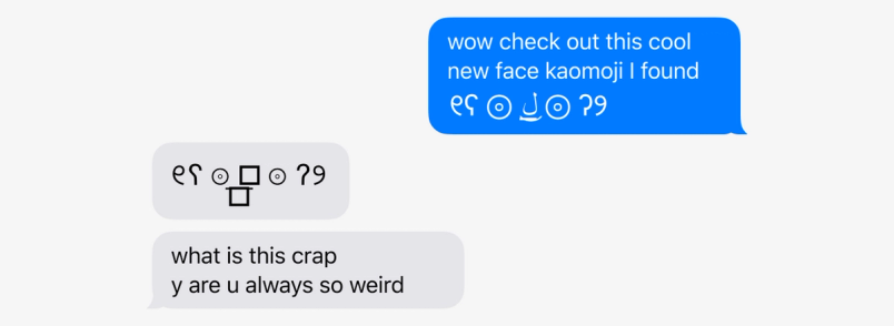
You sent someone a really cool kaomoji, only for someone to complain that it doesn’t look that great on their end:

Something tells me there is no one left with their hand down at this point. (If you actually raised your hand, thank you!)
These little transgressions can be confusing, but not frustrating enough to spend time dissecting. They seem like small bugs that permeate everyday interaction with our tasteless machines.
But these are not bugs, at least not in the traditional sense. All of these examples can be explained. Moreover, all have one common underlying cause—an important and in some ways very impressive mechanism of computer typography many of us might be completely unaware of. That mechanism helps fonts when they run out of characters, and it’s called font fallback.
This space (sometimes) intentionally left (somewhat) blank
As a type designer, one of your jobs is to give your font every glyph it needs.
A glyph is a typographical term roughly meaning a character. Even a simple western font comes with over two hundred glyphs: twenty-six letters of the alphabet plus the same bunch in uppercase, ten digits, symbols, punctuation, accents.
Not every font is western, of course. If you’re designing for Chinese and Japanese writing, your glyphs will number in the thousands. But either way, there are always glyphs to draw, even in a smaller font: symbols and ligatures, esoteric punctuation, digit and letter alternatives to be used with OpenType features In Figma you can now turn on additional ligatures, customize the style of digits, switch to alternative letterforms, and make use of adjustments available in many of today’s fonts.

An ode to OpenType: Fall in love with the secret world of fonts

At some point, you have to draw the line. That line is one last glyph. It comes with a technical name, .notdef, and the dot is there to signify it’s unlike any others. .notdef is a glyph of last resort, one to be used when a font is asked for a character its designer did not bother to draw.
.notdef is the original version of font fallback—a rudimentary solution for a problem that didn’t exist when printing was physical. In the world of metal type, when you hold a letter in your hand you also hold its specific font—and so it’s impossible to ask a font to output a letter it has never heard of. But computers put a strange distance between fonts and text. A computer can display text written by someone else, perhaps long ago, and using a font unknown to its creator, or one that might have not even existed when that text was created. And so a font needs to be able to say, “I have no idea what this particular character is supposed to look like.”
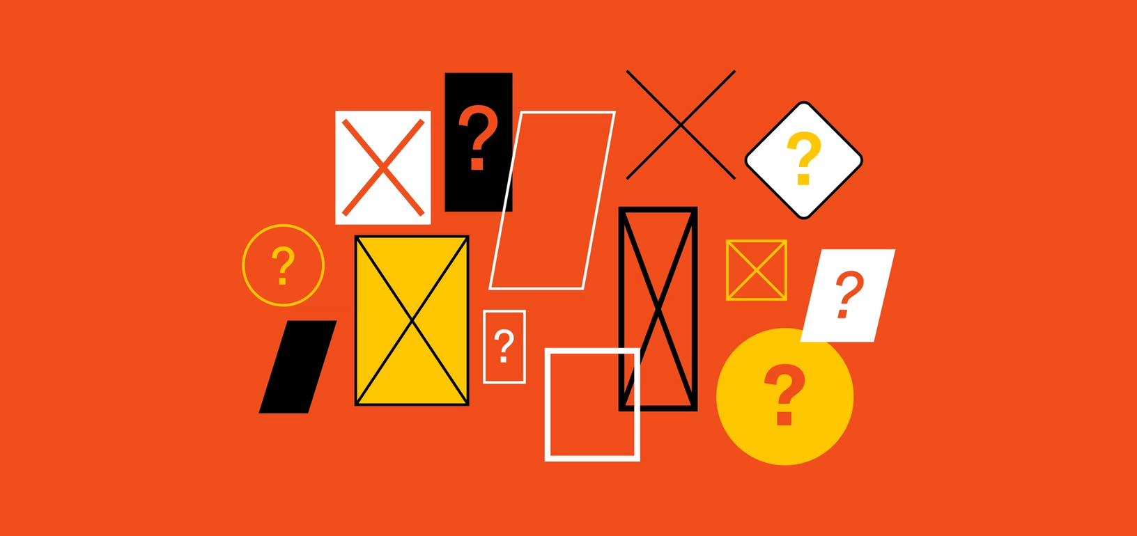
.notdef often looks like a simple rectangle, sometimes with a cross inside. It’s a shorthand for “this space intentionally left blank.” It’s not a traditional Unicode character with its own specific code—rather, just a rectangle that is drawn to cover up for the character that should be there. When you copy and paste it, under the hood it remains the original character you wanted to see. After all, the font might be updated in the future with more glyphs, or you might simply switch to another font that supports the character you wanted:
What gets drawn as .notdef glyph is for the font’s designer to figure out. Even within the rectangle convention, the sizes will vary—and some type designers take their rectangles and cross them out, or adorn with question marks:

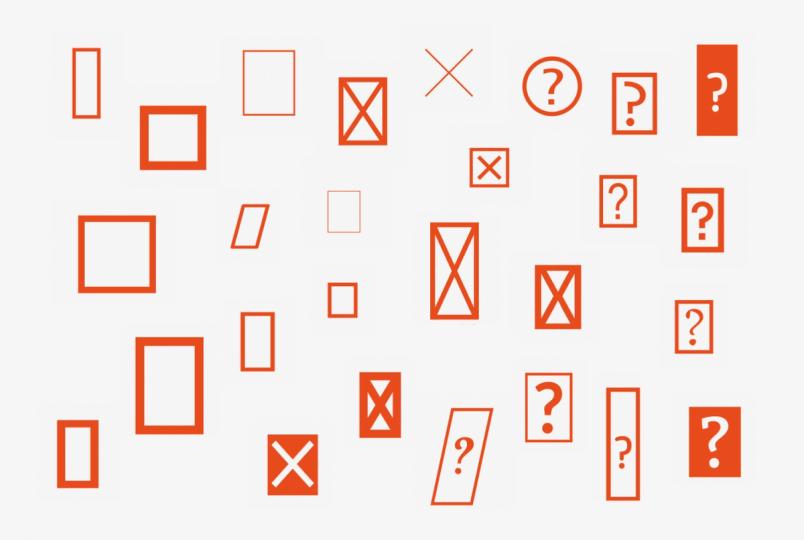
Other designers give up and don’t do anything, leaving .notdef to be a blank square. Others still… well, they go a bit wild:

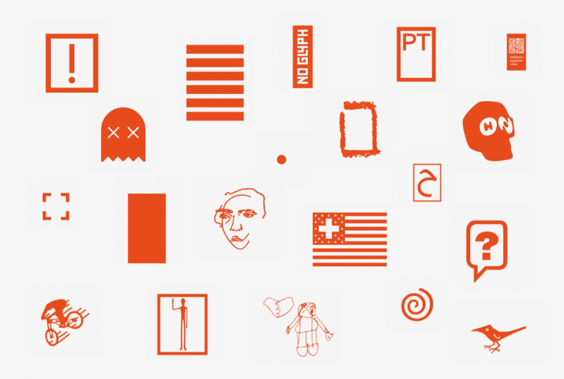
The wild examples are rare, but the regular rectangles? Something tells me you’ve seen one of those rectangles more than a few times in your life.
And yet, you might be surprised how much more often you would see them, if there wasn’t a whole invisible, impressive, and idiosyncratic system to cover every font’s back.
The font fallback you know and love (ǝʇɐɥ oʇ)
The flavor of font fallback most of us are familiar with comes from the web. It looks something like this:
font-family: Joanna, Helvetica Now, Helvetica, Arial, sans-serif;
The premise is simple: the list gives the browser a chain of command. “To render this element, use a font named Joanna. If you don’t have that, use Helvetica Now. Nope? How about an older version of Helvetica? Don’t have any of those still? Fine, just pick Arial. No Arial? Lord. Just grab whatever generic sans serif you recommend.”
The first font listed is often a web font, packaged with the website itself. If it fails to load—or if it’s taking too long to arrive—the next few recommended fonts are those already popular among users, or installed with various operating systems.
The first font is the perfect scenario. Each further notch is a deeper fallback, and a bigger compromise. You can almost imagine each one coming with a more audible groan of the website's designer, ceding control from a perfectly manicured, often unique font meant to represent the brand or the emotion of the site, to increasingly more generic fonts—reliable, sure, but not that exciting.
Font fallback has been there since the very beginning of CSS, in recognition that there was never a time in our history where every single computer came with the same set of fonts.
Outside of a list of fonts, CSS font fallback didn’t give the web designer more specific control over font fallback: no feedback about which font is ultimately selected, no extra adjustments for size, weight, or letter spacing. I’m sad to report it still doesn’t today. The only meaningful change was the addition of a few more generic words for UI fonts which gained in popularity only within the last decade (one example is system-ui, which comes with its own font fallback horror story).
But even if font fallback appears old and simplistic, you might be surprised by two things. The first one is that it operates not at a level of a font, but at a level of a character. The second one? What you declare in CSS is only a small part of font fallback.
Fonts as templates
Operating on a level of a character means the browser or the operating system revisits your font fallback chain with every single letter you ask them to print. If a font doesn’t have that one character, another font on the list is tried, and so on.
Let’s pick up the same list as above, simplified a bit:
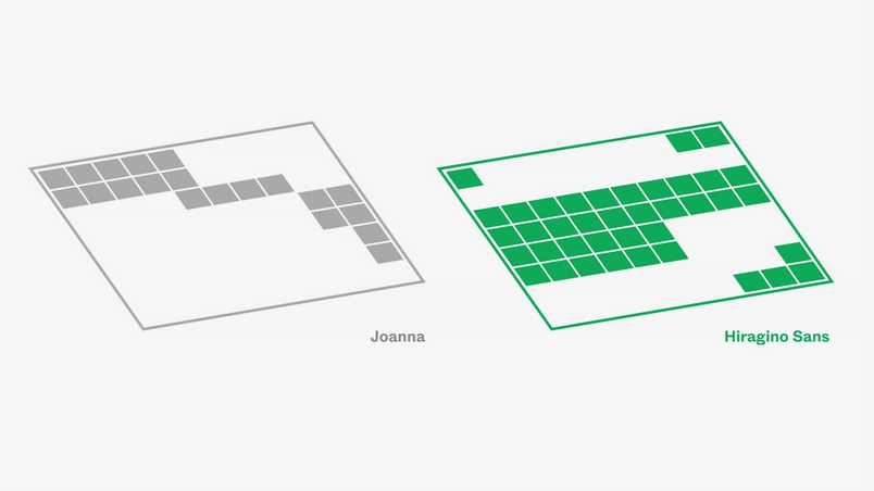
font-family: Joanna, Helvetica Now, Helvetica, Arial;
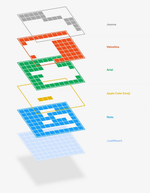
The version of Joanna on my computer has 261 glyphs, covering a few adjacent alphabets, but not much else. I don’t have Helvetica Now, so we can skip that. The traditional Helvetica has a whopping 2,252 glyphs, which takes care of Cyrillic, Georgian, and Vietnamese—plus a lot of math and currency symbols. But Arial is even better. The very bastardization of Helvetica that we often scoff at delivers over 3,300 glyphs, besting Helvetica in supporting Hebrew, Arabic, and… semigraphics.
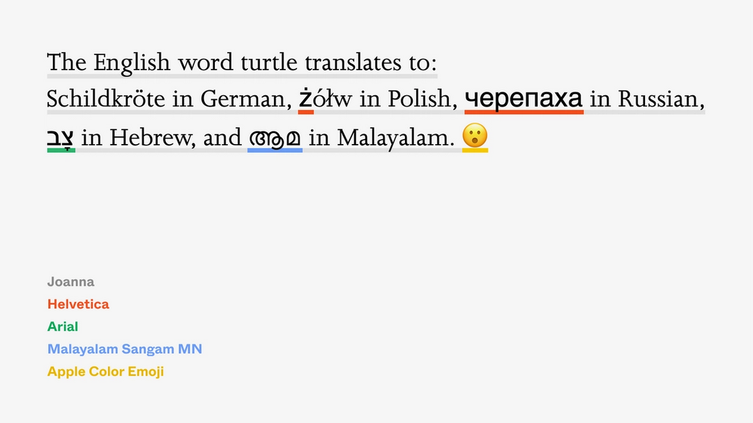
If I asked my browser to typeset a multilingual sentence using the above font fallback list, it would appear as:

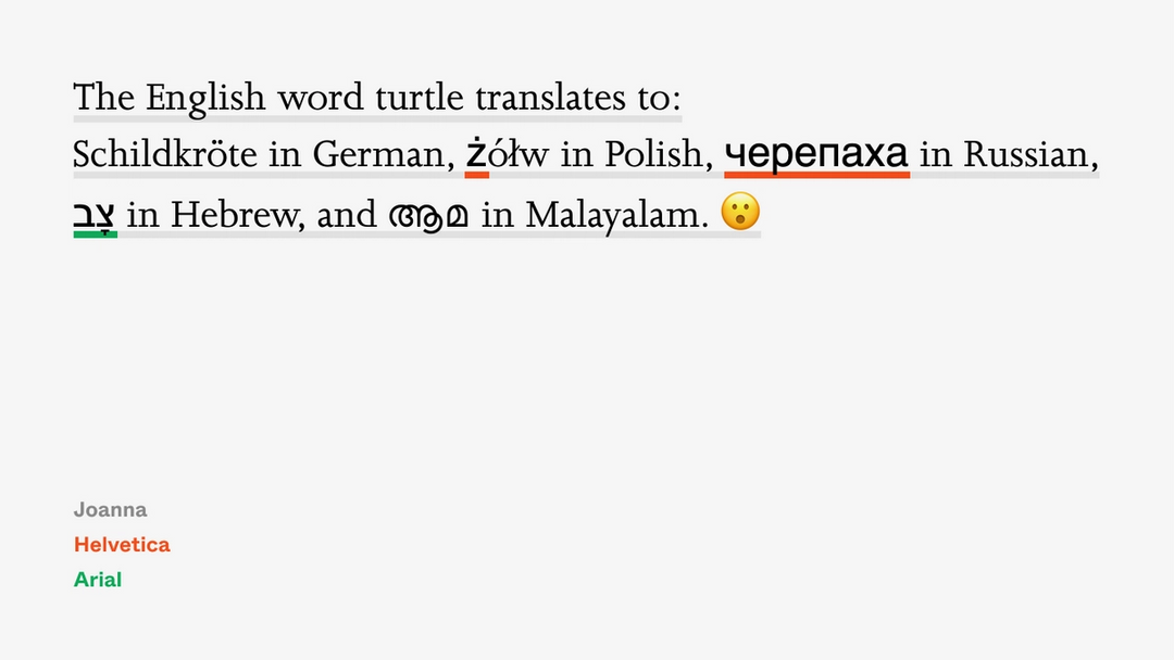
This is not a good-looking sentence, illustrating some of the challenges with limited control when fonts fall back. German got off scot-free, its few extra umlauted letters and booming economy ensuring its coverage even in smaller fonts. But Helvetica’s Russian and Arial’s Hebrew feel off—too big and too thick—and Polish fares even worse, falling back to Helvetica for only one out of four letters.
But then again, compared to an earlier example, this is at least a readable sentence. The boxes, often affectionately called “tofu” by font engineers (and something not safe to print by everyone else), are now nowhere to be seen.
If you happen to be in absolute control over text, you can still pick each individual character and delegate a specific font to serve it, making everything look flawless. But you don’t have to be. And, in the universe of the web, where text can come from anywhere and anywhen, you might not want to be.
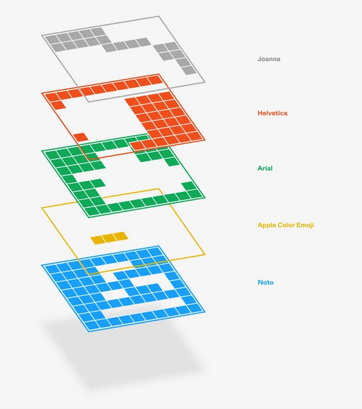
Carefully fine-tuning your font fallback list with fonts like Helvetica and Arial, or other popular fonts equipped with thousands of glyphs, is a great way not just to preserve style, but also to ensure coverage. It helps me sometimes to imagine fonts as templates—each ready to catch as many letters as it can, but each itself also coming with many holes. The font fallback chain allows the next font to catch letters left behind by the previous one, and so on:
But here’s that other surprise that you might have already spotted. None of the fonts I listed in my font fallback support the Malayalam language. None contain any emoji, either. So how come both of these still render as meaningful glyphs, rather than tofu?
It turns out that after you’re done with your font fallback list, your browser or operating system quietly adds over a dozen more fonts to help you out, including some fonts created expressly just for this purpose.
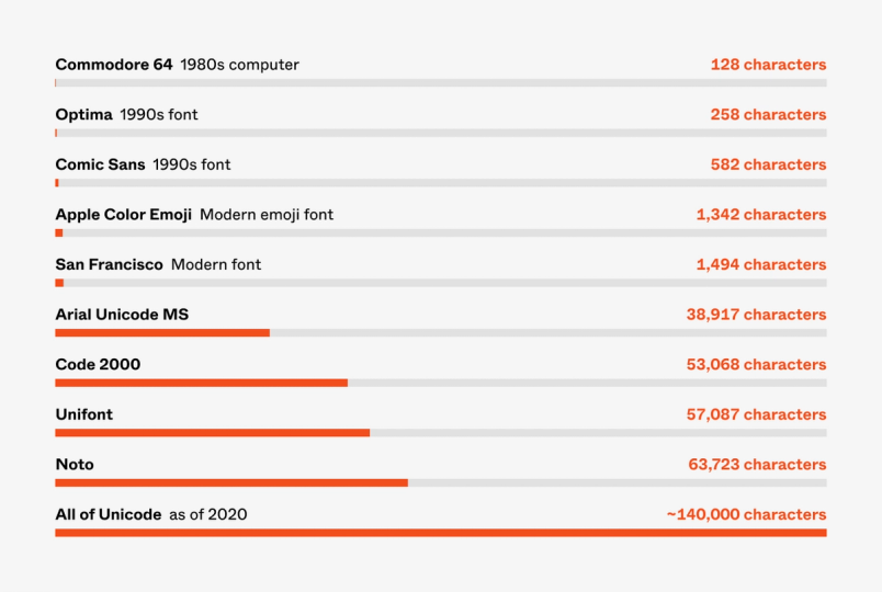
The vast of characters
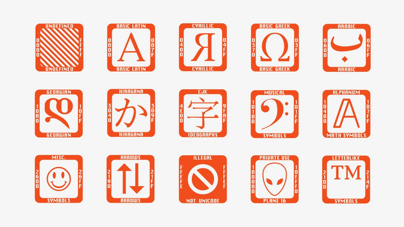
If Arial felt impressive at over 3,300 characters, just look at the scope of the entire Unicode. Today’s edition of the universally adopted standard that governs how to encode every character in digital communication has over 140,000 of them. Tomorrow’s will have even more.
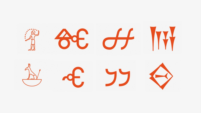
It’s an impressive number compared to early computers struggling with handling 63, 127, or—if you were lucky—255 characters. But it makes sense if you consider Unicode is meant to cover 150 different scripts (from the omnipresent Latin all the way to obscure scripts like Old Permic, a 14th-century adaptation of Cyrillic that fell out of use 400 years ago) and tens of thousands of symbols (among them hundreds of arrows, math symbols, domino tiles, alchemy, and Egyptian hieroglyphs right next to their modern reincarnation, the emoji).
For a font designer, the task of drawing 140,000 glyphs would be brutal, exhausting, insurmountable. And even if someone chose to do that, it would result in a font file so huge it might be impossible to load.
But if no font contains all the characters, then the alternative becomes harrowing for a web designer. Imagine putting together Wikipedia’s typesetting under these circumstances—being forced to find different fonts for different parts of Unicode, remember which one does what, update them occasionally, maintain the huge font fallback chain, and so on.
Your operating system and your browser do that so you don’t have to. They accomplish that by queuing up a phalanx of fonts, and asking those fonts to catch any characters not supported by your font fallback chain.
As an example, the four-font list on my Mac gets quietly extended to look more like this:
font-family: Joanna, Helvetica Now, Helvetica, Arial, Menlo, Monaco, .AppleSymbolsFB, LucidaGrande, CourierNewPSMT, GeezaPro, NotoNastaliqUrdu, Ayuthaya, Kailasa, PingFangSC, PingFangTC, HiraginoSans-W3, HiraginoSansGB-W3, PingFangHK, AppleSDGothicNeo, KohinoorBangla, KohinoorDevanagari, KohinoorGujarati, MuktaMahee, NotoSansKannada, KhmerSangamMN, LaoSangamMN, MalayalamSangamMN, NotoSansMyanmar, NotoSansZawgyi, NotoSansOriya, SinhalaSangamMN, TamilSangamMN, KohinoorTelugu, NotoSansArmenian, EuphemiaUCAS, STIXGeneral, Galvji, Kefa, .NotoSansUniversal, AppleColorEmoji, .LastResort;
And the situation is similar for Windows:
font-family: Joanna, Helvetica Now, Helvetica, Arial, Tahoma, Segoe UI, Segoe UI Historic, Segoe UI Symbol, Segoe UI Emoji, Cambria Math, Abyssinica SIL, DaunPehn, David, DokChampa, Ebrima, Estrangelo Edessa, Ethiopia Jiret, Gadugi, GF Zemen Unicode, Gulim, Han Nom A, Javanese Text, Lao UI, Leelawadee UI, Kartika, Khmer UI, Malgun Gothic, Mangal, Meiryo, Microsoft New Tai Lue, Microsoft YaHei, Mongolian Baiti, MoolBoran, MS PGothic, Myanmar Text, Nirmala UI, Nuosu SIL, Nyala, Phetsarath OT, Plantagenet, PMingLiU, Raavi, Saysettha OT, Shruti, Simsun, Sylfaen, Tunga, Visual Geez Unicode, Vrinda, WenQuanYi Zen Hei, Yu Gothic, Arial Unicode MS, Code2000;
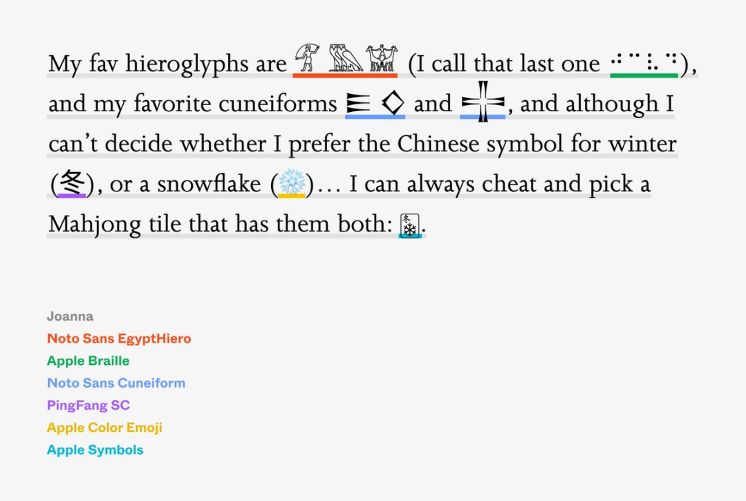
Many of these fonts are responsible for covering a specific locale—NotoSansMyanmar and Myanmar Text take care of Burmese alphabet, for example—while the others have more specific needs. Apple Symbols can help you take care of everything from Braille, through musical notation, to ancient symbols from Apple’s past:

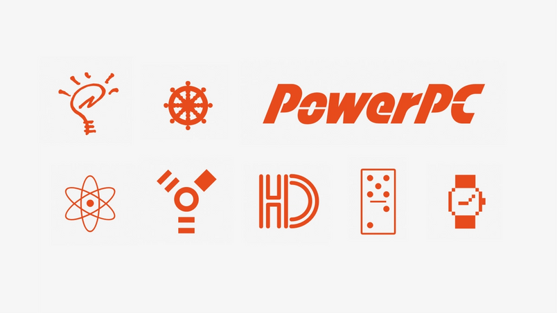
On the other side, Segoe UI Historic contains almost 5,000 glyphs of scripts that are truly ancient—cuneiforms, hieroglyphs, and handwriting like Parthian that disappeared long before the invention of paper:

There are also fonts responsible for taking care of all of the emoji—AppleColorEmoji for the Mac and Segoe UI Emoji on Windows—unique among other fonts because they come in color.
And even though I just said that creating a font to cover all Unicode would be exhausting and impossible, some type designers are brave enough to attempt just that. Somewhere on the above secret font fallback list, there are also monumental fonts, tens of thousands of glyphs and many megabytes each—fonts like Arial Unicode, Unifont, Code2000, or Noto (as in: “no tofu”)—designed to be the last necessary template, and to capture as many leftover characters as possible.

Those fonts are the last true fonts to be asked, the largest safety net at the bottom of font fallback:

I’ll admit that the above two lists are a bit of a simplification. Some fonts only appear for a given language, and other fallback fonts come in pairs linked together—so that, for example, a fallback for sans serif will also look like sans serif. In some circumstances some fonts even quietly impersonate others. (For example, in some Linux distributions, a font called Liberation Sans will pretend to be Arial and quietly take its place!)
But the main principle remains the same and besides that, we don’t have all day, and that hand you’re keeping up is probably hurting a lot by now.
Two font fallbacks, sitting in a render tree
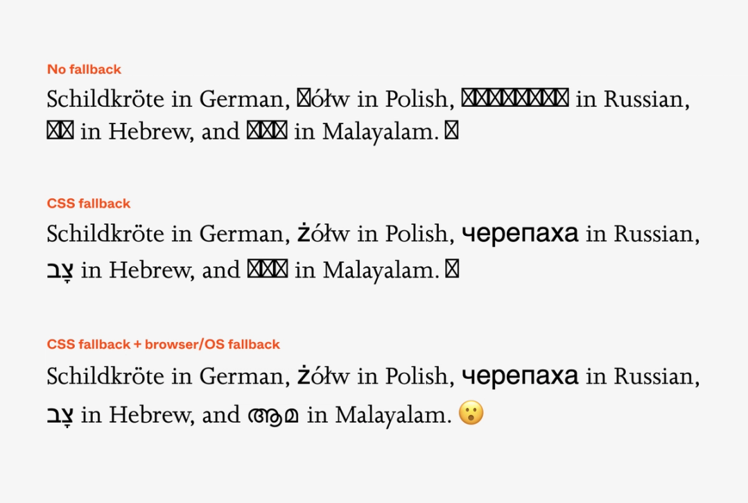
This finally explains what happened exactly the last time we asked the browser to typeset our sentence—two secret fonts stepped in to help, after all the ones we specified threw their hands up in the air:

In other words, we’ve left the land of tofu behind:

This twin font fallback is there for billions of simple everyday uses when only a few characters go missing, but nothing prevents you to typeset small wonders like this one; a sentence that spans millions of years and thousands of kilometers:

It’s not just that you can read this. You can also copy and paste it into your text editor, or onto a website with no CSS… and even if you don’t know anything about typography whatsoever, behind the scenes six very different fonts will be asked to help.
Of course, the seven fonts collaborating above are still fonts. They all have their backstories, their metrics might all feel different optically (remember that font size is more of an idea than a strict measure), and if one of them happens to be taller than the others, browsers will extend the line height of the whole line to accommodate it. This explains why including emoji in text sometimes pushes things apart—the emoji is not supported by the main font, so it falls back to a font like Apple Color Emoji, and that font has slightly taller vertical metrics than the one you’re using.
But those issues aside, it all works, and works surprisingly well. So well, as a matter of fact, that it made all of us really adventurous when handling text.
Hacks and homoglyphs
It is no surprise that within 140,000 characters, one can expect some visual repetition. Languages and scripts evolved over time in a messy way, converged and diverged without a master plan, borrowed from and disagreed with each other.
Even in English, people confuse O (oh) with 0 (zero). And then, part of Cyrillic looks exactly like Latin, and a part of Latin could pretend it’s Greek. You can spell your out-of-office message “ОΟO” in a creative way like I just did, where one letter is Latin, one Greek, and one Cyrillic—and often no one will know any better. The circle itself is such a universal shape there will be no surprise that it appears over and over again in Unicode: as ◯, and ○, and ◌, and 𝗢, and 𝐎, and 𝖮, and ⚪, and ⥁, and many, many more—and as you can imagine, there are more such simple shapes. Typography, as it often does, has a special name for this: glyphs that look alike are known as homoglyphs.
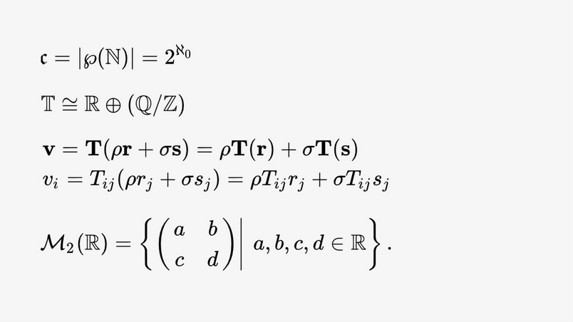
What’s more, Unicode also uses a bunch of styled Latin alphabets. Many come from mathematics where different forms of letters mean different uses: operator names, constants, angles, transforms, tensors. Their separate inclusion in Unicode made semantic sense—after all, mathematical variable 𝑎 is different than the vector 𝐚, and a set 𝔸 should not be confused with the matrix 𝑨. But the decision to include them came with a twist. Given all of these special alphabets, Unicode itself contains what feels like fonts.

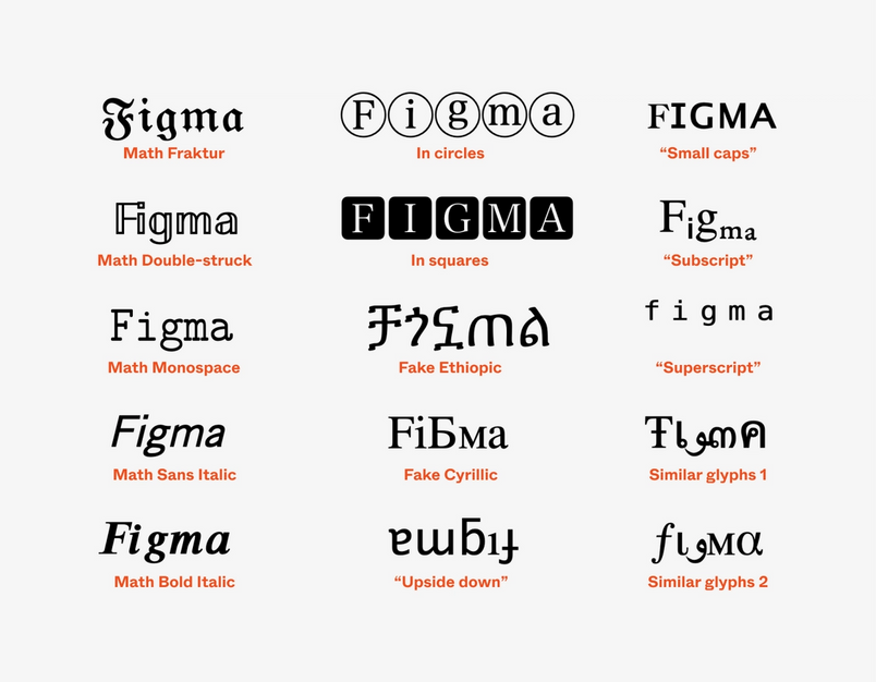
One of the blessings and curses of typography is that characters themselves are not allowed to have an opinion on how they should be used. And so, we’ve seen homoglyphs employed for nefarious reasons—and we’ve also seen them used creatively. Far away from mathematics, I can grab a few characters intended to represent mathematical sets and say “𝕄𝕒𝕣𝕔𝕚𝕟” just because it looks better than “Marcin.” Likewise, I can write “𝕸𝖆𝖗𝖈𝖎𝖓” without knowing anything about number theory, “ᴹᵃʳᶜⁱⁿ” without intending to attempt exponentiation, or go for the hat trick of “𝘔𝘢𝘳𝘤𝘪𝘯 𝙞𝙨 C⚪⚪L” just because I’m having a great day.
It’s really easy to do that, too. The fact that many letterforms look alike is used by websites like Unicode Text Converter that can quickly allow you to “style” your text by finding Unicode characters that look identical or close enough to the letters you want.

This is some creative visual typesetting, not far away from using the ancient letter ᴥ to create a bear nose in ʕ •ᴥ•ʔ, or a Japanese katakana ツ to form the famous shrug emoticon ¯\(ツ)/¯ .
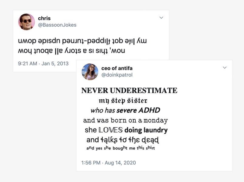
Those kinds of typographical hacks feel particularly useful in places like Twitter or Facebook that don’t actually allow you to change fonts, or even to apply bold or italic to the one typeface they give you:

But every hack comes with a price. No text you see on your computer is meant only for human eyes. A text that has been “restyled” looks similar, but its actual meaning might be very different. “𝕸𝖆𝖗𝖈𝖎𝖓” will often be impossible to find using search, will make the text impenetrable to people using screen readers (they will announce every letter as “mathematical letter M,” “mathematical letter a” and so on), and… yes, you knew we were heading towards this: it will also be subject to the vagaries of font fallback.
It’s not only that none of the popular fonts contain mathematical symbols or specialized alphabets. Some of the “styles” as seen above also jump between parts of Unicode, letter by letter. And so most of them will fall back to some fonts deep within the system, and since font fallback is so different on different platforms, there’s no way of knowing exactly how any of this will appear on the other side. Here’s an example:
As a typographer, I lament this—and as someone who cares about accessibility, I’d recommend not using any of the special “fonts” outside mathematics. But just like in the turtle or hieroglyph examples above, there’s also something beautiful in the concerted effort of five fonts coming together to show you a simple table-flipping emoticon—combined forces of a few box-drawing characters, two Indian characters, one ancient Latin letter, one Japanese character, and one Chinese parenthesis:

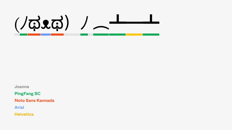
This also explains why if you are allowed to change the font, in situations like this it won’t make much difference. Since many of the characters will come from fallback fonts further down the invisible chain, only the few letters “on the surface” can be controlled:
Most people participating in typographical gymnastics like these won’t even know they are doing that, and that their constructions might look very different away from home. And on some of computers, particularly older ones with a less advanced font fallback, one of the odd characters will keep falling back until it can fall no more—and despite everyone’s best wishes, despite all the invisible safety nets, despite the group effort of typographers working on fonts like Arial Unicode and Noto, it will become the dreaded rectangle.
The last resort’s last resort
What happens when you ask for something that cannot be shown? For a character no font claims ownership of? For a glyph your phone has truly never seen before? After all that we’ve been through, there will be no surprise that the answer is: it depends.
When a character falls through all the templates and hits the ground, some platforms will choose to draw nothing at all. (Figma chooses this path. It also, by the way, falls back only to Noto fonts. It does so both regardless of the platform it’s being used on—it’s the same approach we take with line height We’re altering the way we handle text in Figma. Join me on the journey we took to get there — through type history and into the modern times.
Getting to the bottom of line height in Figma
But there are other approaches, too. A few places take fallback failures into their own hands, and away from fonts altogether. Firefox on mobile phones will draw a gray rectangle, and its laptop equivalent will draw a rectangle… with the Unicode code inside—great for nerds, and possibly stressful for anyone else:

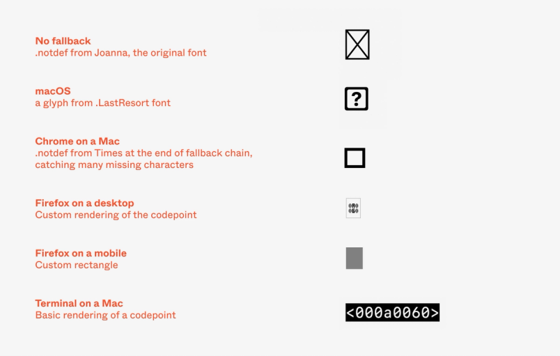
(Your browser, if you’re curious, will show this: .)
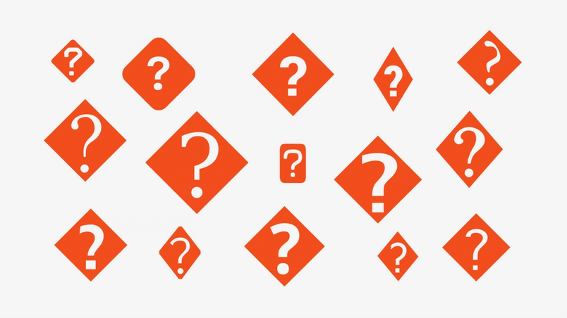
But there is a trick. As you might’ve noticed above, at the very end of the fallback chain, macOS adds a secret font with a beautiful name .LastResort. It’s a font with a very simple purpose: to fall with grace. Its mission is to draw a consistently good-looking nice square with a question mark, and to do so for each and every character you ask it to typeset.


It’s one missing character to rule them all, a nicely balanced question mark inside a rounded rectangle. It being last in the chain means it will be shown for every missing character, regardless of the font you wanted, ignoring its designer’s .notdef wishes.

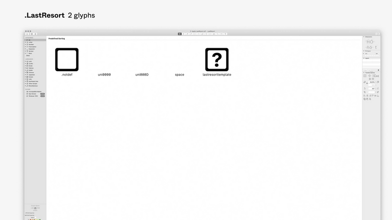
Making sure even the tofu looks consistent is a very Apple thing to do, but their way also shows us an opportunity. If you’re interested in controlling font fallback, there is at least one simple way: you can always put a catch-all font at the very end of a fallback chain. Such fonts are called, well, fallback fonts—and there a few of them in existence: Adobe NotDef (drawing consistent tofu), Adobe Blank (drawing nothing at all), and a prior version of Last Resort that actually tries to help you by showing you at least the area of Unicode your character comes from.

Fallback fonts are like the bus that picks up the slowest race runners when the street needs to be reopened for car traffic—at that point it’s less about finishing the race, and more about avoiding a disaster:

Character assassination
The universe of typography has its own disasters, too, and this brings us to one more character that you might recognize. It sports a boring name, Replacement Character, looks like this: �, and steps in when things go horribly wrong. It’s unrelated to font fallback, but we need to talk about it for completeness’s sake.
Replacement Character is used most often to tell you that something is wrong with the data, that the numbers themselves make no sense. If the numbers make no sense, there is no real reason to preserve them, so the � character is different than .notdef in that it has its own Unicode code: once you see it, you can copy and paste it at will.
Funnily enough, � follows the normal fallback rules itself, and even though it is not mandatory the way .notdef is, some font designers include it also. That means some fonts have two ways to tell you “I have no idea what to do with your request”: answering with .notdef if you’re asking for something they can’t deliver, and � if you’re asking in a way they can’t understand.
That also means that � might look slightly different under different circumstances, although the wild creativity unleashed at .notdef is nowhere to be seen here:

Emoji in bits and pieces
So there you have it. Multiple versions of .notdef, official and secret font fallbacks, .LastResort font with its manicured question mark, and another question mark that means something else altogether. But there’s one thing that will make this even weirder—the thing that arrived not so long ago and made typography more complex for everybody.
Sure, in some sense emoji are very simple. There are no different scripts, no different languages, no bold or italic. All emoji on your computer are usually served by one big font.
But emoji are unique in at least two ways. The first one? They change. A lot. Every year seems to deliver a hundred or so new emoji, and more than a few updates to existing ones. As I write this, the latest version, Emoji 13.0, has been announced early in 2020. It itself contained 117 new emoji. Emoji 13.1 is already shaping up with a few contenders such as “heart on fire” and “face in clouds,” and we already know that Emoji 14.0 will be announced in about a year. For typography, familiar with units of time such as millennia, emoji move at unprecedented speed.
Like every other glyph, emoji follow the rules of font fallback. As you’ve seen above, platforms secretly add an emoji font to the chain. And you could even imagine installing various emoji fonts on your computer, and doing it the traditional way, too:
font-family: NotoEmoji, AppleColorEmoji, JoyPixels;
The reason you don’t see that often in practice is that emoji fonts—being multicolored, and even sometimes bitmapped—are heavier than even Arial Unicode and Code 2000, and use strange new font formats. (Apple’s emoji font on my computer weighs more than 200 megabytes, as much space as a few thousand typical western fonts.)
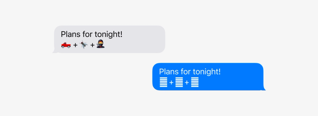
Even more importantly: the emoji font on your operating system is usually the one most up-to-date, so falling back to an older font wouldn’t make too much sense. But the breakneck pace of emoji means that even operating systems lag behind. Today, you could send me a text message with a ninja (🥷), a pickup truck (🛻), and a fly (🪰). Come to think of that, that would have been a very weird text message… but I could only judge it on my phone, since my computer cannot render those three 13.0 emoji yet.

If the emoji font in the fallback chain fails to catch the new emoji, it most often means none of the other fonts can handle it either, meaning the emoji renders as the question mark or tofu.
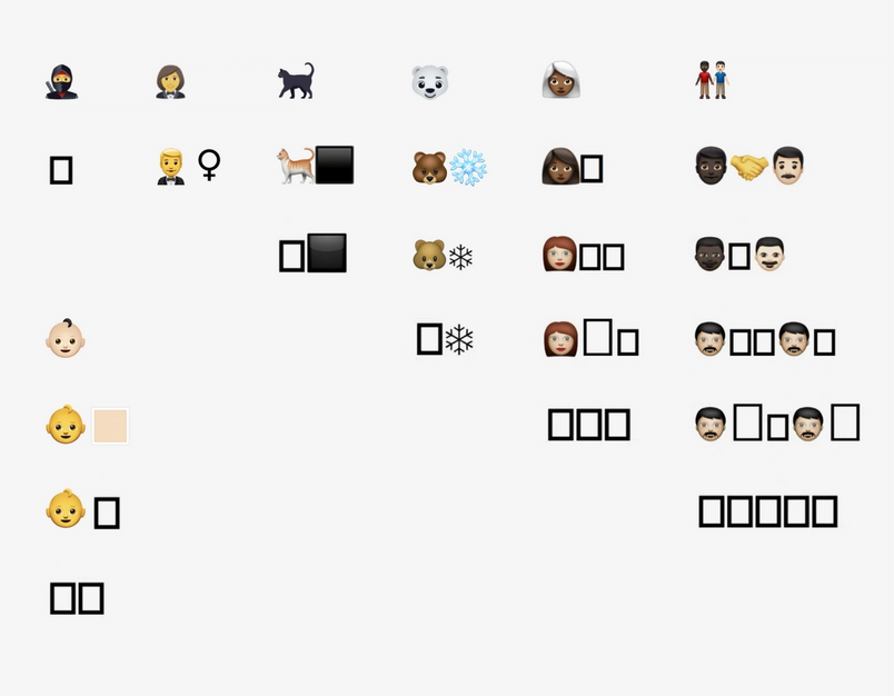
Except when it doesn’t. This is the other weird part about emoji: more and more of them are composites, arriving as a few separate characters glued together with invisible characters called zero-width joiners. The new black cat emoji? It’s a cat character glued with a black large square character. A polar bear? A bear plus a snowflake emoji. Woman in a tuxedo is a person in a tuxedo followed by a female gender modifier. (But don’t expect this to be consistent: A woman firefighter is a woman emoji + fire engine emoji.) And two men holding hands, one black and one caucasian? It’s five characters under the hood: a man, a dark skin tone character, handshake, another man, and light skin tone—and on top of that, two invisible joiners.
On a fresh computer up-to-date on all the necessary emoji glyphs and the recipes to assemble them, these emoji will look perfect. But for others? Instead of tofu, you might see the composite emoji’s individual parts, in a way that can useful to some (seeing a man in a tuxedo and a female symbol next to it makes it possible to imagine the meaning of the emoji), but confusing to others:

But even if helpful, it will still be—but of course!—inconsistent: any new non-composite emoji will fall back to a .notdef rectangle or a last resort question mark.
Per aspera ad astra
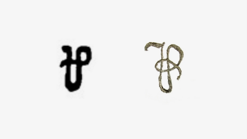
There is a historical symbol I really love. It’s a cousin of @—the “commercial at” symbol that found a new life with the internet—but it comes with a more tragic history.
The symbol I love, known as “per,” was once its exact counterpart: you could buy 5 apples @ 10 cents an apple, or pay 10 cents ⅌ apple. ⅌ was more generic and thus potentially more useful than its more specific siblings percent (%) and permille (‰). And, at least in my opinion, it felt more beautiful than the ampersand (&).
But where @ got lucky, ⅌ didn’t. At the end of the 19th century, only a handful of newfangled typewriters decided to support the symbol. Some people, frustrated with the situation, reached out for the pen:

But others stopped using the symbol altogether.
It’s hard today to know for sure whether the typewriters hastened ⅌’s demise, or whether the symbol was on its way out anyway. And yet, I admire people who held onto it and penciled it in, the same way I admire people who do other similar things today when fonts fail them, in effect instigating their own font fallback:

But the internet leaves no room for someone with a pencil. The text moves too fast and travels too far, and fonts change too often for the old rules of typesetting to remain in place.
But the internet leaves no room for someone with a pencil. The text moves too fast and travels too far, and fonts change too often for the old rules of typesetting to remain in place.
The invisible shield of font fallback is there to help in all these kinds of situations, although it comes with weird side effects—boxes of tofu, disassembled emoji, weird Twitter fonts, fonts shifting awkwardly, question marks in unexpected places. I hope those mysteries we started with feel less like mysteries right now (okay, lower your hand now, for the love of god).
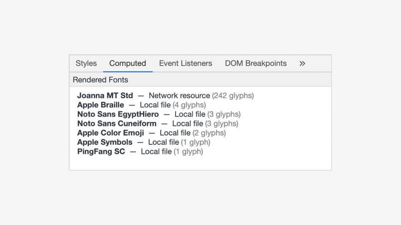
And you’ll have partners along the way, too. Even if you don’t see a character, you can always copy and paste it into a search engine. An excellent web tool called FontDrop! will allow you to drag and drop a font and see all of its glyphs (including .notdef). And among browsers, Chrome chose to offer a lending hand—if you inspect an element, you can see not only what fonts were asked to help in CSS, but what fonts exactly did all the hard work:

As always with font fallback, you can inspect the result on the receiving end. But when you’re sending it, what remains is mostly hope. And so when I write this, I have no idea whether the 🥷 emoji or the ⅌ symbol will arrive on your computer with all their 21st-century and 19th-century glory, or whether they’ll render as tofu, or one of three different question marks, or not show up at all.


Perhaps you will let me know. But at the very least I know that on my computer, only one of the hundreds of fonts I installed contains one glyph necessary for ⅌ to show up—and likewise, only one learned how to render a ninja. I don’t have to know which fonts those are. Everything just works. Similarly, I don’t have to know this for any of the 140,000 other characters my computer puts under my fingertips.
That this is at all possible, that there’s a battery of fonts ready to jump in and help me out, feels like a small miracle. And the fact that sometimes one might still see a tofu, a decorated question mark, or a dangling skin tone modifier? It’s just a small price to pay.
Let us know if Figma could do better in the font fallback department, or with fonts in general! Tweet at us @figma.
Thank you to Roel Nieskens, Stephen Nixon, Martin McClellan, and Jonathan Hoefler for reviewing an early version of this article.
Related articles