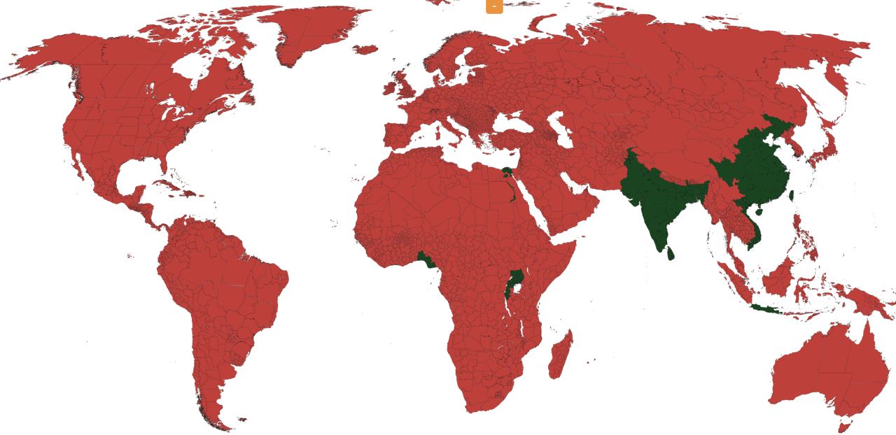
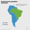
More people live in the green than the red.
(Source: reddit.com)
Related Posts


 cip-ciop-bitch liked this
  sierrachristina3 liked this
  mars-the-4th-planet liked this
  yaevinn liked this
  cpt-r liked this
  skinheadxcvi liked this
  tengoelsindromedepeterpan liked this
  ophiniaonistecua reblogged this from mapsontheweb
  quiet-observations reblogged this from egliserose
  castelnou reblogged this from mapsontheweb
  lokiqueer liked this
  jesstheespeon reblogged this from masterofpinwheels jesstheespeon liked this
  coruscantnights reblogged this from mapsontheweb
  ahmedgeohassan liked this
  a-lil-hex liked this
  hiccup-hare liked this
  onesmallblackpuppy liked this
  coloursoflovelustlife liked this
  egliserose liked this
  teamarum liked this
  tealaroo liked this