Misc
Mercator Misconceptions: Clever Map Shows the True Size of Countries

This Clever Map Shows the True Size of Countries
Maps are hugely important tools in our everyday life, whether it’s guiding our journeys from point A to B, or shaping our big picture perceptions about geopolitics and the environment.
For many people, the Earth as they know it is heavily informed by the Mercator projection—a tool used for nautical navigation that eventually became the world’s most widely recognized map.
Mercator’s Rise to the Top
With any map projection style, the big challenge lies in depicting a spherical object as a 2D graphic. There are various trade-offs with any map style, and those trade-offs can vary depending on how the map is meant to be used.
In 1569, the great cartographer, Gerardus Mercator, created a revolutionary new map based on a cylindrical projection. The new map was well-suited to nautical navigation since every line on the sphere is a constant course, or loxodrome.
Geographic Inflation
The vast majority of us aren’t using paper maps to chart our course across the ocean anymore, so critics of the Mercator projection argue that the continued use of this style of map gives users a warped sense of the true size of countries—particularly in the case of the African continent.
Mercator’s map inadvertently also pumps up the sizes of Europe and North America. Visually speaking, Canada and Russia appear to take up approximately 25% of the Earth’s surface, when in reality they occupy a mere 5%.
As the animated GIF below—created by Reddit user, neilrkaye – demonstrates, northern nations such as Canada and Russia have been artificially “pumped up” in the minds of many people around the world.
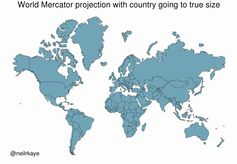
Greenland, which appears as a massive icy landmass in Mercator projection, shrinks way down. The continent of Africa takes a much more prominent position in this new, correctly-scaled map.
This visualization also highlights how distorted neighboring countries can look in Mercator projection. In the GIF above, Scandinavian countries no longer loom imposingly over their European neighbors, and Canada deflates to a size similar to the United States.
Despite inaccurate visual features—or perhaps because of them—the Mercator projection has achieved widespread adoption around the world. This includes in the classroom, where young minds are first learning about geography and forming opinions on the relationships between countries.
Getting Reacquainted with Globes
Google, whose map app is used by approximately 150 million people per month, took the bold step of using different projections for different purposes in 2018.
The Earth is depicted as a globe at further zoom levels, sidestepping map projection issues completely and displaying the world as it actually is: round. The result is a more accurate depiction of countries and landmasses.
With 3D Globe Mode on Google Maps desktop, Greenland's projection is no longer the size of Africa.
Just zoom all the way out at https://t.co/mIZTya01K3 😎🌍 pic.twitter.com/CIkkS7It8d
— Google Maps (@googlemaps) August 2, 2018
At closer zoom levels, users are typically using maps for things like navigation, which the Mercator projection was designed for. The exact angles of roads and borders are preserved in this projection.
In the Right Direction
In a more globally connected world, geographic literacy is more important than ever. As people become more accustomed to equal area maps and seeing the Earth in its spherical form, misconceptions about the size of continents may become a thing of the past.
This post was first published in 2018. We have since updated it, adding in new content for 2021.


VC+
VC+: Get Our Key Takeaways From the IMF’s World Economic Outlook
A sneak preview of the exclusive VC+ Special Dispatch—your shortcut to understanding IMF’s World Economic Outlook report.

Have you read IMF’s latest World Economic Outlook yet? At a daunting 202 pages, we don’t blame you if it’s still on your to-do list.
But don’t worry, you don’t need to read the whole April release, because we’ve already done the hard work for you.
To save you time and effort, the Visual Capitalist team has compiled a visual analysis of everything you need to know from the report—and our upcoming VC+ Special Dispatch will be available exclusively to VC+ members on Thursday, April 25th.
If you’re not already subscribed to VC+, make sure you sign up now to receive the full analysis of the IMF report, and more (we release similar deep dives every week).
For now, here’s what VC+ members can expect to receive.
Your Shortcut to Understanding IMF’s World Economic Outlook
With long and short-term growth prospects declining for many countries around the world, this Special Dispatch offers a visual analysis of the key figures and takeaways from the IMF’s report including:
- The global decline in economic growth forecasts
- Real GDP growth and inflation forecasts for major nations in 2024
- When interest rate cuts will happen and interest rate forecasts
- How debt-to-GDP ratios have changed since 2000
- And much more!

Get the Full Breakdown in the Next VC+ Special Dispatch
VC+ members will receive the full Special Dispatch on Thursday, April 25th.
Make sure you join VC+ now to receive exclusive charts and the full analysis of key takeaways from IMF’s World Economic Outlook.
Don’t miss out. Become a VC+ member today.
What You Get When You Become a VC+ Member
VC+ is Visual Capitalist’s premium subscription. As a member, you’ll get the following:
- Special Dispatches: Deep dive visual briefings on crucial reports and global trends
- Markets This Month: A snappy summary of the state of the markets and what to look out for
- The Trendline: Weekly curation of the best visualizations from across the globe
- Global Forecast Series: Our flagship annual report that covers everything you need to know related to the economy, markets, geopolitics, and the latest tech trends
- VC+ Archive: Hundreds of previously released VC+ briefings and reports that you’ve been missing out on, all in one dedicated hub
You can get all of the above, and more, by joining VC+ today.

-

 Travel1 week ago
Airline Incidents: How Do Boeing and Airbus Compare?
-

 Markets2 weeks ago
Visualizing America’s Shortage of Affordable Homes
-

 Green2 weeks ago
Ranked: Top Countries by Total Forest Loss Since 2001
-

 Money2 weeks ago
Where Does One U.S. Tax Dollar Go?
-

 Misc2 weeks ago
Almost Every EV Stock is Down After Q1 2024
-

 AI2 weeks ago
The Stock Performance of U.S. Chipmakers So Far in 2024
-

 Markets2 weeks ago
Charted: Big Four Market Share by S&P 500 Audits
-

 Real Estate2 weeks ago
Ranked: The Most Valuable Housing Markets in America