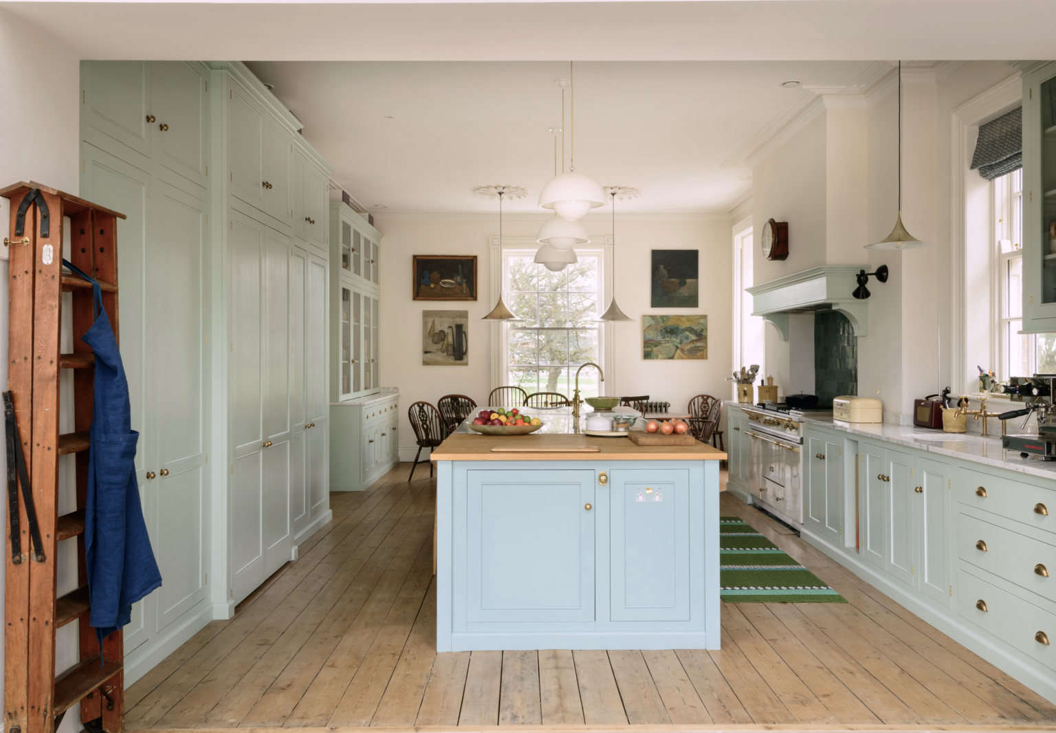
Back when Laura Jones and I shared an apartment on First Avenue and First Street in New York’s East Village, we had two tiny bedrooms off an open living space. The only time we ventured into its stove/sink/fridge corner triangle was to make coffee or grab a bowl of cereal or maybe steam broccoli. We vowed to be eternal roommates and never dreamed of learning to cook. If you had shown us photos of Laura’s current kitchen in Yorkshire, England, we would have been agog to put it mildly—and thrilled. Who wouldn’t be?
Since our days together, Laura moved home to Chicago, where she met her husband, Richard, a British businessman and fly fisherman with a closet full of bespoke suits (cost-effectively made in York from fabric and horn buttons he hunted down himself in Huddersfield and Bradford). Their daughter, Amelia, was born 13 years ago, and along the way they fully remodeled a house in Wicker Park, but the plan was always to move to the UK, Richard’s software company’s home base. In 2015, the family made the leap.
They bought a Regency house that had been converted into a nursing home and then a hotel. It required a total resurrection, something Laura and Richard discovered they loved obsessively doing together in Chicago. Oh, and I should mention that marriage and motherhood turned Laura, who is a writer and one of those all-around capable sorts, into an amazing cook. And so it made sense to create a center-of-the-action kitchen, and to design something fitting for the house, the setting, and the family (think timeless, expansive, exquisite, delightful, funny, and tall).
I’ve been hearing via email almost daily about all the highs and lows of the renovation—for more than two years, Laura and Richard project-managed and outfitted it all (Laura, for instance, purchased the house’s 125 lights and then created a master plan designating the exact location for each). I recently got to see the finished results firsthand. What had sounded gargantuan felt magical and just right in real life. Here’s the kitchen, along with lessons from Laura about creating your dream design in a foreign land. I wish I could move in.
Photography courtesy of deVol, unless noted.

1. Shop around—and gather ideas as you go.
The first time we viewed our house, we had a clear vision of the kitchen occupying what was then the hotel’s gloomy restaurant—with light streaming in through new windows on all sides. This was the fantasy that hooked us on the place. As soon as our architect, Chris Walker of Native Architects, handed us the first of what were to be many sets of floor plans, we went kitchen shopping. DeVol and Plain English had come onto my radar via Remodelista, and I was cautiously smitten. Though we were prepared to put a lion’s share of money and effort into the kitchen, we fully expected both companies to be too expensive to justify in a house more than 200 miles from the London real estate market. To the list of contenders we added a local company that we considered a more realistic option and predicted they’d be our choice.
We provided plans and paid visits to designers at all three, each time refining our thoughts and our budget. In the designs they proposed each gave us useful ideas that wiggled their way into the end result. It was an excellent exercise. As expected, Plain English was by far the most expensive. The surprise was that the local company actually came in slightly higher than deVol. We couldn’t imagine more beautiful or well-made furniture than we’d seen at deVol’s Cotes Mill headquarters during our initial session with our designer, Matt Fern. It was an easy decision.

2. Dare to think big and tall.
Once demolition began, it was a long time before anything would resemble a room again. The kitchen had never been a kitchen before, and we had nothing to go by for scale except the plans, measured in millimeters of all things. The ceilings were 3,353 millimeters high (11 feet), and we’re tall, so we saw no reason not to build up. The island was drawn to fill the outlines of the room. As our choices evolved—colors, lighting, tiles, stools, dining table—I Photoshopped everything into a scaled rendering. It all looked cozy on my laptop, but when the cabinets finally arrived, 18 months after our initial meeting with Matt, we were stunned by the size of them and felt we’d made a huge mistake. It was like an oversized showroom all out of proportion for real people. The last straw: as he helped carry in the island, one of our builder/comedians asked “where’s the stripper pole?” The original plan had been for a marble countertop, end to end, but I called Matt in a panic and asked for a late-game change: a section of oak at one end that I hoped would break it up visually and make it seem less like a runway.
It all really worked out: the room suits us perfectly and makes the most of the space. Admittedly, though, there are downsides: it’s a trek from the sink to the fridge on the other side of the island, especially when, like me, you almost always forget something. (But an under-counter fridge on the end of the island for essentials like milk, butter, wine and beer, saves a lot of walking.) Another thing: when I’m cleaning up, I can’t quite reach across the island to grab a plate on the opposite edge. There’s no advice here really except it is what is, and sometimes you just have to make it work. Even the dreamiest dream kitchen isn’t perfect.

3. Speak the local building lingo.
To communicate with our crew, I had to quickly become fluent in British English. An un-alphabetical, random glossary: A faucet is a tap. A sink is a basin. Counter: worktop. Stove: cooker. Carpenter: joiner. Painter: decorator. Punch list: snagging list. Large appliances: white goods (even if they’re not white). On a related note, some English people have delightfully English names. How about our garden designer, Lizzie Tulip? Yes, that’s the name she was born with.

4. Divvy up the details to obsess over.
One of the reasons Richard and I enjoy doing this sort of thing together is that we both have severely details-oriented personalities. We each also have our own fixations, which works well for dividing and conquering. We trust each other because we know the other person has considered every option on the planet.
Richard’s obsessions, to name a few, are: anything made of brass (must be unlacquered), old doors, wood floors, fireplaces, and windows (all but one original window was replaced—and several added—by a traditional joiner using rot resistant Accoya wood and double-glazed Slimlite glass, a system Richard exhaustively researched very early on). He’s the knobs and knockers man. He found every doorknob in the house, each slightly different, very old, and a treasure. One day I found him drilling holes in the ends of our brand-new kitchen island to rig up a Downton Abbey-style Georgian tight-wire, bell-pull system that rings in the basement and a push-button gadget that makes an awful noise in Amelia’s room in the attic. Meanwhile, I was the one who sourced every tile, every light, every bit of sanitary ware (another English-ism, meaning bathroom fixtures). I also happily took charge of swatches and switches and sockets and ceiling roses and cornices. I still have samples of just about every paint and wallpaper sold in England.

5. Meet your makers.
It can take a while to feel at home in a new country, but working on this house helped a lot. The project was stressful for all the usual reasons—took too long, cost too much, too many people asking “when will you be finished?”—but for me it was color therapy combined with occupational therapy, putting me in the nearly constant company of people who are extremely good at making things. I admired and enjoyed them, but I also worried about them, a lot. I’ve never heard as much domestic drama aired as I did when we had dozens of men working and drinking tea in and around our house daily.
On Saturday mornings when Amelia was in school (not her favorite feature of English life), Richard and I would pick up coffee and scones with the heft of cobblestones and drive to one workshop or another, most of them multigenerational family businesses. We went to Richmond in the Yorkshire Dales to see our windows and shutters being made; to a joinery outside York to check the progress on the bottom half of our staircase; to Northallerton to visit Ryedale Plasterers and the molds they’d made to reproduce our cornices; down country lanes not detected by Google Maps to see how the restoration of our fireplaces was going. We learned the lay of the land on these jaunts while also getting privileged glimpses of traditional trades and master craftsmanship.

6.Treat your kitchen as your design lab.
For amateurs navigating a big project, and choosing to act as our own interior designers, the kitchen was a good place to establish principles and parameters to be applied throughout. The quality of deVol’s construction made us realize it was important to us to use traditional methods in all the work we did. That said, we didn’t want to live in a house that was slavish to a period, and knew it would feel phony to try for something quintessentially English, whatever that is. So we went for lasting workmanship and then felt free to choose other things that simply make us happy. It was a gradual (perhaps eternal?) process. We started layering colors in the kitchen and then moved on to furnishings, lighting, and art, mixing new and vintage in varying styles and patinas. The only qualification: a kind of tingle that meant it was probably going to work.

7. Know where your cereal boxes go before signing off on the plans.
Just as we were about to approve the final design, after which no changes could be made, and write our last nonrefundable check, I looked at the plans and realized I hadn’t fully thought about our storage needs. For instance, on close examination none of the shelves in the pantry had enough height to fit our vast cereal collection. Why hadn’t I fretted over spice racks or knife blocks or whether the dog food bin would fit under the lowest pantry shelf? If deVol had given me a questionnaire about these things, I’d missed it. At that point our kitchen supplies were all in boxes, so I did a frantic mental walk-through of our Chicago cupboards and sent our designer a list which over the next couple of days I kept updating as things occurred to me. Lesson learned in the nick of time: with a kitchen this costly and permanent, no detail is too small or idiosyncratic.


8. Never lose your foreign accent.
The cliché about Americans is that we want everything big and ultra-convenient, and it definitely holds true for me (and Richard) to some extent. But I love it that scruffiness and imperfection are art forms here. It spares so much anxiety not having to worry about a scratch or a stain. This is a country where antiques dealers can be Instagram rock stars, and I can get behind that 100 percent. That said, when we were told we couldn’t have something, because it didn’t exist here—plinths for our washer and dryer; paintable wall plates for switches and sockets; small-duct air conditioning—we refused to believe it, in true American style, and went out and found them all ourselves. (They exist here!)
Tipping isn’t etched into the social contract in the UK like it is at home; instead it’s tea, coffee, and biscuits in abundance and with great frequency throughout the working day. I myself haven’t been able to give up tipping, and I just can’t remember to offer people tea and coffee at regular intervals. This is my public apology. Meanwhile, water boils so much faster here thanks to the 240v electrics, and I think that’s a wonderful thing. I’ll go put the kettle on for Margot now. I’m sure my eternal roomie will be home any minute.

Working on your own dream kitchen? Take a look at our Kitchen Resource Guide, including:
- How to Choose the Best Kitchen Cabinets and Hardware
- How to Choose the Best Kitchen Countertop
- How to Choose the Best Kitchen Sink and Faucet


Have a Question or Comment About This Post?
Join the conversation