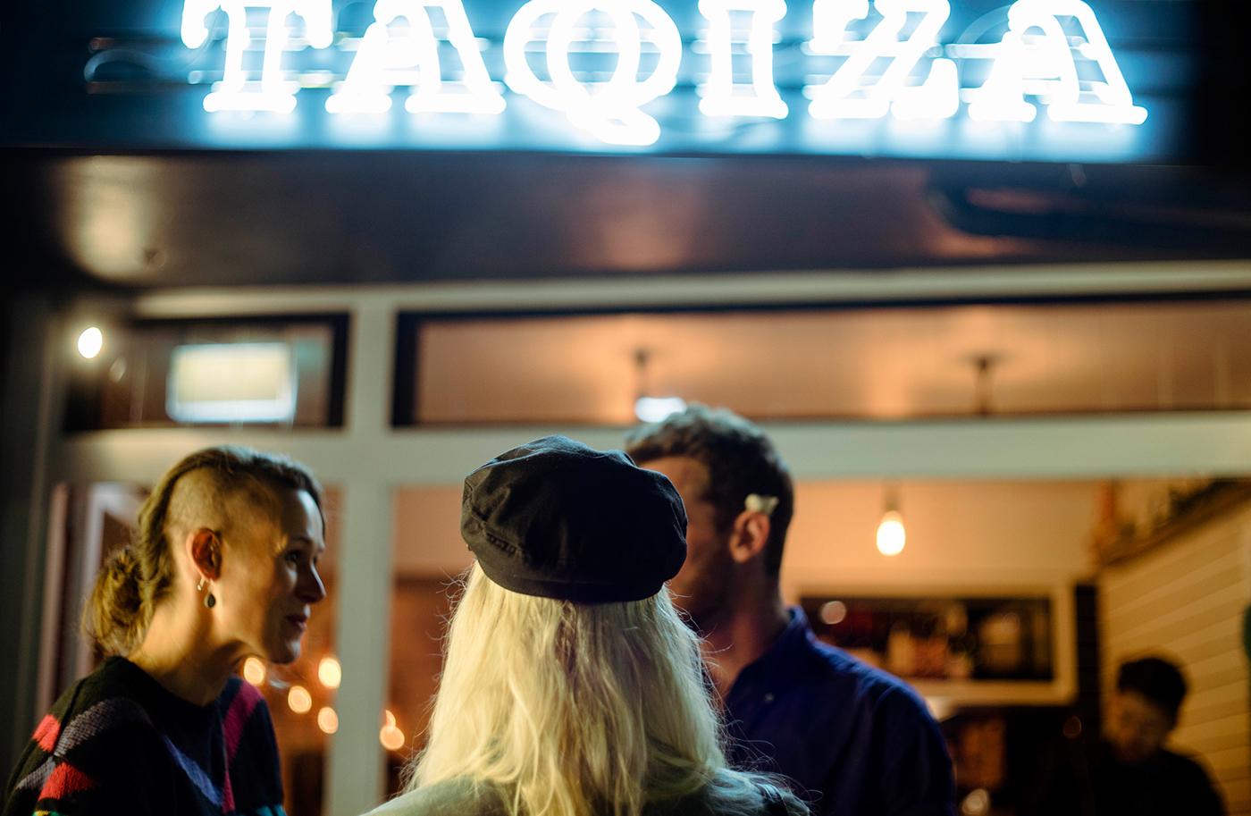
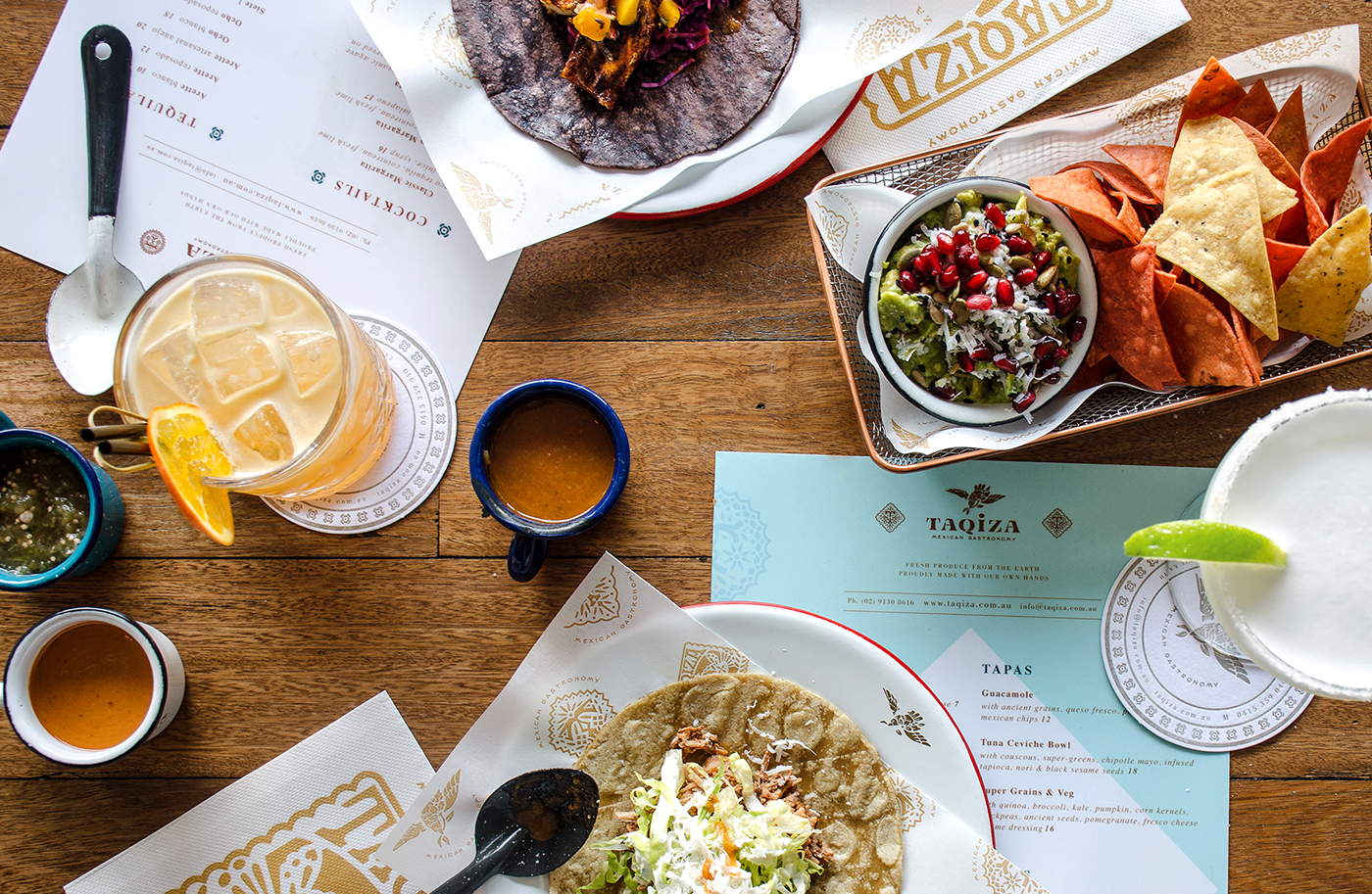
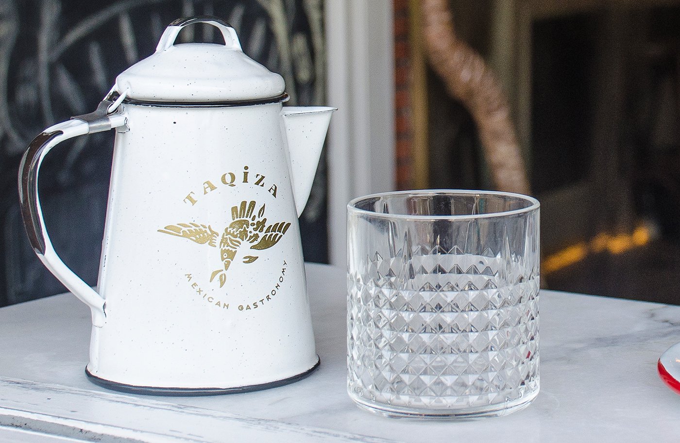
Taqiza is a mexican restaurant located in Bondi Beach in Sydney, Australia. His owner, and executive chef, Pablo Galindo commissioned me to bring to life the concept of what a Taquiza (with a 'u') is in México, a gather-together / laid-back party of made your-own tacos, but most important, a celebration around food. As a second layer of communication, I was asked to inject the exotic and premium paradise of Tulúm, México, in order to mirror the vibes and aesthetic of both locations. This immediately make the project more interested to me, has been the first time that a client wanted to talk about Mexico outside the category of vibrant and colorful graphic language. Finding, that Mexico can be portrayed in many premium and beautiful ways.


As inspiration, I took three bases:
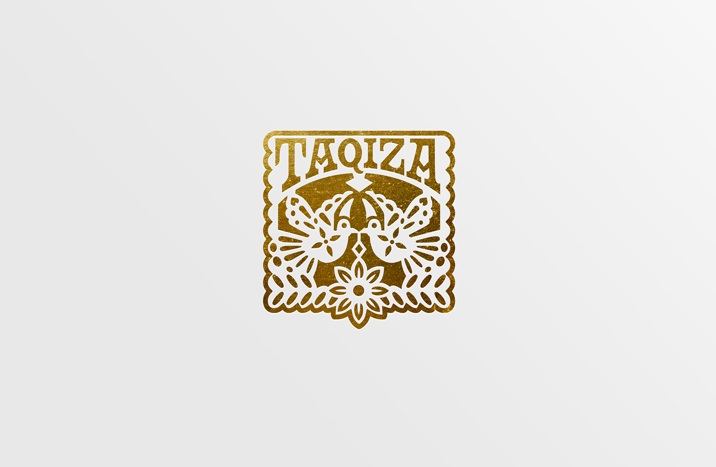
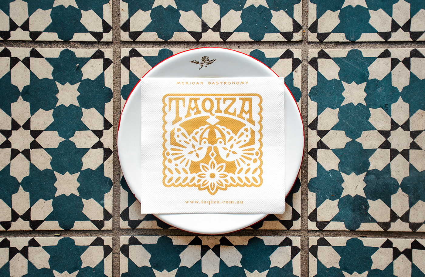
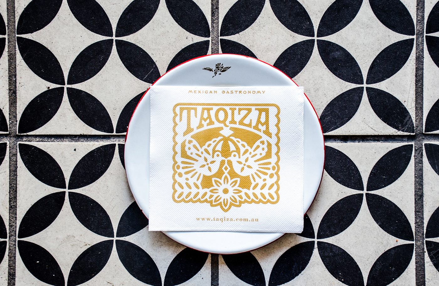
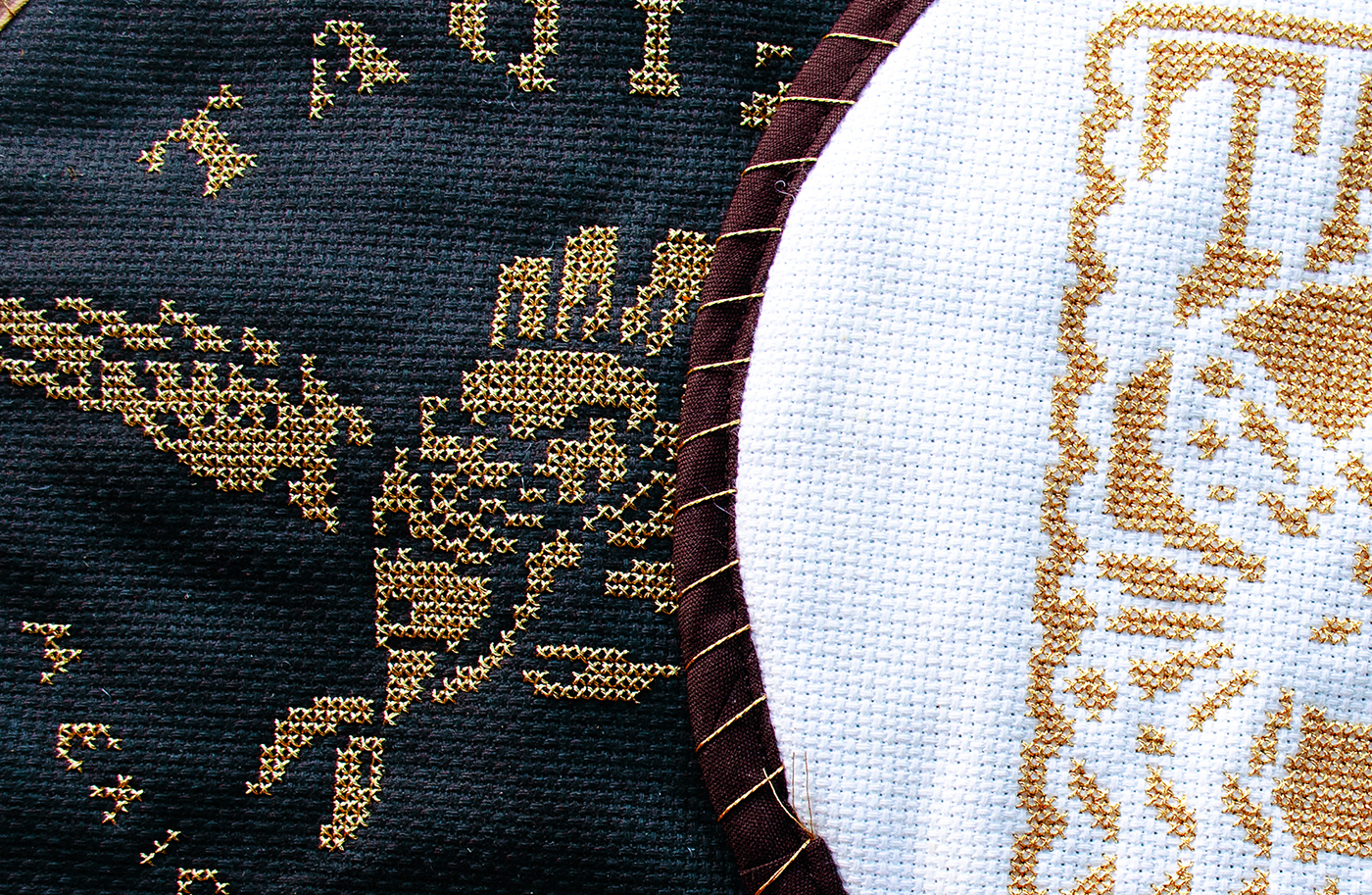
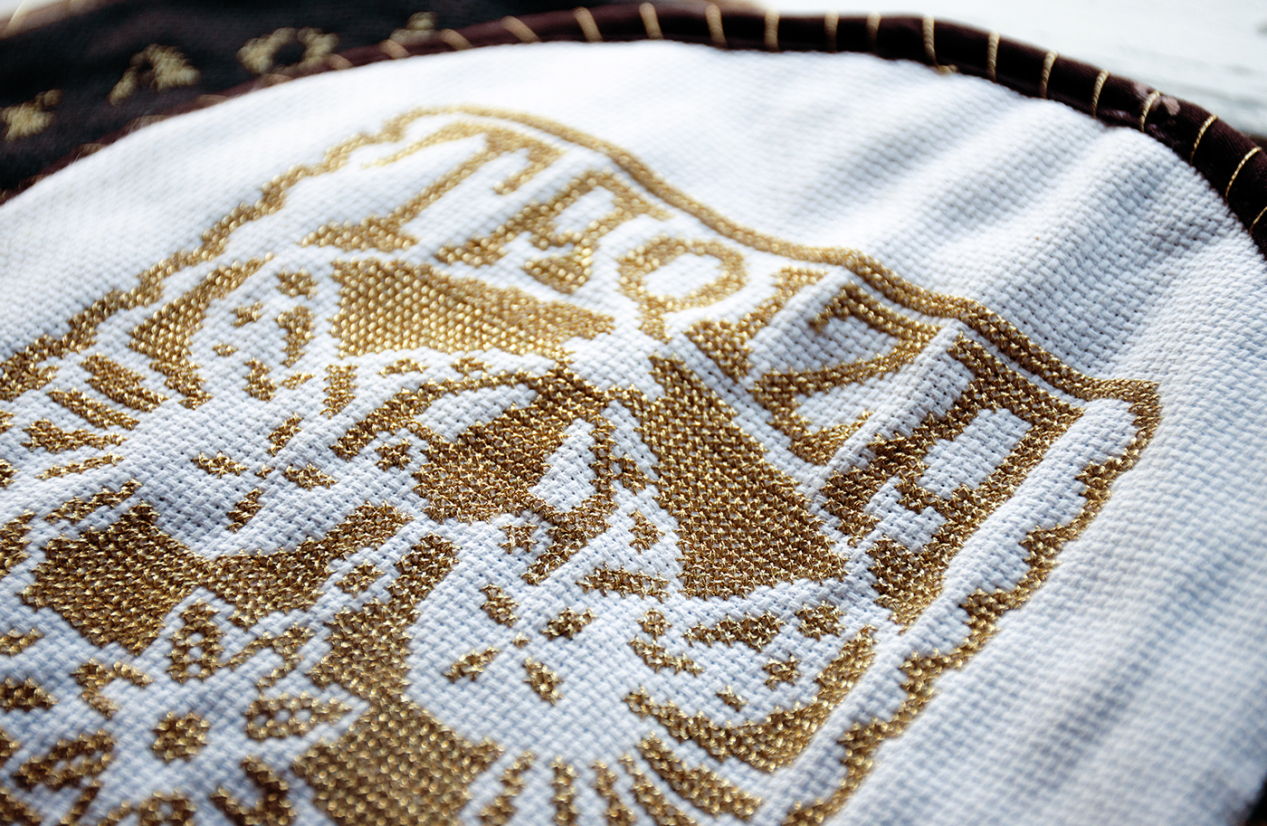
1. The craft and care that we as Mexicans put in cooking, is the same that we use in decor for our parties and dishes, and papel picado is the best example of dedication similar to cook.
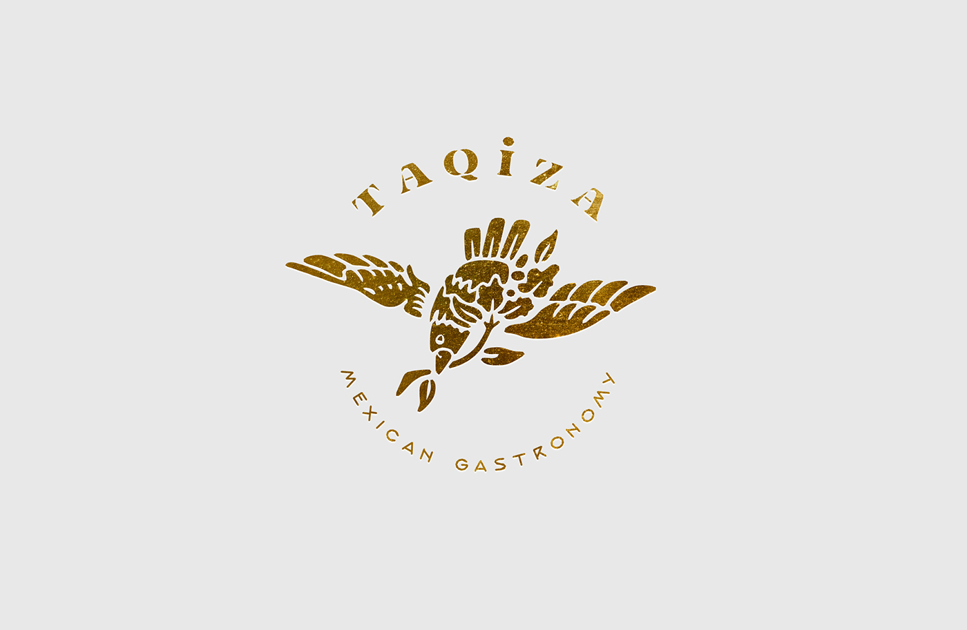
2. The mexican shield of an eagle eating an snake over a cactus, I think is the ultimate form of heritage we have in México, and I wanted to make a playful adaptation to express that heritage.
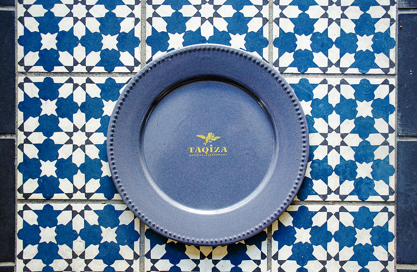
3. Tulúm, beautiful destination in the Mexican Caribbean, where relaxation meets high-end, and the colors scheme is golden sand, turquoise water, blue skies, and green palms.
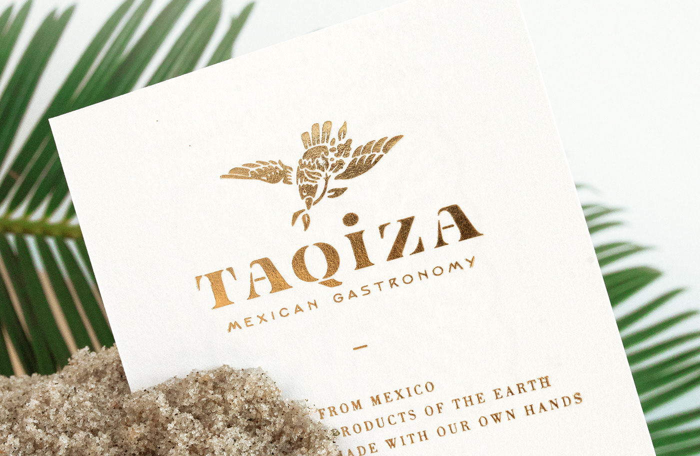
The result is a logotype inspired by cut-outs, stencils and papel picado, and 4 capital T's to express the mix-match of what a Taquiza is.
* The name has been adapted from it's original root for a better english pronunciation.


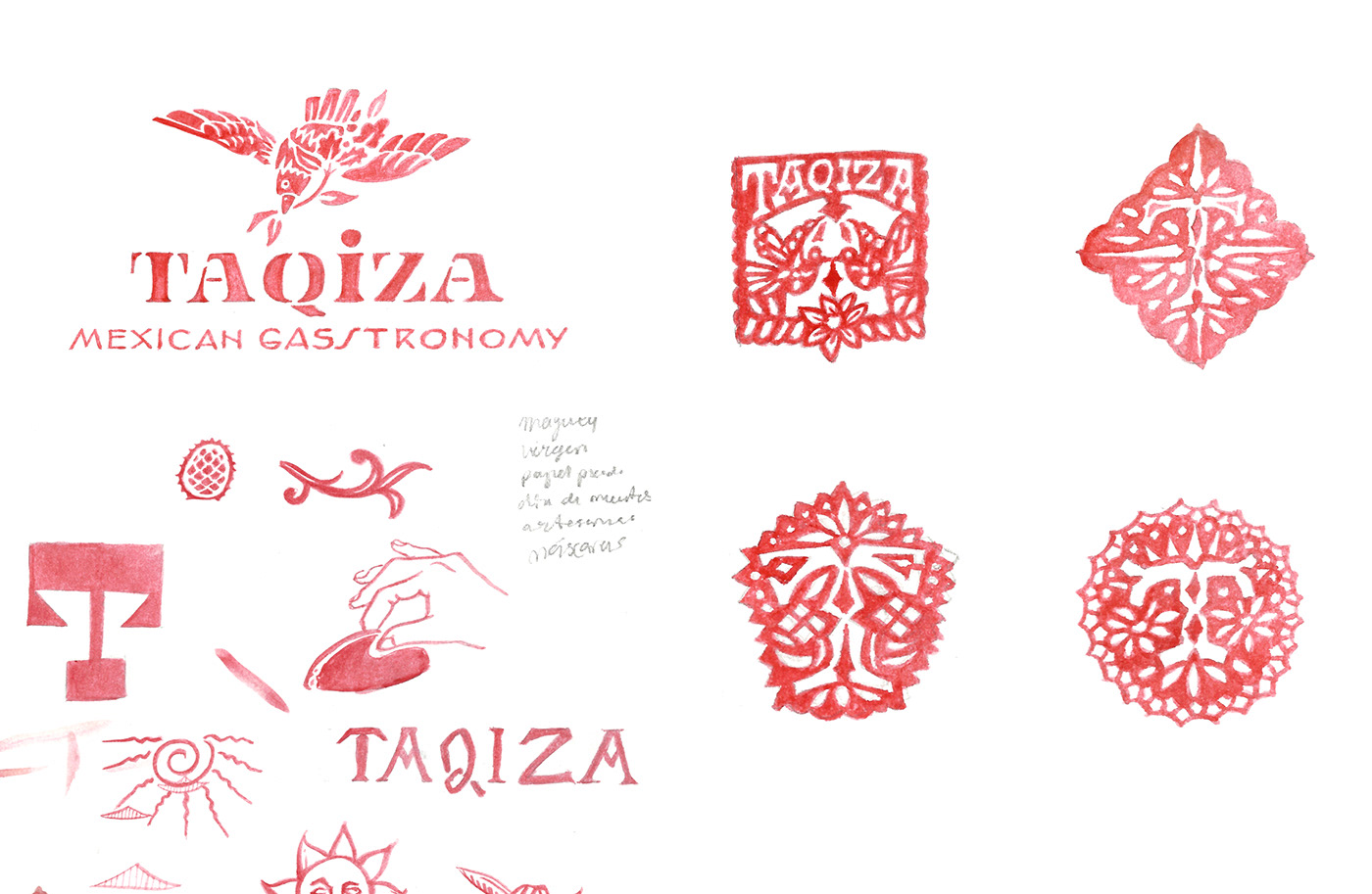
Sketches