Apple’s App Store is getting one of the biggest upgrades since its launch nine years ago, the company announced today at its Worldwide Developer Conference. The upgraded storefront will little resemble its earlier counterpart thanks to a new user interface and redesign whose aim is to help users better discover new applications and learn about how they’re used, while offering developers a better way to feature their content and tell their stories.
The change has been a long time coming for the App Store, which has been much maligned by developers who claim the existing interface makes it too hard for them to reach new users.
The updated storefront could change that in a number of ways.
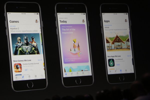
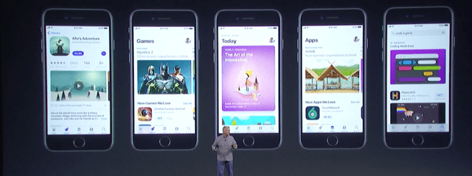
The new store is divided into five key areas. “Search” and “Updates” tabs are still present, but the other three bottom navigation buttons will take you to entirely new experiences.
The App Store’s new homepage, so to speak, is a tab called “Today,” which is meant to help users find out what’s happening right now. The hope is that the continually updated content will give the store a more real-time feel that deserves repeated daily launches — more like visiting your favorite news site for recent updates, for example.
Though Apple said that today’s App Store has 500 million weekly visitors, and it often features fresh content, it still “feels” more like a static storefront.
Users have downloaded more than 180 billion apps to date, noted App Store head Phil Schiller, and developers have made $70 billion from those apps to date, he added.
That said, Apple may not have been living up to one of its goals with the store — to make it a “great opportunity for all developers.”
“We continue to work really hard at that,” Schiller said.
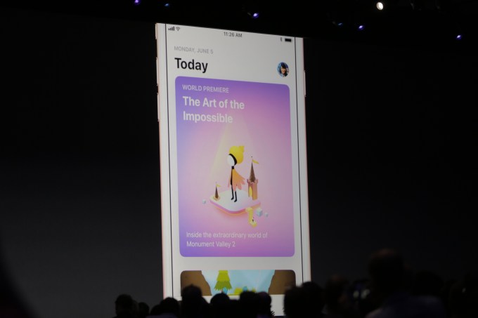
The Today tab, which is a new way to discover apps, is Apple’s big first step toward making the App Store feel more alive.
Apple says the content in the Today section will now be updated every day, and will feature new releases in a more in-depth fashion. Instead of just rounding up a list of apps editors like, the new App Store will use large, colorful imagery, video content and “stories” to help introduce new and updated apps and games to end users.
“If you remember back to the first time you started downloading apps…and it was so much fun to go in every single day and discover new apps that were appearing? That’s an amazing feeling…and we’re bringing that back again,” explained Schiller.
Each day, there will be an App of the Day and Game of the Day listed on this page, to encourage repeat visits to the store.
The Today tab also will feature notable new releases.
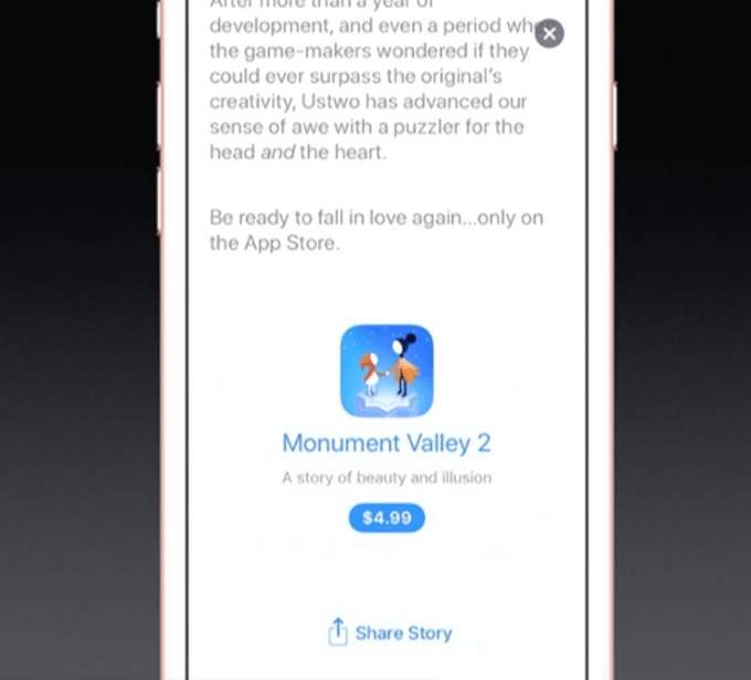
For example, Apple showed off how the “world premiere” of the sequel to the popular Monument Valley game would appear on the new store. The game gets a featured spot at the top of the vertically scrollable Today tab, and you could tap on the image to go to a page that takes you “inside” the new game, allowing you to learn more.
This includes reading about the game in a more editorial format — you’ll even see things like key quotes broken out as larger text to make them pop. You also can scroll through more photos and multiple videos in a new carousel that you move through horizontally, so you can really get a sense of game play.
A new social sharing button will aid those developers who snag this sort of featured listing on the App Store. With a tap, users can share the app’s “story” with their friends from this same page.
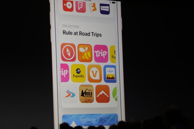
The Today tab also will feature Apple’s editorial content, like those curated collections available in the current App Store. These will update regularly, and will be focused on a theme or a goal. For example, the collection mentioned in the demo was a round-up of meditation apps.
But Today won’t only feature an improved format for Apple’s own “listicles,” there also will be expanded editorial content like “How To” guides on using apps. These new articles will teach you tips and tricks for apps you might be considering, or could serve as ways to learn more about those you already have installed on your devices.
In the latter case, that could prompt users to re-launch apps they may have abandoned, as they may learn the app can do something they didn’t know about before.
The photo app VSCO was demonstrated here, with a list of tips that included one on how to use VSCO for GIFs.
These editorial stories, tips and tricks and lists also will be surfaced in the App Store’s upgraded search, the company says.
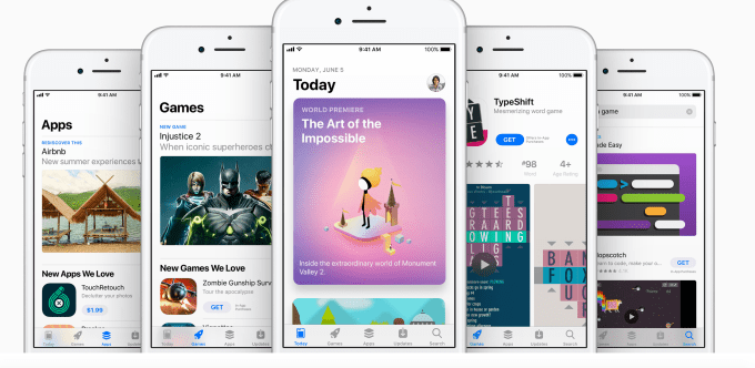
The new App Store also will now break apart Apps and Games, giving them each their own tab accessible by the navigation buttons at the bottom of the screen.
There are number of advantages to doing this. For starters, it lets Apple separate out Games and Apps’ Top Charts, giving more apps and games exposure — especially those that would have otherwise been more lowly ranked due to having to compete with those apps that forever sit at the top of the charts — like Facebook or Pokémon GO, for instance.
But it also gives both app and game developers new ways to market their work to consumers. The Games page, for example, will now feature in-app purchases listed alongside apps, allowing developers to highlight their upgrades, such as their newly released characters or levels.
The system (or lack thereof) for app upgrades is something many developers have had issues with. Some have felt when they put so much work into expanding their app or game, they should be able to release that upgrade with a big price tag. Today, many just launch a “version 2” of their app instead, and then try to resell it anew. Apple hasn’t gone so far as to formalize upgrades, but it has made selling app and game add-ons something that can be marketed separately from the apps and games themselves. That may help quell some developers’ concerns with the upgrade process.
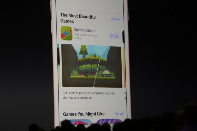
The new App Store may feel a bit more personalized because of this separation of Apps and Games, too. If users are largely interested only in finding new games, they can turn to the Games tab to see what editors are playing this week, scroll down the page to watch game videos, browse by category and more — all within easy reach, and without having to read about new (non-game) apps.
The games’ individual app pages have been improved, too. There are now more videos (triple the number, says Apple), big badges that indicate if they earned an accolade like “Editor’s Choice,” and they better highlight user ratings, reviews and developers’ responses to users.
If the game is on the Top Charts, this too will be shown right on its app page so you get a sense of its current popularity.
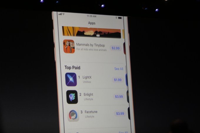
Similarly, the new Apps section features the same design, including its own Top Charts, but one is just focused on the non-game apps.
There are a slew of under-the-hood features arriving in the new store, too, but Apple just teased these briefly on a single slide. But a quick peek at that slide shows the features Apple thought to highlight, like support for more TestFlight users, auto-renewal with Apple Pay, receipt enhancements, new design resources and more.
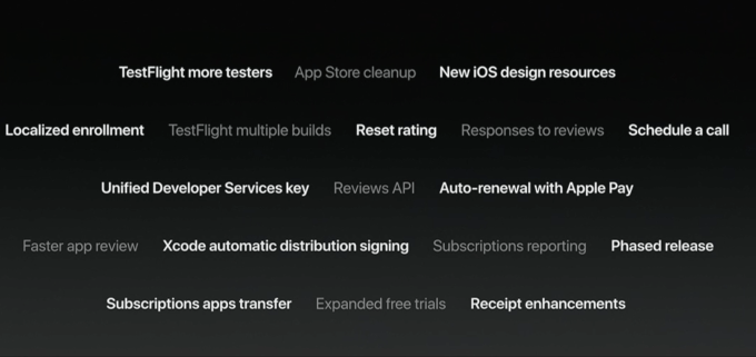
One of the more critical items — and one of the only from this section to get a shout-out — is the introduction of phased releases. Already available on Google Play, this will allow developers to more slowly roll out new apps and updates to new users by making them available to smaller groups initially in order to help keep the rollout stabilized and prevent overloading their servers.
The App Store has had quite an overhaul, even before today, under Schiller’s lead. He also introduced App Store search ads, support for subscription-based apps where the split with Apple drops from 70/30 to 85/15 in year two and faster app review times.
Apps are reviewed in less than 24 hours now, Schiller noted onstage. And many are approved in just one to two hours, he said.
The upgraded App Store arrives with the launch of iOS 11, expected later this fall for the general public. It’s available to iOS developers today.
[gallery ids="1499870,1499865,1499766,1499868,1499867,1499866,1499765,1499757,1499758,1499760,1499763,1499764"]