“Colour is a creative element, not a trimming.” – Piet Zwart
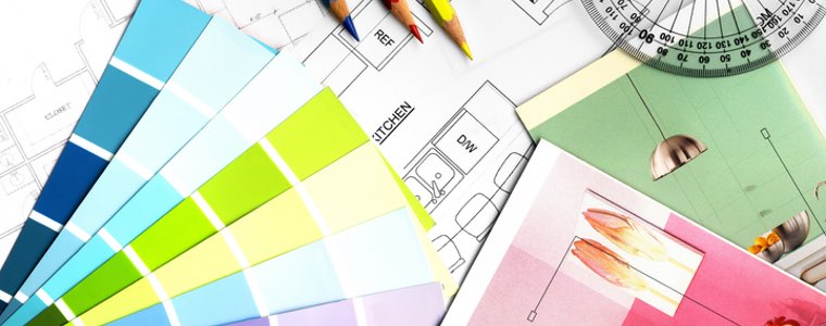
Pick a colour but not just any colour for your marketing. Colours definitely play an important conscious and unconscious role in purchasing decisions. Certain colours have a huge psychological impact on people’s behavior, emotions and buying choices. Designers and marketers know the importance that colours have and they also know it can influence what we support, what we are attracted to and what we choose to buy.
This colour diversity goes beyond blue, red, orange, purple or yellow. Believe it or not, humans can see about 10 million different colours. It is said women seem to prefer soft colours and men prefer brighter choices. We definitely have our preferences and we definitely associate certain colours with certain feelings, experiences and childhood memories.
If you are curious what colours to choose for your marketing, this guide can help:
Red
“When in doubt, wear red.” – Bill Blass
Red is associated with excitement, power, wealth and is youthful, fiery and bold. This hot colour creates a sense of urgency, which is good for retail and Casinos. Red has been known to encourage the appetite so it is a popular colour for fast-food restaurants. The colour red has been known to physically stimulate the body, raising blood pressure and heart rate and is associated with fast movement, excitement and passion. Companies that use red are Coca-Cola, Lego, Nintendo, and Netflix.
Blue
“I never get tired of the blue sky.” – Vincent Van Gogh
Blue denotes trust and strength and dependability. It is the preferred colour of most men. The casual colour blue is associated with jeans, peace, water, tranquility, and reliability. Blue can create a sense of security and has been known to curb the appetite while stimulating productivity. Blue is the most common colour used by companies looking to promote trust in their products. Companies that use blue are Twitter, Facebook, Walmart, and WordPress.
Yellow
“How wonderful yellow is. It stands for the sun.” –Vincent Van Gogh
Yellow screams optimism and is seen as warm mixed with clarity. Yellow is associated with the sun and the summer. Companies that use the colour yellow are Subway, Nikon, Best Buy, and National Geographic.
Green
“Green is the prime color of the world, and that which it’s loveliness arises.” –Pedro Calderon de la Barca
Green is associated with the earth so it is seen as peaceful, healthy and promoting growth. The colour green is linked to health, tranquility, power and nature. Many brands use green to give a sense of relaxation and it is frequently associated with recycling and environmental issues. Green stimulates harmony in your brain and encourages a balance leading to decisiveness. Companies that use the colour green are Starbucks, Landrover, Animal Planet and Tropicana.
Orange
“Orange is the happiest color.” – Frank Sinatra
Orange is friendly, cheerful and confident. Orange can trigger a sense of caution. However, it is also a playful colour as well. It is used to create a sense of anxiety that can draw in impulsive buyers and window shoppers. Companies that use orange are Payless, Blogger, Crush, and Nickelodeon.
Purple
“Purple does something strange to me.” – Charles Bukowski
Purple is seen as creative, wise and imaginative. It is commonly associated with royalty, wisdom, and respect. The colour purple stimulates problem-solving as well as creativity and is frequently used to promote beauty and anti-aging products. Companies that use purple are Yahoo, Welches, Hallmark, and Cadbury.
Gray
“The color of truth is grey”– Andre Gide
The colour gray comes off as balanced, neutral and calm. It symbolizes feelings of practicality, old age, and solidarity but too much gray can lead to feelings of nothingness and depression. Companies that use gray are Wikipedia, Apple, Mercedes, and Honda.
“The purest and most thoughtful minds are those which love color the most.” – John Ruskin