Logo designs are everywhere.
I look around me now, and I can easily count up at least 10 different logos without much effort… they are scattered around us everywhere we go, are embedded in our culture and way of life. They influence our decisions, communicate and represent a company’s values, and are often full of meaning…
But really… what is the purpose of a logo, and why do they matter? This is something graphic designers and business owners really need to understand before working on their brand identity.
Lets discuss…
What’s the purpose of a logo?
The primary role of a logo is to identify… Remember this, as it trumps all other advice you’ll ever hear. Identification is what really matters. That’s it.
Trends come and go, design tools and techniques will evolve, what we perceive a logo to be may even drastically change with time, but for all eternity the single most important goal of a logo will always remain this – to identify the person, product, business or service you’re designing it for.
![]()
This means, as a designer (or business owner), before working on any ideas you need to fully understand the environment in which the logo will be seen. Who are the brands competitors and how do they look? What colours and symbols are already owned by established competition? How can we differentiate the logo so the business stands out from the crowd?
Logo design is a strategic tool – it’s not art.
Logo design is not art – too many people mistake them for art since logos are a visual object.
Our role as designers is not to design a thing of beauty… and not to design something we or the client personally likes the look of, but instead logo design needs to be treated as a strategic business tool that will allow a company to be identified in the vast world we live in. Of course, a logo can still look good, but that should be a secondary factor when designing a logo. Identification comes first.
A logo design doesn’t need hidden meanings
Designers (including myself) often aim to fill a logo full of meaning from the outset, however, this isn’t needed – the focus should be on identification. Any meaning or association will come with time through interaction with the logo.
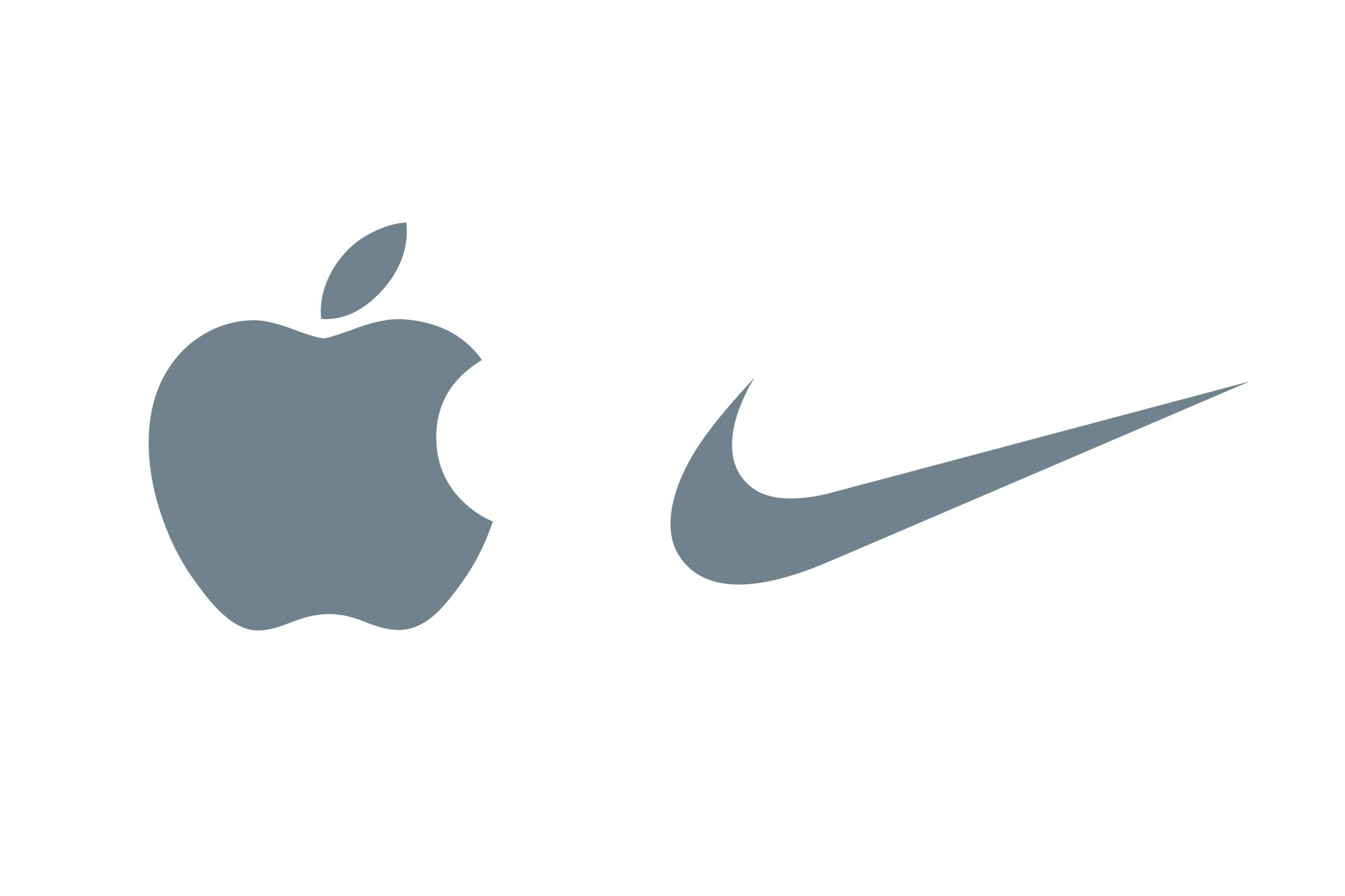
A new logo is an empty vessel (wisdom gained from designer Michael-Bierut), and from day one it has no meaning to onlookers, even if it was added intentionally. With time meaning will be added through ongoing marketing, and the interactions customers have with the company’s brand. To really understand what I mean by this, take a look at the tick and apple illustrations below, and try not to imagine more than just well-designed icons… it’s impossible.
Ok, so now we got that out the way, let’s look at why logos matter…
Why do logos matter to the world?
They are the face of a business, product or service
When you picture a business in your mind, you often immediately picture the logo, be it the golden arches of a famous fast food company, or the apple with the bite out of it representing one of my favourite technology brands.
Likewise, when you see a logo you’re familiar with, as you did with the Nike and Apple logos above, you’ll immediately associate it with your memories, experiences, and interactions with the brand.
Establish Instant Brand Recognition
A well-designed logo will be memorable, helping customers to remember the brand.
Shapes and colours are easier for the human brain to process and memorise than words are. This means that if the identity is unique in the marketplace it’s easy to find and identify the company once again to purchase its services, and to recommend to friends.
Logo design influences our decisions
From our very first day we build up a visual library in our mind and begin to associate fonts, shapes and colours with specific emotions and objects.
By simply looking at a logo, like it or not we will immediately make judgements, and perceive a business, product or service in a certain way.
If we think a company looks too expensive, too corporate, too fun, or too radical we will avoid it. Likewise, if the logo (and the associated brand identity) looks like the type of company, products or service we’re looking for, and wish to be associated with, we will actively engage with the company and buy its products and services.
This is why it’s essential the logo correctly represents the business, as you want to attract the right audience.
The logo forms expectations of the company, and if it fails to meet those, or if the business attracts the wrong people things will start to go down hill – wasted time and money serving people that won’t become customers, and potentially even bad reviews from disappointed customers… getting the logo right matters.
The logo design I created for Rocks & Road (see below) is a great example of how to represent a business correctly through good logo design.
![]()
Create a Good first impression
With so many businesses in the world, a company has one chance to impress and attract. If the logo design fails to impress onlookers in today’s internet driven world it’s very easy to go elsewhere.
Some business owners go down the DIY route, or use low-cost amateur designers, not understanding how damaging poor design can be for them when first impressions matter so much.
I love the saying ‘there’s nothing more expensive than cheap design’ – it sums up the losses the company is causing by accepting the cheapest and quickest route.
Communicate brand values & additional meaning
Although a logos primary purpose is to identity, they can also be leveraged to communicate important brand messages and values. Just make sure to keep it simple… ideally stick to just the one key idea.
As an example, the logo design for Amazon (shown below), has a smile beneath its name communicating the happiness of receiving something you’ve really wanted. This positivity is enhanced by the vibrant orange colour, a colour which I personally associate with warmth, fun and the sunshine. Beyond the obvious, the smile is also an arrow, connecting the A to Z, showing that they offer a wide range of products – very clever!
![]()
As an another example, the logo for delivery company FedEx, whilst looking immediately corporate and professional, has an arrow cleverly hidden within the white space of the E and X to symbolise speed and precision. (You can read more about the story behind the fedex logo here).
![]()
By truly understanding the role of a logo design, you will be able to create stronger brand identies that will perform for the business, rather than just create a pretty picture.
I’d love to hear your thoughts on this… find me on twitter – lets talk. Or are you a potential client looking for a logo designer? Get in touch – lets discuss working together.
Free eBook: Logo Design Tips from the Pro’s
Grab this free eBook I created packed full of expert logo design tips and advice from some of the worlds greatest logo designers, including Aaron Draplin, Michael Bierut, David Airey, Von Glitschka, Jacob Cass & many more! Download the free logo design tips eBook here.
![]()