"Metal came out from this new zeitgeist and contributed to the necessary creation of a new format, where content and concepts were finally dealt with in an unprecedented way in fashion fields."
Read full case at Folch
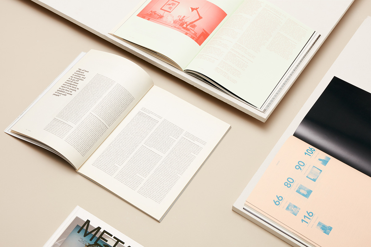
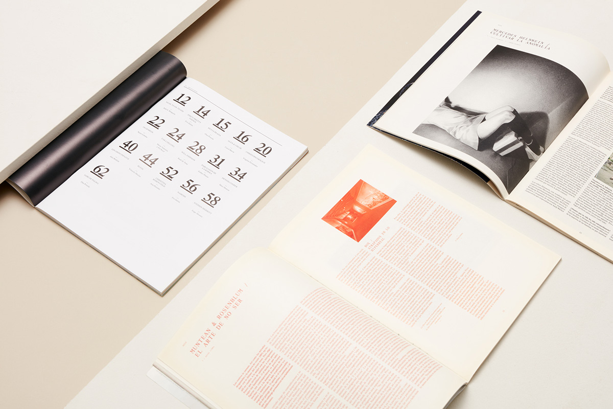
Moving away from the young fashion publication for young people, Metal’s visual language turned more mature and sophisticated, claiming a more conceptual idea of fashion. The new format, art direction and typographic treatment symbolised this transition. While creating a strong attitude and strengthening the magazines structure, design almost disappears, creating with its absence a recognisable look and feel.
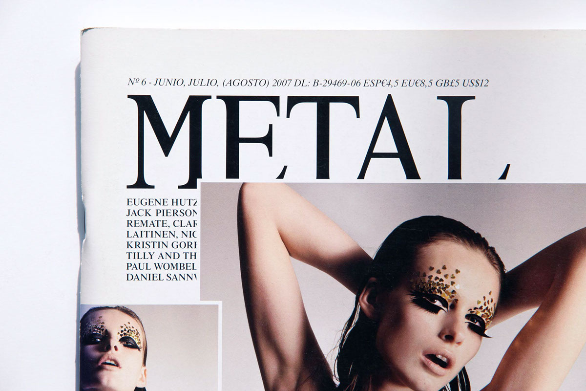
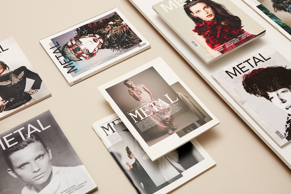
Two overlaid pictures, a dynamic header, blank spaces: strange though it may seem, these elements shaped Metal’s covers across many issues. In a time where dynamic identities were still pretty unknown, Metal couverture plays with a changing headline, which is sometimes even partially hidden underneath pictures.

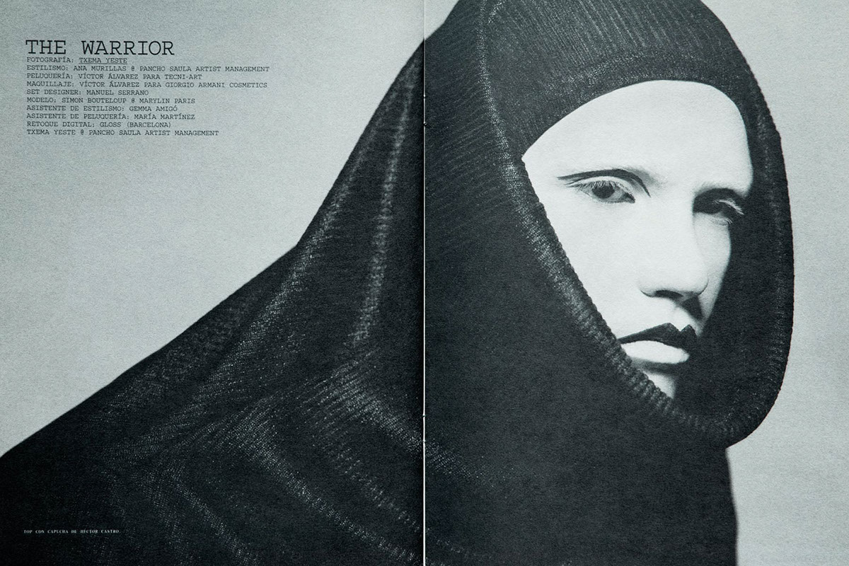
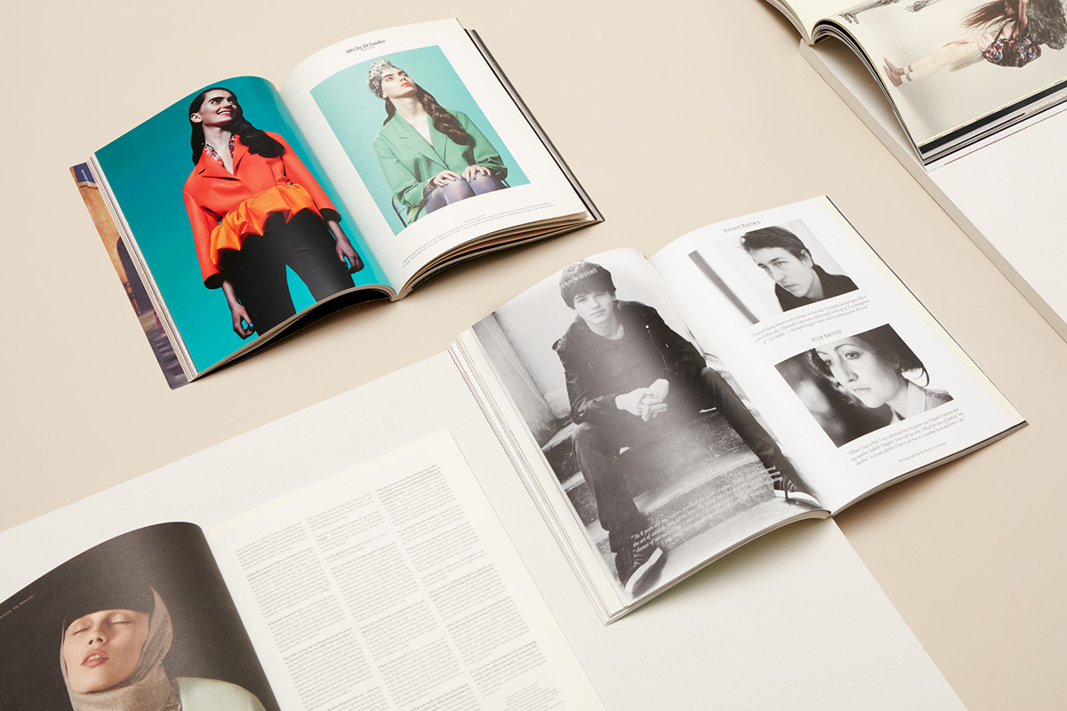
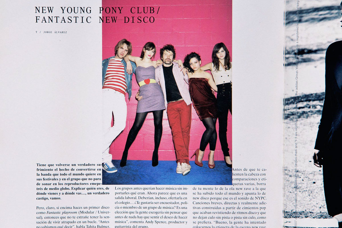
Images were presented in a fresh and pretty irreverent attitude: overlapping shots and displaced pictures characterised the publication. Overlaid, partially hidden, stepping across the borders of the page: pictures dance around the grid and this treatment strongly characterises the visual impact of the magazine.
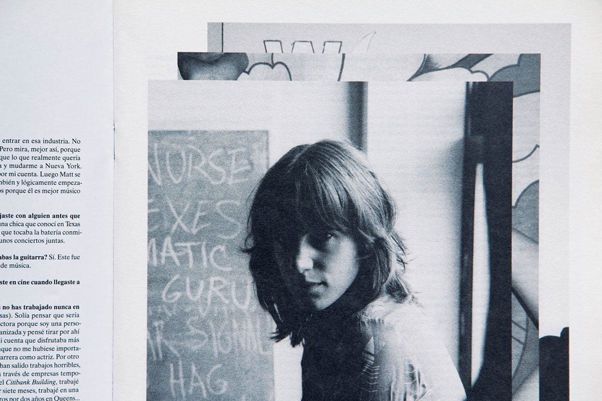
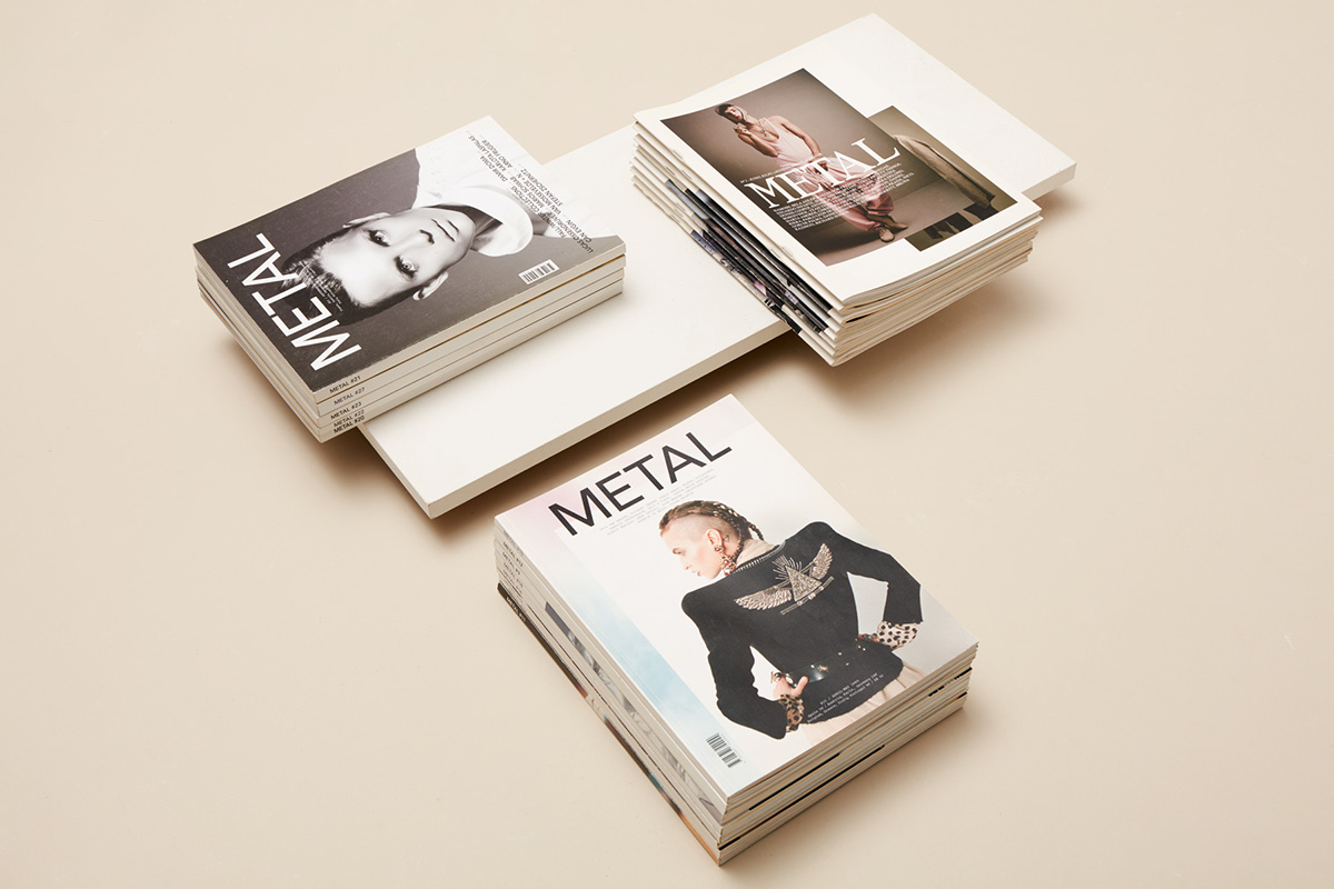
Some of the photographers who turned their noses up at this choice, were later aspiring to see their work published in such a fresh and experimental framework. Images were strongly enhanced by an innovative and playful choice of papers, something not really common in editorial design at that time: the harmonic play between the organicity of the offset paper and the cold white of the coated ones was spread across the bound and stapled publication.