


Tourism British Columbia’s brand identity was given a major facelift to reflect its unique offering. Special attention was paid to ensure that the new tools were sufficiently flexible for the specific needs of the many regions and points of contact.
All communications now focus on the emotions stirred by encounters with BC’s larger-than-life wilderness and its life-affirming effect on those who experience it first-hand. The tagline “Super, Natural British Columbia” thus regains its full meaning and its place at the heart of all brand communications.
The cornerstone of the new visual identity is a specially created hand-carved wood font. This new display font, called Great Forest, has been designed to be appealing, organic, memorable and strong. Great Forest includes three typeface families with several special characters and discretionary ligatures that allow for maximum flexibility.
Great Forest flouts all conventional typographical rules, which is exactly what enhances its unique and imperfect style, making the brand image instantly recognizable. Text set in this font looks like it was carved directly in wood by locals or tourists who were intent on leaving their mark on British Columbia.
To further enhance the font’s unorthodox look, the spacing between each letter and each line is deliberately based on the same measurement: the width of the cutting tool used to carve the letters in the wood. This unique feature allows the letters to be piled up one on top of the other, giving a nod to British Columbia’s Aboriginal totem poles.
The official logo, created using the same font, is also editable. It exists in several different formats (vertical, horizontal, square) and with different denominators, based on regional requirements. The maple leaf symbol that complements the logo provides a simpler signature for certain special pieces and underscores the Canadian connection in international communications.
The work of over ten local photographers further illustrates the brand. Selected photographs celebrate the diversity, wealth and sheer immensity of the province’s many different ecosystems, all using natural colour with no special effects or retouching.
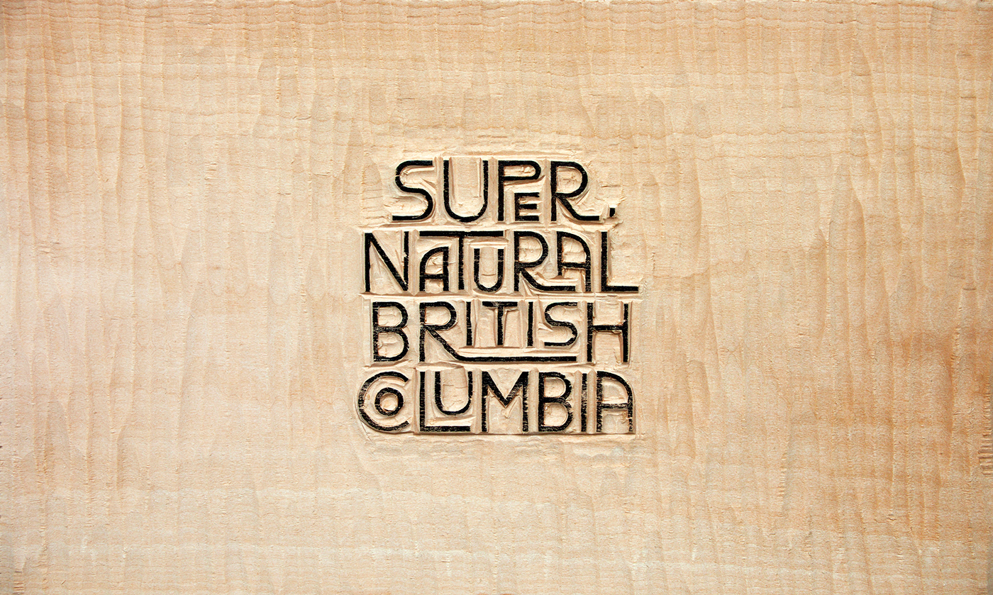
Wood carved logo block

Wood carved font block detail
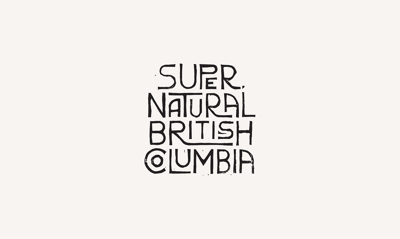
Printed logo

Font introduction - Photo by Spencer Robertson

Font overview
Font tutorial video
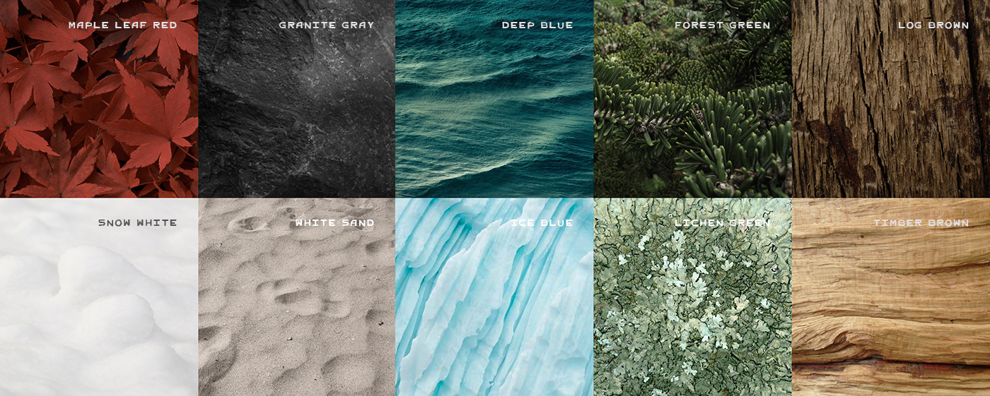
Colour palette references
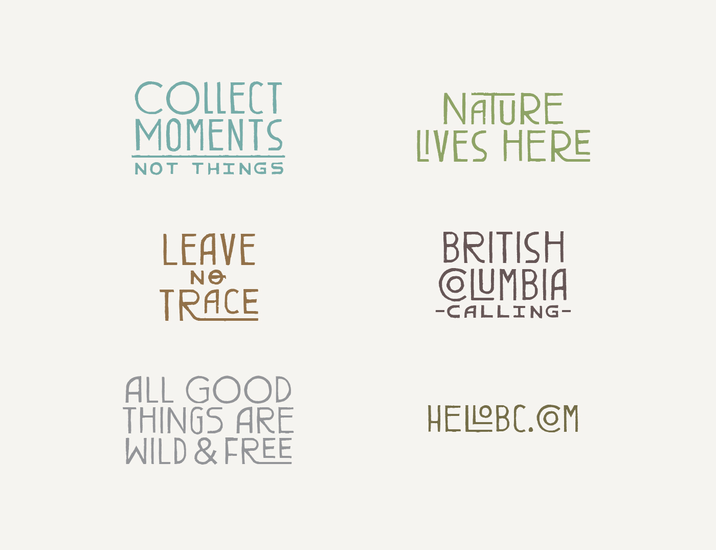
Copy tone
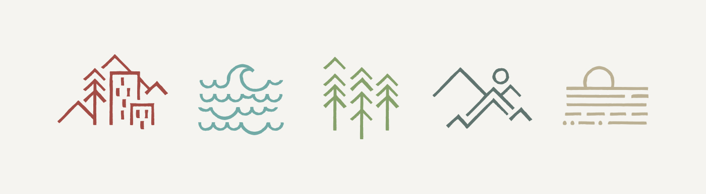
Icons
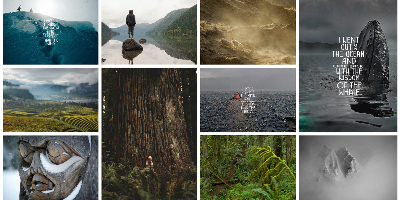
Photographic moodboard - Photos by Garrett Grove, Paul Colangelo, Duiken Redactie, Adam Gibbs, Anthony Taylor, Camila Massu, and Eric Berger.
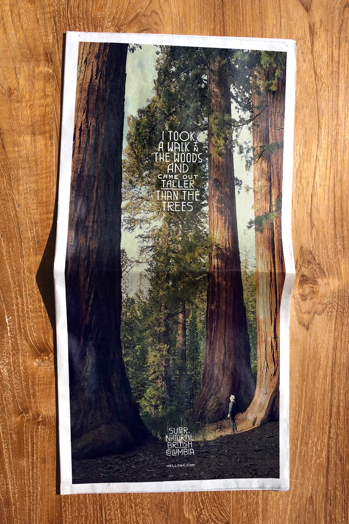
Newspaper layout - Photo by quixotically-insane
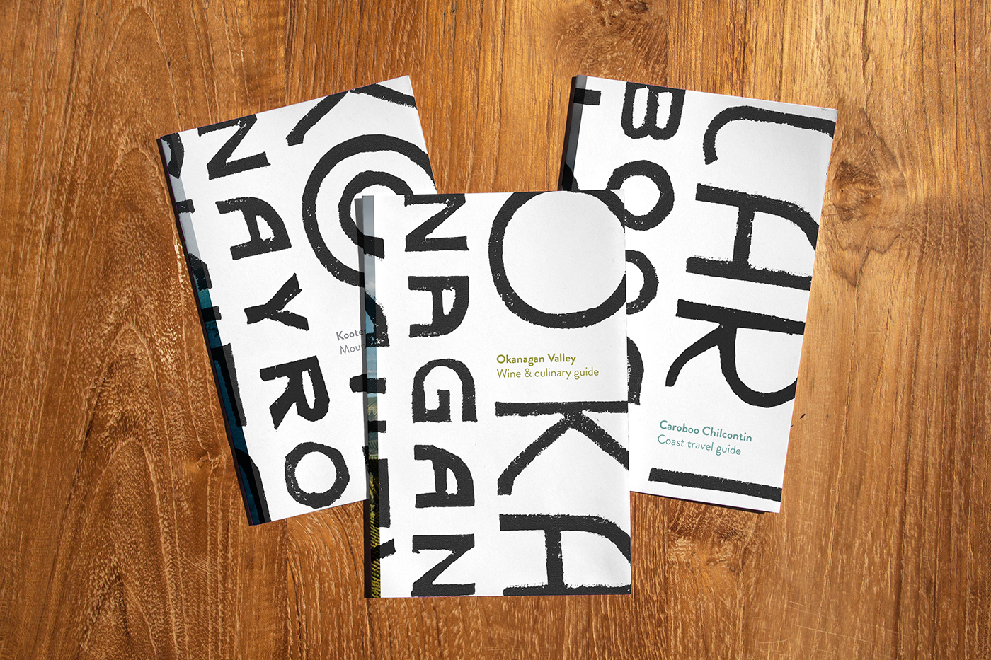
Regional brochures covers
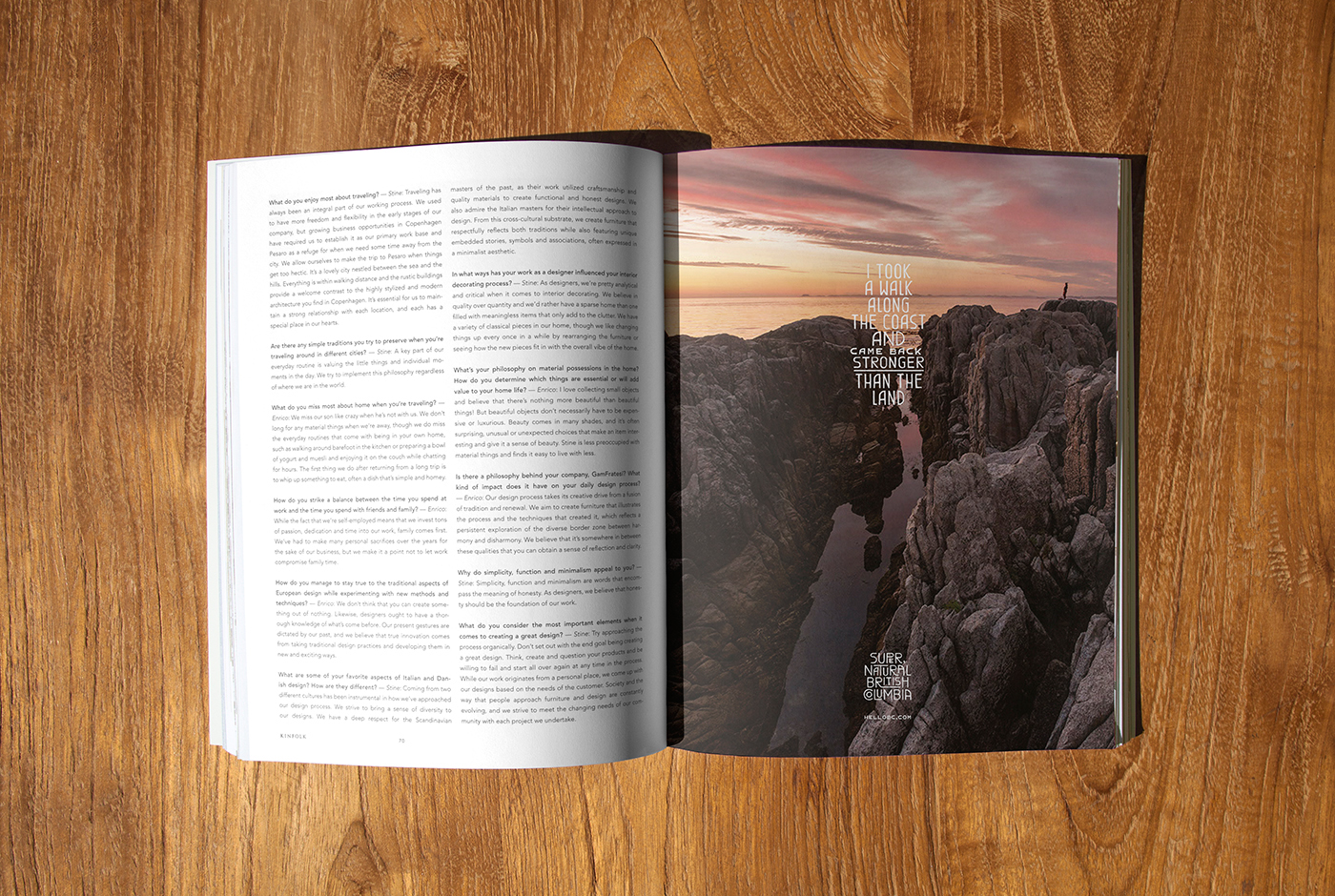
Magazine layout - Photographer N/A
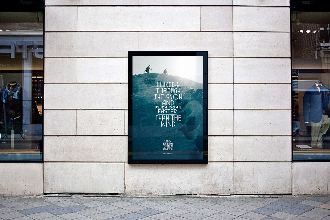
Outdoor print layout - Photo by Garrett Grove

Car sticker - Photo by William Woodward

Office wall
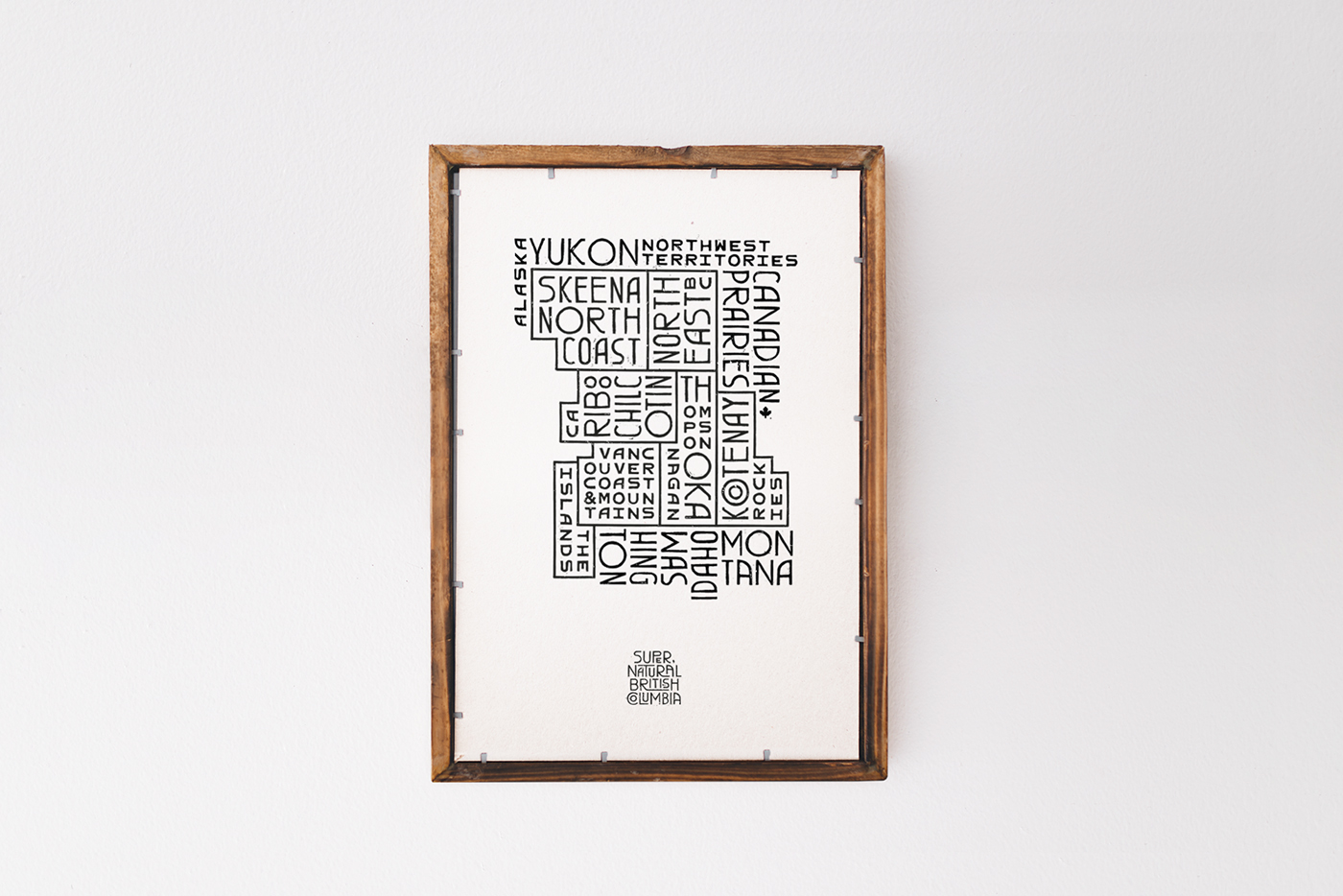
Regional map poster
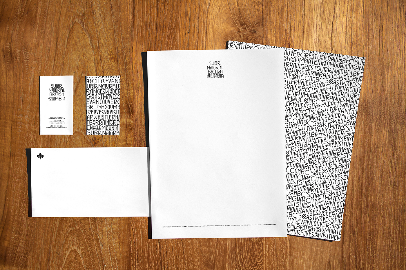
Stationery
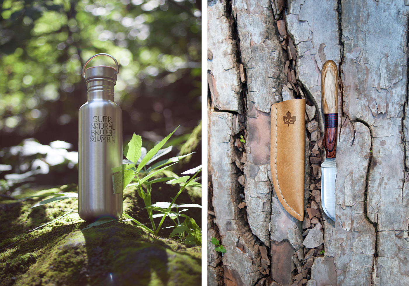
Branded merch

Reusable bag
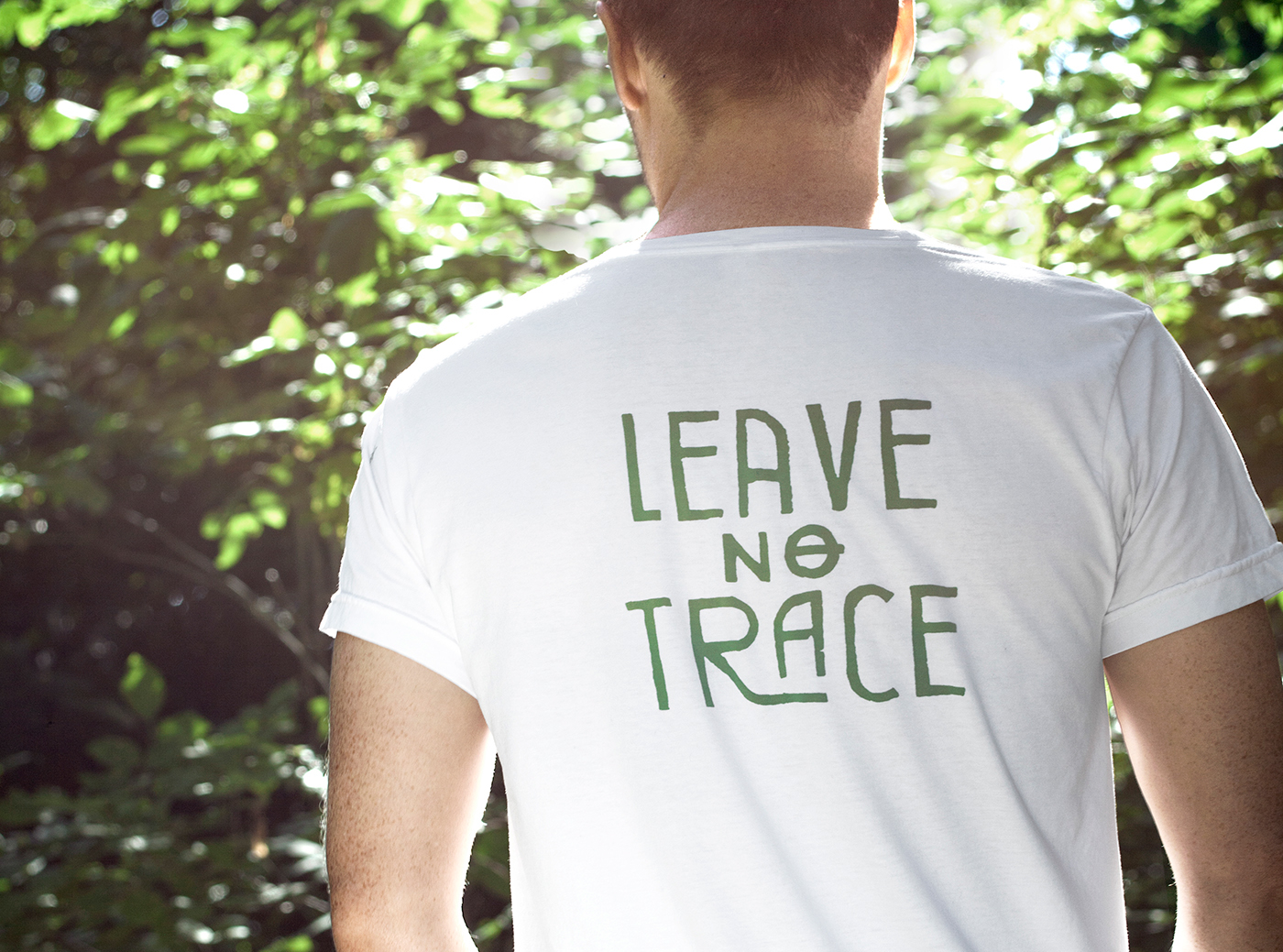
Statement t-shirt
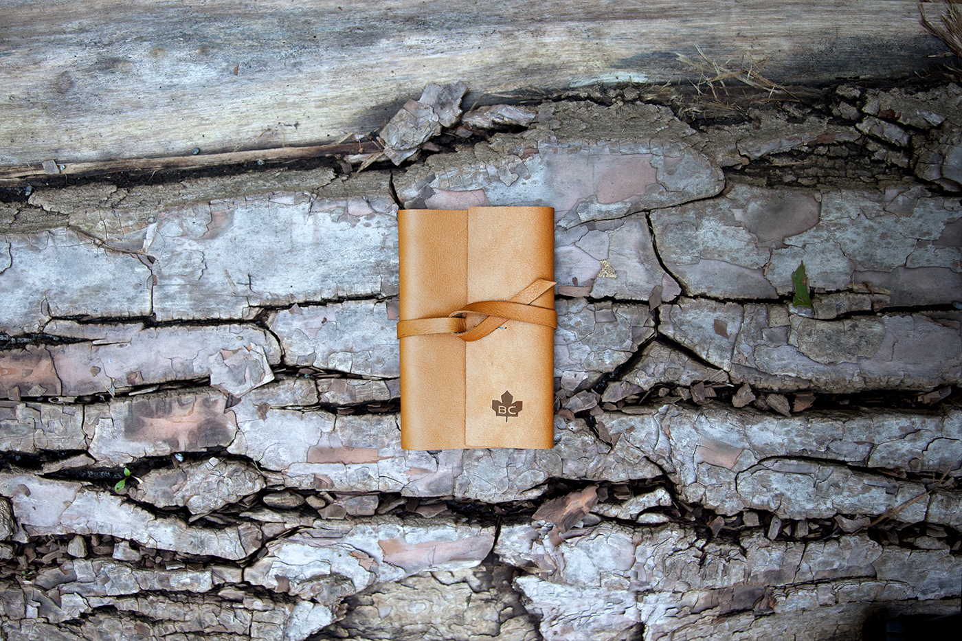
Travel notebook - Exterior

Travel notebook - Interior
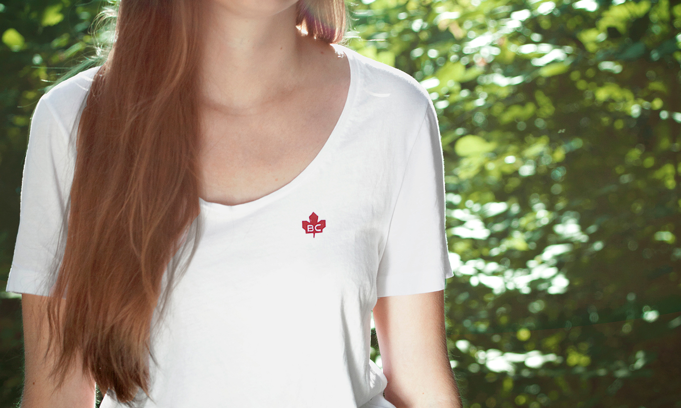
Icon t-shirt
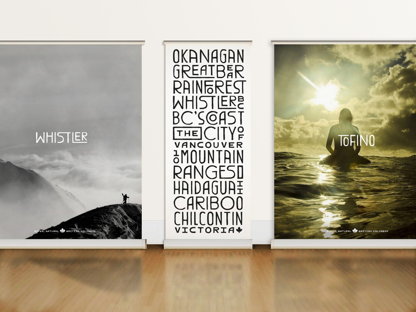
Trade show display - Photo by Reuben Krabbe and Sarah Lee.

Logo evolution
Brand launch video