Køltzow
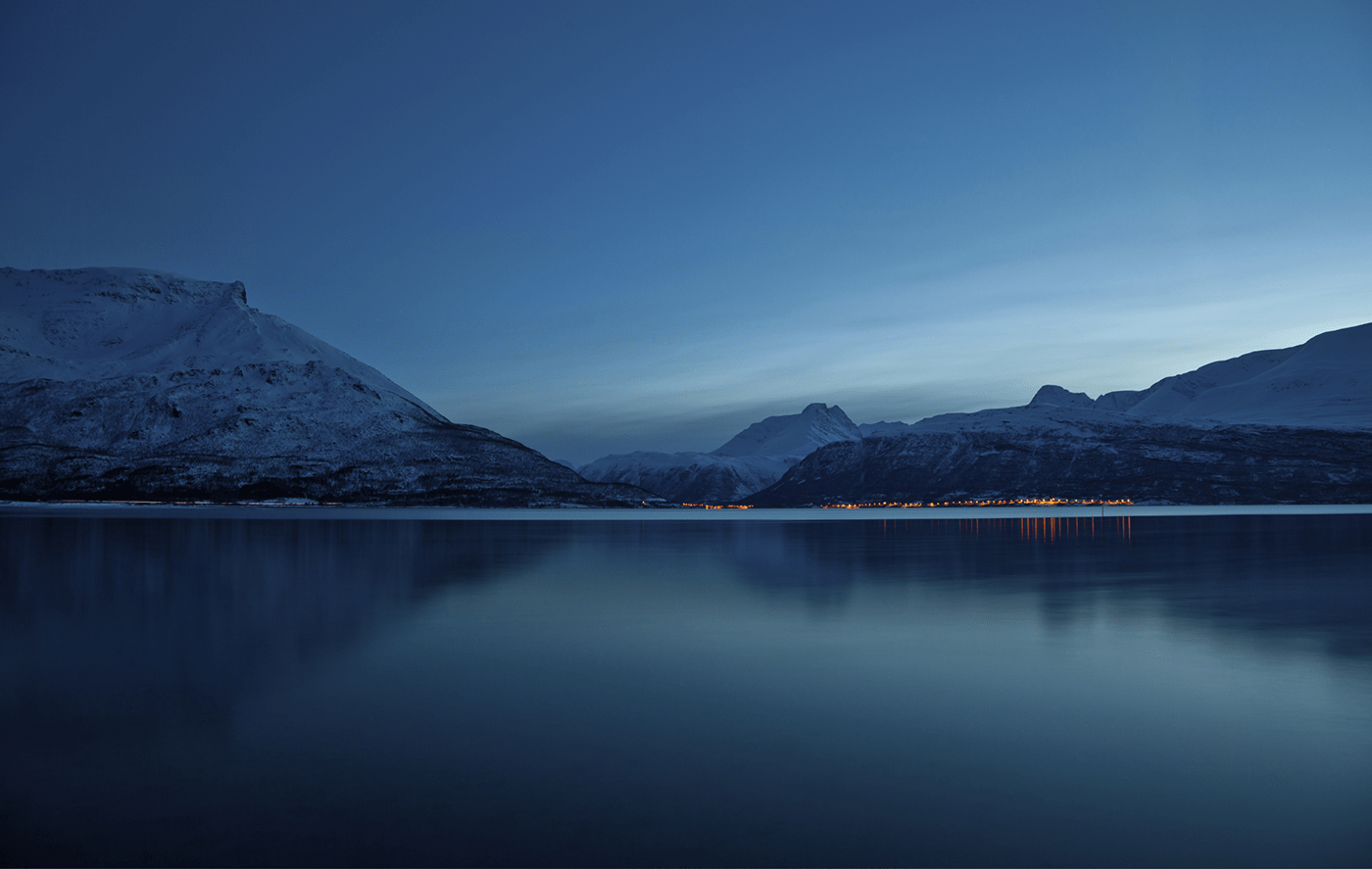
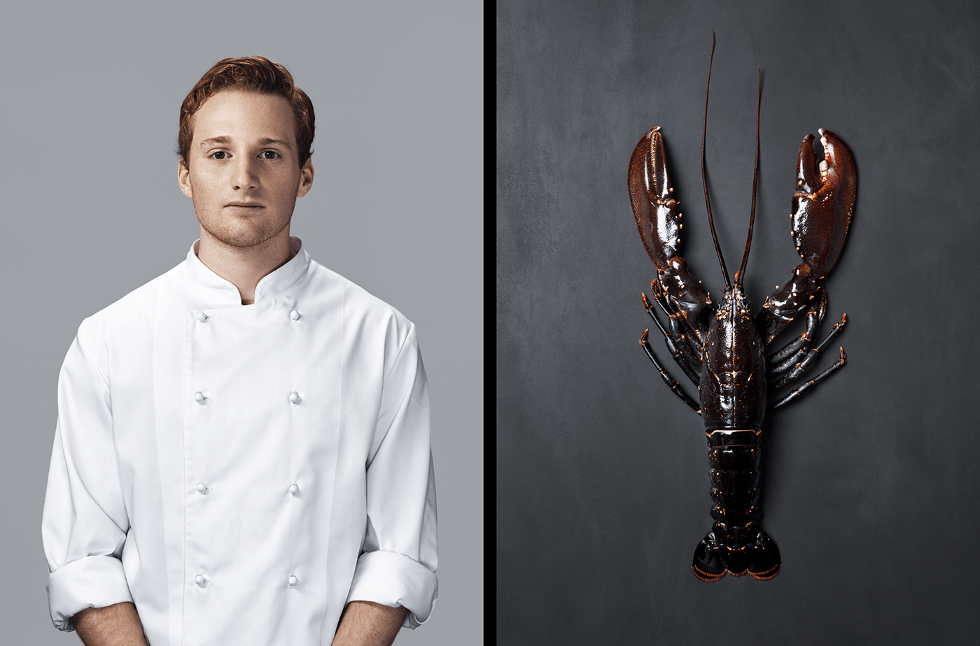
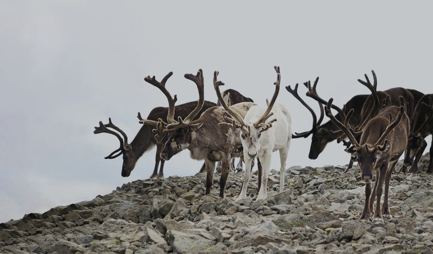
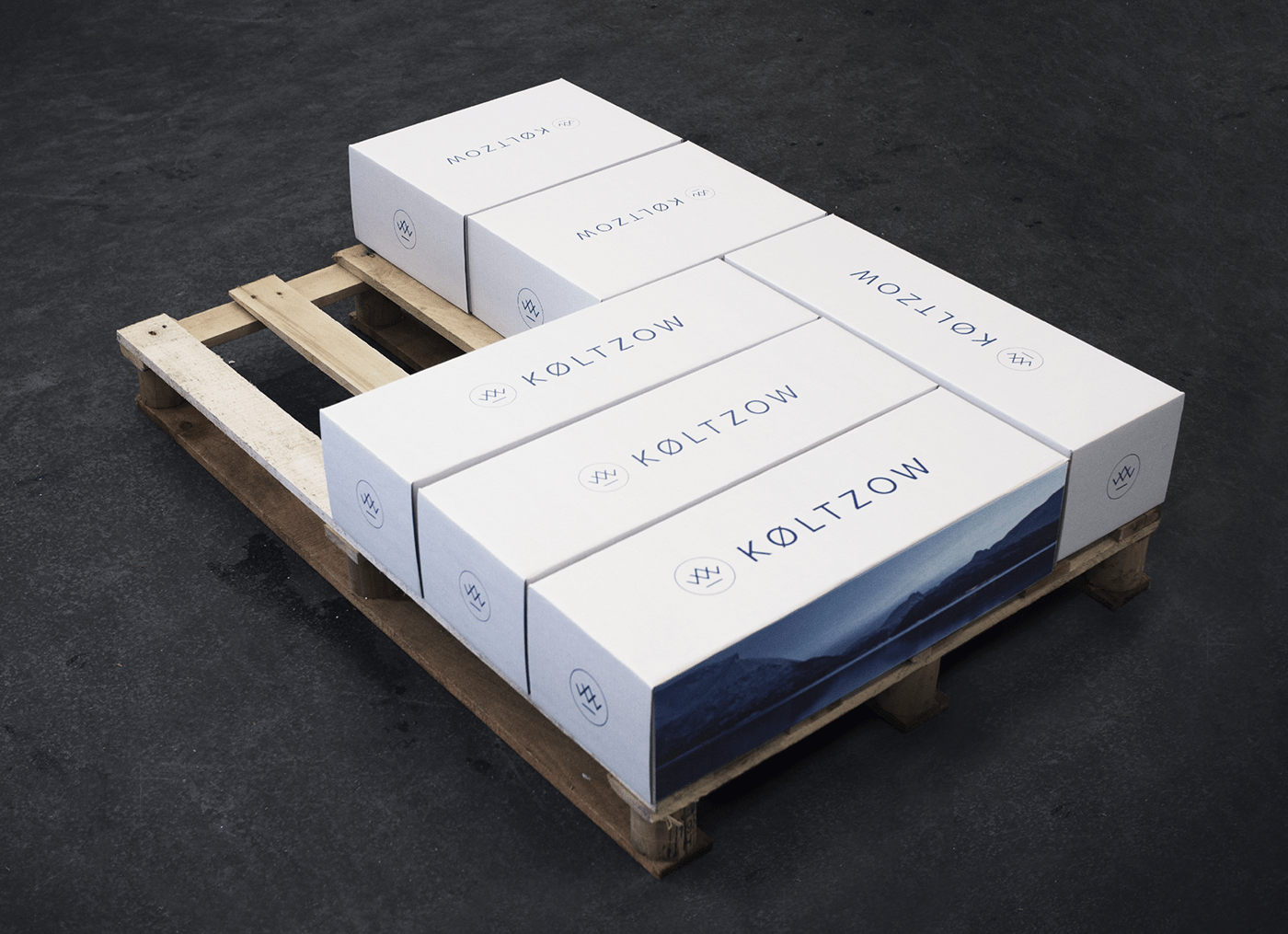
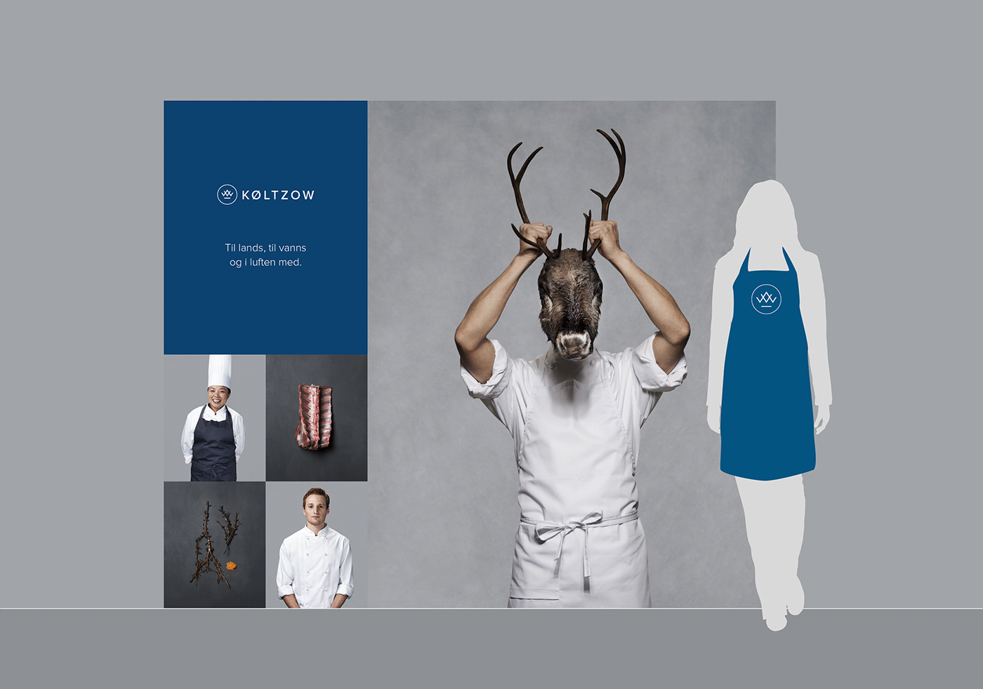
When seafood & fine meats company Køltzow (est. 1913) needed a new identity, it felt like a natural choice to photograph some of their beautiful products and experienced employees. Also, the new symbol reflects the origins of the products; the K of Køltzow is tilted so that, when put together with the W (from the original name W. Køltzow), they form a mountain range – set above the horizontal line of the sea.
When seafood & fine meats company Køltzow (est. 1913) needed a new identity, it felt like a natural choice to photograph some of their beautiful products and experienced employees. Also, the new symbol reflects the origins of the products; the K of Køltzow is tilted so that, when put together with the W (from the original name W. Køltzow), they form a mountain range – set above the horizontal line of the sea.


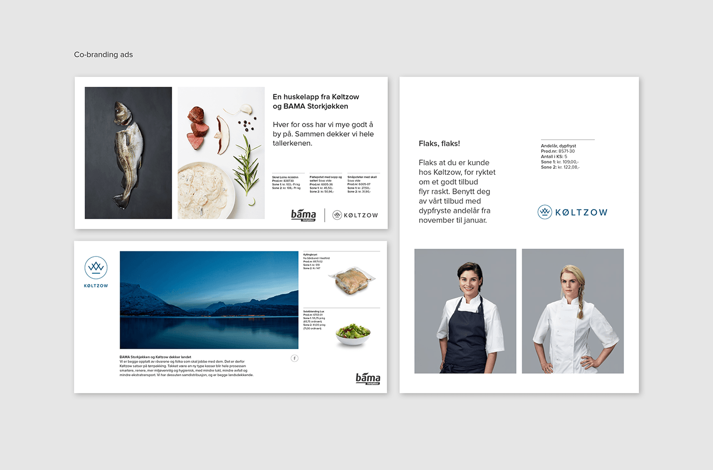

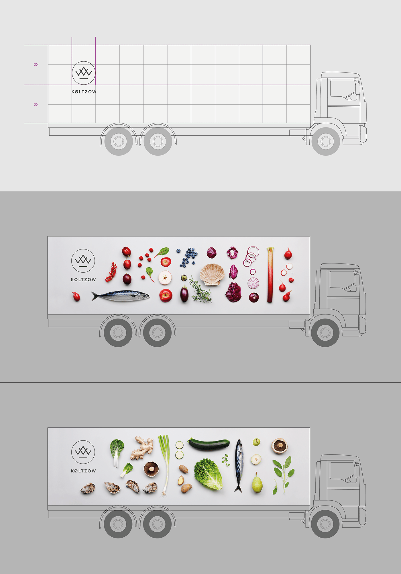

Køltzow is part of BAMA – Norway's biggest fruit- and vegetable supplier. The trucks are combined BAMA/ Køltzow-vehicles, and so have to communicate both greens and seafood/ meat.
Created at Mission Design
Graphic Design and Art Direction: Gøril Torske, Geir Lysbakken, Sigrid Pfanzelter and Kine Ugelstad
Graphic Design and Art Direction: Gøril Torske, Geir Lysbakken, Sigrid Pfanzelter and Kine Ugelstad
Photography: Veslemøy Vråskar at Palookaville and Mathias Fossum
Copy: Dag Evjenth
Account manager: Bård Annweiler
At Køltzow/ BAMA: Ingebjørg Hjortdahl and Linda Langebro
Copy: Dag Evjenth
Account manager: Bård Annweiler
At Køltzow/ BAMA: Ingebjørg Hjortdahl and Linda Langebro
Published 2015

