Although your entire audience hasn't gone mobile just yet—especially in the case of B2B—it's still important to consider how your brand's video marketing assets appear on different devices.
Your top-of-funnel marketing videos are designed to get you broad reach, but if the content doesn't load quickly enough, or if it isn't optimized for mobile devices, you don't get a chance to impress this mobile, forward-thinking portion of your audience.
You're skipped over. End of story.
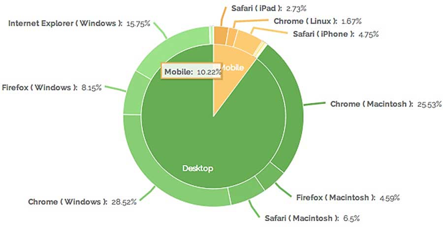
Source: Vidyard, video analytics data, homepage video, 2013
As it stands, adoption is increasing (some B2B brands are saying up to 30% of their audience is engaging with a mobile device), and multidevice optimization is no longer a "nice to have" for your marketing campaigns.
Your audience expects not only video but also a great viewing experience, no matter how they choose to engage with your content.
In this article I'll guide you through some steps you can take to make sure you're doing video right for mobile.
First, though...
Why bother creating your own video landing pages?
With video, most marketers seem to be happy just to have created the initial asset—"Woohoo—we made an awesome video!"—and they then upload the video to YouTube and promote it via social channels.
Well and good, but YouTube is only a small part of a video strategy. Ultimately, you should be driving folks back to your website to convert.
Unfortunately, annotations (commonly used in YouTube videos to drive viewers back to your site) don't work on YouTube mobile. Also, reading comments and looking at the video description (normally a place where you can link to more content) is not easy on YouTube mobile, so relying on it to drive viewers into your funnel isn't ideal.
Because your goal is to use (rather than rely on) distribution sites like YouTube to get folks on your site—where they'll engage with more of your content and transition further and further down the sales funnel based on their viewing history—it's time to start embedding videos on your own landing pages and promote those pages instead of your YouTube channel alone.
Here's how to ensure your landing pages fit the mobile bill.
Step 1: Create responsive video players
With video embedded on your site, a responsive player should be the first thing you tackle. You'll want to make sure your video sizes are device-agnostic. This means your video content should be visible on both an iPhone (640px wide) and a large monitor (1,920px wide)—and everything in between.
Ultimately, you just want to make sure the player's dimensions look appropriate for every screen size.
After building your landing page, you can optimize for mobile sizing when you embed your YouTube video asset on the page. You'll need access to the HTML of your website to do this, and here are some detailed instructions to guide you through the process (via Smashing Magazine). If you're using a video marketing platform with a customized player container, you can use the code samples here to adjust your player's sizing.
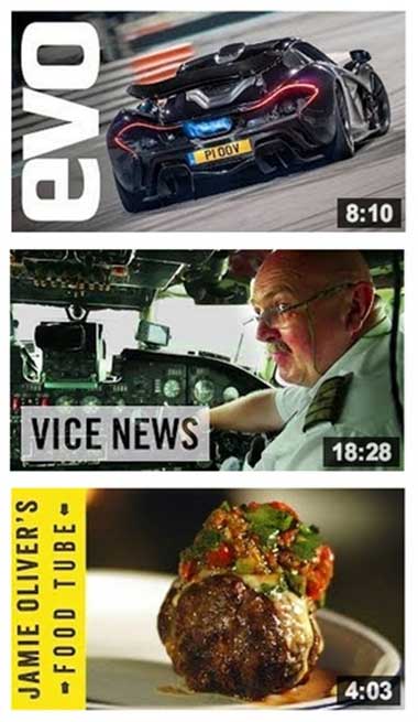
Step 2: Create big, bold splash screen images
Because your video's thumbnail image—splash screen—has the potential to become illegible on a small device screen, you'll want to design the cover of your video with mobile users in mind.
A big, bold image will work well at all sizes, and it's good for visibility in search results, because your videos become easily recognizable.
Take a look at the following simple splash screens that are not only visually stunning but also visible/legible at any device size. (With its yellow vertical bar, Jamie Oliver's cooking videos are easy to recognize at a glance from the splash screen—every time).
Step 3: Be clever about your calls to action
Finally, to ease conversions, you'll want to be careful with the design of your video campaign's landing page.
As I noted, YouTube mobile makes it relatively difficult to see a video's description, one place where you can place links back to your site, and you can't have annotations or clickable final CTAs in videos on YouTube mobile.
For your own video landing page on your site (the one you'll promote as the main campaign landing page instead of YouTube), make sure you create a CTA that's external to the video but still above the fold. An example of this can be seen with Juniper Network's Data Rap Battles.

As you can see, you can vote on Juniper's custom landing page and interact with other CTAs, and it all looks great on mobile. The campaign doesn't rely on watching the whole video to reach a CTA, which is a good practice for mobile-friendly campaigns.
* * *
Overall, use responsive design, bold splash screens, and thoughtful CTA placement when building out your next video campaign to ensure your audience has the best possible experience with your content—regardless of the device they use.


