


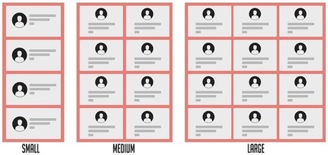
With container queries, you’ll be able to consider the breakpoints of just the component you’re designing. As a result, you end up specifying less code and the components you develop have fewer dependencies on the things around them.
Get Started for FREE
Sign up with Facebook Sign up with X
I don't have a Facebook or a X account


 Your new post is loading...
 Your new post is loading...
Your new post is loading...
 Scoop.it!
With container queries, you’ll be able to consider the breakpoints of just the component you’re designing. As a result, you end up specifying less code and the components you develop have fewer dependencies on the things around them. 
No comment yet.
Sign up to comment
Scoop.it!
In this article, I’m going to take a look at the common features of our new layout systems, along with a couple of examples which serve to highlight the differences between them.
Scoop.it!

I think there’s huge potential for a new variable font format to become a key part of the designer’s tool belt. It would greatly improve the reading experience of general users of the web, too.
Scoop.it!
As the transitionary phase that brings form to ideas, mockups hold a lot of weight in the design process. This piece reviews the most common mockup mistakes when designing in RWD, so you can make sure your step to responsive is a step forward, not back.
Scoop.it!
If there’s only one thing you take away from this article, make sure it’s this: you need to think about your designs.
Scoop.it!
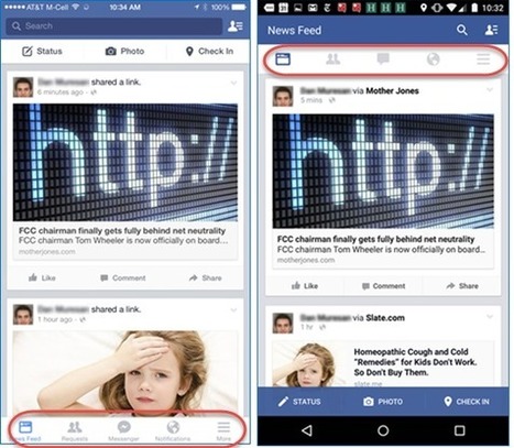
Mobile navigation must be discoverable, accessible, and take little screen space. Exposing the navigation and hiding it in a hamburger both have pros and cons, and different types of sites have different preferred solutions to the mobile-navigation quandary.
Scoop.it!
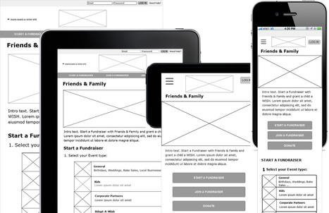
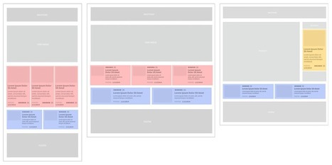
Designing with multiple screen sizes in mind becomes speedy and more effective when considering content in the wireframing process. By blocking out areas for the content or splitting it into different categories, designers can create movable parts to adapt to any screen size.
Scoop.it!

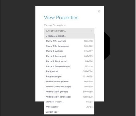
With the introduction of media queries, designers are able to specify breakpoints a website will adapt to and target specific devices and viewport sizes. Basic media queries are usually for a phone, tablet, and desktop. But there’s generally no consideration for the Very Big Desktop.
Scoop.it!
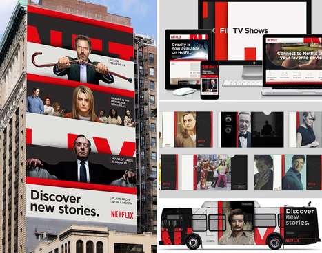
What’s fascinating about Netflix’s rebrand is the way it embraces, and refines responsive design; this is responsive design beyond viewports, it’s responsive design for mobile, the web, print, social media, and of course TV.
Scoop.it!
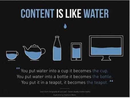
The most important element in any website is of course, its content. The most important part of any content is its text. Make it visible. That’s it. That’s what the whole article was about.
Scoop.it!
Whether you’re designing a small company website or reworking an ecommerce platform, let’s explore some mistakes you definitely want to avoid on your next responsive Web design project.
Scoop.it!
It’s certainly possible to approach the sun without melting our waxen wings. So follow along and let’s see how far we can push towards perfection in our pursuit of the ideal responsive design.
Scoop.it!
Typography is not one-size-fits all, yet that’s often how we approach it on the web. We understand the value of responsive design but seldom do we design responsive typography.
|
Scoop.it!
On the surface, it appears that adaptive requires more work as you have to design layouts for a minimum of six widths. However, responsive can be more complex as improper use of media queries (or indeed not using them at all) can make for display and performance issues.

Manesha's curator insight,
February 17, 2016 5:15 PM
Les sites web adaptatifs sont une bonne chose car la conception vise, grâce à différents principes et techniques, à offrir une expérience de consultation confortable même pour des supports différents. L'utilisateur peut ainsi consulter le même site web à travers une large gamme d'appareils (moniteurs d'ordinateur, smartphones, tablettes, TV, etc.) avec le même confort visuel et sans avoir recours au défilement horizontal ou au zoom avant/arrière sur les appareils tactiles notamment, manipulations qui peuvent parfois dégrader l'expérience utilisateur, tant en lecture qu'en navigation.
Scoop.it!

As a workflow, designing responsive sites can seem daunting, especially if you are new to the process. Designing for multiple screen sizes, the constraints of small screens, and considering touch, all add complexity into the mix that takes us beyond creating fixed width sites.
Scoop.it!
I went on a personal quest to find the best way to use the powers of CSS preprocessors to manage breakpoints and write media queries in my projects. The outcome was include-media, a library that promises "simple, elegant and maintainable" media queries in Sass
Scoop.it!
e’ve developed a simple mixin that enables you to collate your typography styles into one central location and call on a specific look at any point. It also handles media queries, allowing you to specify different properties at different breakpoints.
Scoop.it!
All in the name of responsive web design.
Scoop.it!
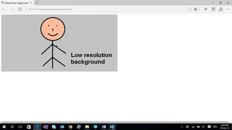
An important part of a responsive website are responsive images. In this article, we’ll learn more about responsive images on the web and see how to build them.
Scoop.it!

Adopting a mobile first strategy can be extremely difficult at first; however, there are many benefits to this concept. All that is required from you is to step up and take the leap.
Scoop.it!

Responsive sites and adaptive sites are the same in that they both change appearance based on the browser environment they are being viewed on (the most common thing: the browser's width).
Scoop.it!
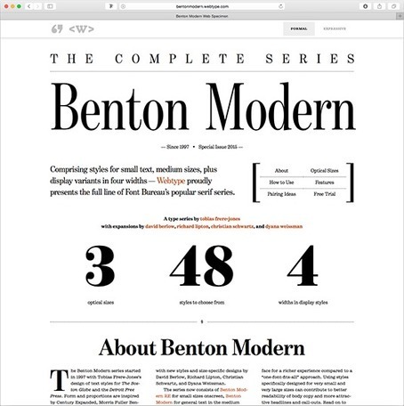
It stands to reason that responsive web design requires responsive typography to suit. Font size, spacing and layout should work together to create an elegant, legible text setting in each viewport. But how? We asked seven leading web designers.
Scoop.it!
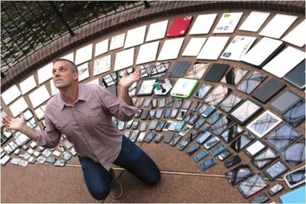
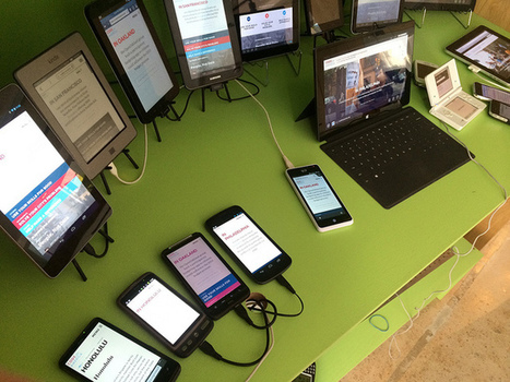
In fact recent studies show that over 80% of the population search for local businesses on their mobile phones. This article outlines why responsive web design is a small business must have.
Scoop.it!

Tabbed layouts are a great way to house a lot of related content in a small, compact area. In this tutorial, we're going to build a responsive tabbed layout using CSS and JavaScript, and implement a basic no-js fallback.
Scoop.it!
You only need to worry about creating one single website that has a great multi-device design; however, this is something that requires a completely different way of designing and developing altogether. Responsive design is the key.

Local Top Rank's curator insight,
October 15, 2015 12:00 AM
Tips on how to responsive design for multiple mobile devices #responsivedesigning #mobilewebdesign
|


